Every year I get a look at the entire Major League Baseball Postseason logo collection and every year I just skip right past a few pages in there… Why? They’re Tiebreaker logos.
A series of logos which will almost certainly be tossed aside, never to be seen by the light of day, and to be honest, they simply follow along with the template established for that year throughout the postseason. Really, I find they’re not worth spending too much time worrying about.
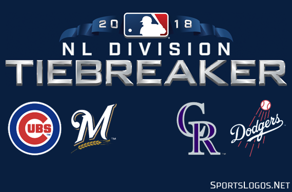
This year appears to be the exception to that rule as for the first time in MLB history we have not one, but two Tiebreaker games on the same day. Let’s see the logos!
So to answer some questions, no the team logos are not a part of it – I added them because I like logos (what?!) and yes there’s an AL version of this same logo – the differences include the name changing from NL to AL and the flag colour going from blue to red. There’s also a Wildcard Tiebreaker logos as well, the only difference is changing “NL DIVISION” on the top line to “NL WILD CARD” (same for AL with the usual changes… name/flag colour).
Here’s a look at the unused MLB Tiebreaker logos for 2018:
As mentioned earlier an MLB Tiebreaker game is fairly uncommon, before our double-bill today the last game was in 2013 when the Tampa Bay Rays beat the Texas Rangers, back then they weren’t quite so specific with the logos for each possible tiebreaker scenario so we got a generic all-in-one design:
Remember, today’s games are NOT playoff games despite all the teams participating being playoff teams (also an MLB first!). Because this is the regular season teams continue using 40-man rosters and they shouldn’t be wearing the 2018 Postseason patches on their jerseys or caps yet.


