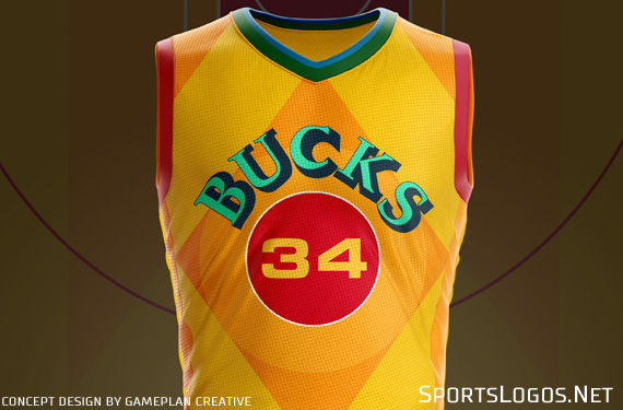
Oh, the joy of creating an NBA uniform untethered to the whims of the team, Nike or the league. As NBA teams across the association release a wave of City Edition uniforms, a former NBA uniform designer and his team at Gameplan Creative took to their drawing room to reimagine the MECCA-inspired design shown for the Milwaukee Bucks.
A look at what the Gameplan team fashioned serves as a reminder of the power of exercise but also allowed for a freewheeling discussion of the path City Edition uniforms have taken under the new Nike direction.
“I think a lot of these designs, they are going away a little from the brand,” says Tom O’Grady, the chief creative officer at Gameplan and former creative director for the NBA. “There is no brand connection in what we see in some of the team examples. That is a big paradigm shift for me. They are taking this provocative look at their market and creating something more market-based than team-based. Does it raise eyebrows, does it add value? It is a big departure.”
While that departure may have moved the NBA into a new realm when it comes to uniform design, O’Grady isn’t sure yet if it has moved too far. He remembers a time when an alternate uniform was a retail-driven addition, taking a current identity and expanding it while “staying within the same ZIP code.” Those alternates of past often make returns time and time again (think black uniform from the Timberwolves) but now, with the ease of creating a new set of uniforms for just twelve players, the relatively inexpensive process of manufacturing, and donning a new uniform for just a couple of nights a season, teams have used the City Edition as a way to “refresh the brand and do changes on the fly to keep the brand fresh over 82 games.”

O’Grady says he sees the City Edition craze of swerving outside a team branding lane as a way to awaken fans and say, “We are not a sluggish corporate entity, we can do some really wild creative stuff as well.”
So, whether the Prince-inspired purple from the Timberwolves that lacks a strong tie to the team, but plays off the city, or the new MECCA floor-inspired design for Milwaukee, O’Grady took the opportunity to work with Gameplan’s Brigitte Smith to decipher their own improvements upon the Milwaukee MECCA design, an exercise in modern-day NBA creativity.
The MECCA floor was originally designed by artist Robert Indiana and played on in the MECCA Arena by the Bucks and Marquette University in 1977. The team has brought back elements of the city-connected floor for inspiration in the past. And with many of the archival uniforms of old already worn through, O’Grady figured the team thought it time to do something unexpected.

“The uniform in the NBA and sports is like the painting,” O’Grady says. “Then you got to go out and buy a frame to fit the beautiful painting and that is what the court is. Here the frame has driven the design of the painting.”
With the colourful, geometric pattern of the floor the critical element of the design, O’Grady says it was a challenge to see what they could do to create a Milwaukee-friendly design. The unauthorized version from the Chicago firm first put a focus on the integrity of the MECCA font. They had to recreate the font of the floor by hand and used that as the principal wordmark lettering.
From there, in an effort to keep the uniform vertical — “The game of basketball is very vertical and I have always been cautious not to do too much horizontal because it stunts the height and majesty of the tall players, truncating the verticality of the players,” he says — the colour blocking and geometrical patterns required detailing.
“Brigitte and I saw a lot of details on the Robert Indiana court,” he says. “The baseline had the font, it was handsome, and the side panel pays homage to what the baselines look like.”

With a yellow-heavy design on the court, that colour easily translated to the uniform mock-up. The “shocking red lanes” from the court played well as a trim on the uniform and the diamond shape was meant to balance out the jersey top. “Then, just nailing that MECCA font, that ‘70s weird, awful government font they curved with heavy drop shadow, felt so authentic,” O’Grady says. “That is what sold the graphic on that court.” The red circle in the middle of the uniform holding the number in a Euro-style font added a core element to the uniform.
Gameplan added the Milwaukee wordmark on one short side and the logo of the Bucks’ head on the other, really the one detail that ties the uniform directly to the team, something the actual uniform doesn’t have. “If I didn’t know that court design existed and I saw (that uniform), I would say, ‘What the hell are you doing? That is crazy-ass ugly,’” O’Grady says. “But tied to the story, it is a perfect complement to what the court is. If you are trying to pay homage to the court, you nailed it.”
As the NBA City Edition uniforms serve as a new wave of uniform design, one moving past team identity and into city identity, designers the country over have enjoyed the exercise of crafting their own creative efforts whether for team or for city.
Studio Stories is a monthly column from Tim Newcomb that explores the stories behind some of the designs dominating the sports landscape. Follow Tim on Twitter at @tdnewcomb


