Trophies matter. Maybe in hockey more than any other sport, where the “hoist” of the trophy evokes so much emotion, so much desire. When it came time for the 2019 Winter Classic uniform design, Adidas Hockey partnered with the Chicago Blackhawks and Boston Bruins to take a break from looking forward — expect more of that with the Stadium Series and All-Star Game efforts – to relive the emotion of history. But even with all this talk about heritage, the design group had a little extra something in store for the entirety of the event’s uniform aesthetic.
“Heritage is a big deal in hockey,” says Matty Merrill, design director for Adidas Hockey. “When we approached the Winter Classic, we knew we should do something 100 percent authentic. We wanted to find an important, meaningful moment.”
Adidas settled on the first Stanley Cup win, the first cup year for both Chicago and for Boston, since they happened just a few years apart and kept the looks within the same era.
“They are 100 percent heritage but still two of the more forward-looking designs,” Merrill says.
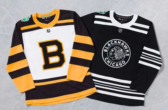
Well, that 100 percent heritage does come with a bit of a caveat, Merrill admits. The Boston uniform, the base of which using the 1929 design that saw the young club capture its first trophy, came with a notable change as the Bruins decided to change up the crest, embracing the way the varsity “B” looked across the front instead of the more traditional logo the team wore originally all those years ago. The dark brown “B” sets off the center of the white jersey that includes brown on the shoulders and plenty of yellow striping.
Using felt in the logo, Merrill says they sought a more distinct 1920s-style design. “It is how it showed up in the historic jersey and lends authenticity to the jersey here,” he says. “When people discover these, that they are felt, it is a material that reminds me of a high school letterman jacket.”
To mix in a few details on the Bruins’ uniform, Adidas placed the year of each of the club’s Stanley Cup wins inside small shamrocks on the back, inside neckline. With the Winter Classic game played at Notre Dame Stadium in Indiana on Jan. 1, 2019, Merrill says the design team — Adidas Hockey has designers ranging from a 20-something female who grew up playing hockey in Connecticut to a 20-year veteran of NHL uniform design — wanted the small touches to go inside the uniform and not cloud the legitimacy of the original design.
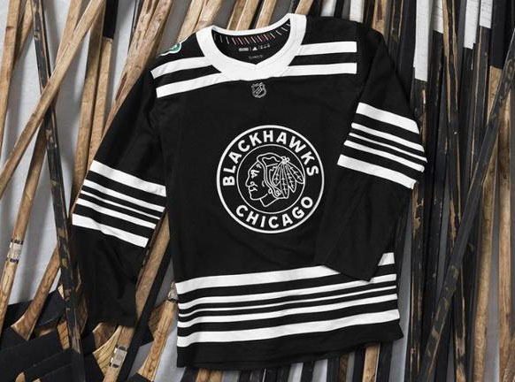
For Chicago, the black and white Black Hawks’ uniform of 1934, their first Stanley Cup victory, stays true to the original uniform from the team’s origin in the 1920s. They too include a felt-forward crest on the front, coming large and with plenty of prominence. Special stitching was meant to mimic the era and the felt continues through to the name and number on the back of the jersey, just like it does for Boston. The neckline on the collar of both uniforms was also given an old-school threading look to try to create as close a one-to-one aesthetic comparison of the two eras of uniforms without giving way to the performance attributes of the Adizero style.
The uniform includes white striping in varying widths throughout the waist and sleeves. Along with the black and white, Adidas tossed a hint of red into the inside neckline collar, placing the years of the Chicago Stanley Cup wins between the same style of hash marks found in the end zone of Notre Dame Stadium. Again, Merrill’s team wanted a slight nod to the location of the Jan. 1 game without becoming gimmicky along the way.

“The Winter Classic is a look at days gone by, while the Stadium Series is a look at the future,” Merrill says about how the NHL has positioned the two franchise games. The discussions around Winter Classic have helped teams, Merrill says, as they look to 2019 and a completely new slate of third jerseys for the NHL. “For the thirds, it really comes down to the team’s opportunity to branch out and recognize history,” says Jacob Berry, Adidas Hockey senior manager of brand communication. “It comes down to storytelling and partnering to tell the story of an individual team. We are using that moment as a muse to tell stories and have conversations that build.”
Think of the Winter Classic designs much in the same way. Not only will the Bruins and Blackhawks offer up the in-game designs that harken to roughly 90 years ago, but along with the game comes the opportunity to create a fresh, modern design too.
Enter the practice jersey.
Last year, to coincide with a marketing event that saw the New York Rangers players ride the subway for an event in Central Park, Adidas created a set of practice uniforms. The popularity on social media was a hit, but Adidas was too new to the game to have captured on the consumer aspect of the draw and the fresh look was unavailable for purchase.
Not this year.
“Fans are hungry for new and different,” Merrill says. By having the freedom to create in the practice jersey for an event such as the Winter Classic, Merrill adds it allowed the design team to keep the game jersey authentic. “We didn’t have to put a Notre Dame reference on the outside, but really step out for the practice jersey that leads up to the game.”
This year, that means to expect gold on white. The Blackhawks and Bruins will both feature practice jerseys with an all-gold mark large across their chests, Chicago with a black and a white with the alternate tomahawk “C” logo and Boston offering white and yellow options with their Winter Classic “B”.
While giving the fans something new in the Notre Dame-inspired practice jersey, Merrill’s design team at Adidas Hockey remained focused on one element for that Winter Classic game: a nod to the ultimate trophy hoist.
Studio Stories is a monthly column from Tim Newcomb that explores the stories behind some of the designs dominating the sports landscape. Follow Tim on Twitter at @tdnewcomb


