A logo change is likely coming to the Ottawa Senators one way or another, but not until 2021 at the earliest.
During an appearance on the Sens Callups podcast posted last night, Aimee Deziel, Chief Marketing Officer of the Ottawa Senators shared some of what’s been going on behind the scenes in the team’s quest for a new look.
“The earliest we could introduce a new brand would be the 2021 season and that’s a function of how the NHL and Adidas manufacture prototypes and test manufacture the jerseys”, Deziel revealed on the podcast. “So before anyone gets too caught up with ‘will this be next year?’, it won’t be next year. Again that’s mostly dictated by the NHL”, adding “I don’t have an exact time, I don’t have an exact logo, but I can tell you that introduction is at least a season and a half away”.

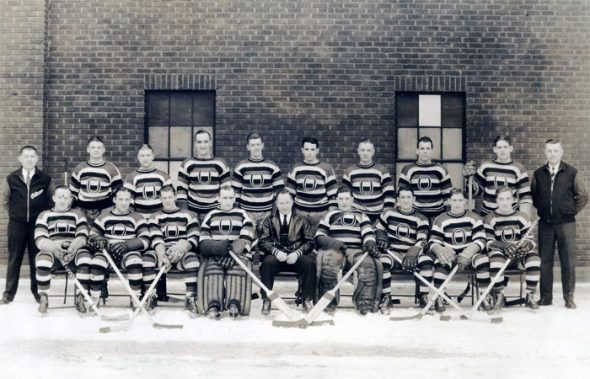
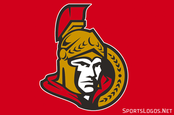
For the past several seasons the Senators have jumped back-and-forth between using the team’s three-dimensional Centurian soldier logo and the heritage-inspired “O” with stripes logo as their primary brand, last season the “O” was pushed to the forefront being used on social media and even as the team’s centre ice logo, this year that’s all been flipped back to the Centurian.
“The Centurion with the general population is actually the more popular of the of the logos”, Deziel said referencing the results of a survey the club took regarding various logo options. “That’s basically what we decided to base our decision on in terms of the centre ice logo and kind of double down on the Centurion”, later adding “to suggest that it’s a runaway winner is a lie but it is the more preferred logo.”
Familiarity with a brand certainly doesn’t hurt its popularity with a majority of fans, both in Ottawa and across the hockey world. People in general typically fear change, preferring to stick with something they’re used to even if it isn’t necessarily the better option.

Ottawa welcomed the Senators as an expansion franchise prior to the 1992-93 season re-introducing the Senators name that the city’s previous NHL club had used, with great success, during the league’s original two decades fifty-plus years earlier. A two-dimensional version of the current Centurian logo was introduced for that expansion season and would be used by the club until 2007 when they switched to the three-dimensional version of the logo the team now uses.
I got the sense during the conversation that the team preferred the Centurian logo to both the “O” and the original 2D version of the logo, for the most part, the data backed that up, even revealing that the team’s younger fans feel the same way.

“Building fandom with younger fans is incredibly important”, Deziel said. “Surprisingly enough, kids, they love the Centurian and they don’t like the ‘O’ so much, they have an affinity with the Centurian because he’s a character. There’s a relatability to that Centurian that we may be able to conserve. That is important. There’s the heritage, there are all these values that we need to make sure that we pull into the new.”
So what could we see? There will be some change, one way or another, that much I’m sure of. A team doesn’t go through all this, over this length of time, to just walk away without changing anything. This is a team which is exploring every bit of data before doing anything in an attempt to make everyone happy, I have a feeling we’ll see some sort of combination between the Centurian and the “O” logos.

“One option is we just scrap everything and start from scratch. Another option is we do variations of each of them. We try and do some kind of a combination,” Deziel said. “I think that all of those options should be explored.”
Whatever they end up doing, it won’t be finished and on the ice until the 2021 season.
Listen to Deziel’s entire interview with Sens Callups about the logo, and other topics, here.


