![]()
The Arena Football League this past weekend unveiled its new league logo, it’s the first significant change to the league’s primary logo in fifteen years.
Designed by Chuck Kascur, the new look sticks with the red, white, blue of the previous logo but adds silver. The silhouette of a player and the shield are both gone, replaced with a tilted silver football. The wordmark also gets an update with the crossbar on the “A” retaining its unique look, now flipped.
Here’s a side-by-side to better illustrate what’s changed:
![]()
The league says the design signalizes “the exciting future of gamification and new technologies the AFL will employ”, is “optimized for digital space”, includes brighter colours and the updated font “to convey a higher level of energy”. With elements “refined with modernization and gamification at the forefront”.
“This marks the beginning of many changes to come from the League, including a uniquely modernized and gamified experience for fans”, said Arena Football League Commissioner Randall Boe in the official release. “The new logo represents the high-energy momentum of the League that we are excited to share with everyone.”
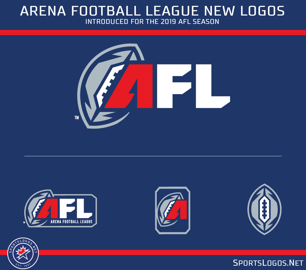
The new logo is in use immediately and will be featured on jersey patches in the new season.
Arena Football League team logo history
Related stories:
 New Football League Puts Viewers In Control
  Defunct Arena League Toledo Bullfrogs Unveil Unused Uniforms
  Baltimore Brigade Announced As New Arena Football Team
  Washington AFL expansion team unveils nickname as “Valor”
  San Angelo Bandits unveil wild new football uniforms
  First Look at LA Kiss Field Design
  LA Kiss Unleash Fiery New Uniforms

