
The Canadian Football League’s Montreal Alouettes officially unveiled their new logo and uniforms for the 2019 season at an event held tonight at Montreal’s Société des Arts Technologiques, this was an event I was invited to but ultimately had to miss due to it being my beautiful baby girl’s birthday… I’m sorry, I just can’t miss something like that.
Tonight’s unveiling comes following a three-month long campaign of teasers and hype during which the logo leaked via a trademark registration by the club, the team confirmed the leak shortly after promising us that the logo was just part of what was to come for the Als in 2019.
So here’s that other part…
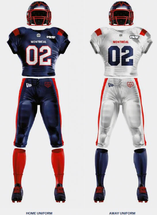
The uniforms are clean and simple, nothing wrong with that. Both uniforms feature a single red stripe on each shoulder, the city name on the chest, a red stripe down each leg, and solid socks. The home uniform gives us a two-colour number on the chest, the road reduces that to just blue.
It’s our first look at a New Era uniform in the CFL, the Buffalo, New York company – traditionally known for their ballcaps – signed on as the exclusive uniform provider for the league beginning with the 2019 season. A New Era logo can be seen on the front pant leg.
New Identity: @MTLAlouettes unveil new logo and new look!
Take a closer look 👀 | https://t.co/fe8zAQ389R #ToujoursGame #MontréALS pic.twitter.com/j4ubryPR0u
— CFL (@CFL) February 1, 2019
“This new identity can be summarized in one word: ‘MontreALS'”, Alouettes President and CEO Patrick Boivin said in the press release. “We came to the conclusion that our DNA must reflect Montreal’s DNA even more. We intend on better connecting with Montrealers in different areas that define our city such as music, gastronomy, fashion and culture, among other things.”
![]()
The logo matches what we first wrote about back in November, a bird in flight seen from above forming the shape of an “M”, a very informative feature uploaded by GRDN to their Behance page explains that it’s also a plane and a fleur-de-lis.

This “M-Bird” logo is placed on the top of the helmet, a very untraditional location for a primary team logo to live on a helmet… but it seems to work in this application.
Speaking of the helmet, it also contains a neat little tribute to the logo history of the Alouettes at the back…

Designed in collaboration with Montreal’s GRDN brand design agency, the entire process began during Als training camp prior to the 2017 season, nearly a two-year project.
![]()
This is the first major logo redesign by the Alouettes since their return to the CFL over 20 years ago, it’s the fifth distinct look across the two versions of the team.
Montreal Alouettes Logo History
Related stories:
 Montreal Alouettes Launch Red Alternate Uniform Ahead of Canada Day Debut
  CFL’s Montreal Alouettes to Unveil New Alternate Jersey This Summer
  CFL’s Montreal Alouettes Unveil New Helmet for 2022 Season
  CFL Unveils New Adidas Uniforms Across League
  Alouettes Honour WWII Flight Squad on New Uniform
  Reebok Redesign: CFL introduces new uniforms

