The Vancouver Canucks have unveiled their commemorative logo which will be used during their 50th anniversary celebrations next year. The Canucks joined the National Hockey League alongside the Buffalo Sabres, playing their first game in the fall of 1970.
The logo features a callback to the original Canucks team logo, which was a hockey stick placed inside a hockey rink to form the letter “C”; the same idea is used here with the stick placed into the “5” of “50”.
From the Canucks:
Styled in classic Canucks blue, the logo reveals an upright hockey stick and blade outlined in the negative space between the number 50; a modern-take of the elegant stick-in-rink logo first worn in the inaugural season of the franchise. Vancouver’s primary logo, the orca whale, sits below and links eras in Canucks history past and present.
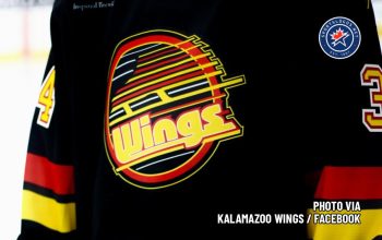
For their 50th anniversary season, the Canucks will wear their black, red, and orange throwback uniforms with the “flying skate” logo on the chest, originally worn from 1989-1997, for a series of games. They will also be unveiling a new alternate/third uniform for 2019-20.

The Canucks have gone through a myriad of different looks over their 50 years in the NHL — they started blue and green with the “stick-in-rink” logo in 1970, switching to black/yellow/red with a large “V” on the jersey in 1978 — the V replaced with a hockey skate in 1984, in 1997 the club switched their colours to blue, red, and silver and going with a logo depicting an orca whale in the shape of a “C”, this logo survives today but now in the original blue/green colour scheme re-introduced in 2007. The 12 years they’ve used the current look is the longest period in which the Canucks have gone without a major uniform change in their franchise history.


