The 2019 Major League Soccer season kicks off this weekend with a handful of games on Saturday afternoon. Seems as good a time as any to take a look at the new uniforms that’ll grace the MLS pitch over the next nine months.
The overall theme this year seems to be keeping it simple. Most teams stripped away elements from their previous jerseys going with very plain designs, sometimes this works well, sometimes it’s a little too plain. Here, we’re going through team-by-team to show you the new looks as well as what jersey is being replaced.
We start things off with the champs (and also, well, alphabetical order)…
ATLANTA UNITED FC

A slight change to Atlanta’s primary kit, the vertical stripes are now thinner and in greater abundance, they’ve also been added to the sleeves. A state map of Georgia has been added to the bottom left of the jersey with a “17” in reference to their inaugural season as well as being the number the club has designated for their supporters.
Anything else?

Ah yes, a brand new championship star above their badge, in honour of winning the 2018 MLS Cup in just their second season.
***
CHICAGO FIRE
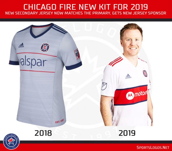
Chicago has updated their secondary kit to match their primary kit, adopting the full horizontal stripe across the front. The team also has a new jersey sponsor on both their primary and secondary, switching to Motorola from Valspar.
***
FC CINCINNATI

The only expansion side in 2019, FC Cincinnati will bring their blue and orange colour scheme up with them to Major League Soccer. The primary jersey features a glitchy vertical striping pattern in orange on blue, the secondary kit is about as plain as you can get — all white with just the badge and sponsor.
***
COLORADO RAPIDS

The Rapids dropped their secondary design inspired by the blue, red, and yellow State flag of Colorado in favour of one that better matches their actual team colour scheme of burgundy and silver. Now “cloud white”, the jersey is designed to pay tribute to the area’s local mountain culture, the snow-capped peaks and all that.
***
COLUMBUS CREW SC

Still alive! The Columbus Crew have simplified things a bit for 2019, the checkerboard pattern has been removed from either side of their yellow jerseys. The pattern isn’t gone for good, it now resides as a subtle background pattern all over the jersey.
***
D.C. UNITED

The trend of simplifying continues with the DC United who have removed their red sleeves and the silver-to-black wing gradient from their secondary jersey. In its place is an all-white jersey with silver accents around the collar.
***
FC DALLAS

FC Dallas introduced their new secondary kit dubbed the “Reunion” jersey, paying tribute to architecture in Dallas. It’s subtle, yes, but the all-white jersey includes diagonal striping (visible when close up) based on the design of the Margaret Hunt Hill Bridge, a circular patch similar to the top of the Reunion Tower is on the sleeve honouring Lamar Hunt.

***
HOUSTON DYNAMO

The rainbow “guts” live on, but in a slightly reduced capacity. Reducing the colours from five to three, the Houston Dynamo rainbow pattern, very obviously in tribute to the old Houston Astros uniforms, are now higher up on the chest and in the shape of a chevron. Light blue has been added as a trim colour on the sleeves and remains at the collar and on the stars above the badge.
***
LA GALAXY

The Los Angeles Galaxy will acknowledge each one of their MLS Cup victories with five stars above the badge instead of just one star to represent all five. The new secondary jersey adds vertical stripes in the new “glitch” pattern while also removing all traces of gold from the colour scheme.
***
LAFC

The second-year Los Angeles Football Club is dubbing their new secondary design as their “Street By Street” jersey. It features a concrete block pattern to “represent the texture and strength of our streets”. Gold is gone, silver is in.
***
MINNESOTA UNITED FC

Simplification continues throughout MLS, Minnesota United removes their silver shoulders and the stripe at the waist for a largely plain white jersey with slight hints of powder blue. The team is calling it their “Drift” jersey.
***
MONTREAL IMPACT

Montreal Impact retains their trademark look while also getting in on some of that simplification action going around. The stripes, like Atlanta, have been slimmed down and increased, but now fade away about halfway down the jersey. A bell logo is added to the lower left in honour of the North Star Bell from Stade Saputo.
***
NEW ENGLAND REVOLUTION

New England eliminates red from their secondary “Colonial” jersey, now light blue is added as a sleeve colour as well as on either side of the main base. Adidas stripes remain, now in blue. The only red exists in the badge and MLS shield.
***
NEW YORK RED BULLS

The Red Bulls go from white to grey on their primary kit, the diagonal white and silver stripes have been replaced with LOVE FIGHT PASSION GLORY, which also appears in the lower left in red.

The back of the jersey features the team name in large red letters at the bottom under the player’s number.
***
NYC FC

This may be the update I like the most. NYC FC keeps their vibrant baby blue jersey but adds a thick vertical stripe in navy blue and orange (love that colour pairing). The stripe is broken up to make room for the jersey sponsor.
***
ORLANDO CITY SC

Orlando City keeps it purple but removes the gold from the Adidas stripes on the shoulder. The pattern used on the base of the jersey has gotten an update and the collar goes from button up to a more modern jersey collar.
***
PHILADELPHIA UNION
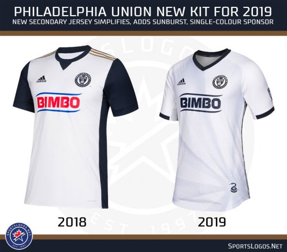
The Philadelphia Union have eliminated their blue sleeves and striping up the sides (Adidas striping remains) in favour of a more clean look. The snake logo has been added to the bottom right which also originates a sunburst pattern. For both their primary and secondary jerseys, the Union have removed the colour from the sponsor logo to help it match the rest of the design — good stuff.
***
PORTLAND TIMBERS

The Portland Timbers with a nice update to their primary jersey, keeping green as the base the team has added dark green hoops while also removing the gold Adidas stripes on the shoulders. The badge also gets an update, the axe returns to its usual white colour instead of the gold used last season.
***
REAL SALT LAKE

Real Salt Lake goes in the opposite direction of those other teams going for a simple design adding a digital glitch pattern to their otherwise plain design from 2018. Blue takes a back seat in 2019 as red becomes the dominant colour on the Real Salt Lake secondary kit, note the badge now in just red and white.
***
SAN JOSE EARTHQUAKES
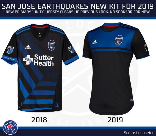
No jersey sponsor quite yet for the San Jose Earthquakes who introduced a cleaner primary jersey, dropping the blown-up badge pattern from the base for a simple black with a blue horizontal stripe across the top.
***
SEATTLE SOUNDERS FC

Talk about going in an entirely different direction, the Seattle Sounders have adopted a new colour scheme for their secondary “Nightfall” jersey. Now black with pink accents, the jersey was inspired by a photograph at a Cascadia Cup game in Seattle from 2014 showing the sunset behind the stadium.
***
SPORTING KANSAS CITY

Sporting KC one of many to add the “digital glitch” style of pattern to their jersey, the new primary kit keeps the powder blue but drops the vertical stripes in favour of this diagonal pattern; white has also been eliminated outside the badge.
***
TORONTO FC

The poster-child for simplification in 2019, Toronto FC eliminates everything outside the logos from their primary kit going with a plain red jersey, a little grey survives on the cuffs and the inside collar.
***
VANCOUVER WHITECAPS FC

The Vancouver Whitecaps are reaching into their past for their new primary design, the horizontal striping and collar both loosely based off of what the NASL’s Whitecaps wore forty years ago in 1979.

That’s it for 2019, in 2020 we’ll have a couple of new expansion teams to look forward to in Miami and Nashville as well as the usual slew of changes across the league. Until then, you can do your MLS jersey shopping here!
Did I make a error? It happens! Let me know in the comments or send me a Tweet with a heads up and I’ll fix it ASAP. Thanks


