With Spring Training in full “swing” (pun, I guess), let’s take a look today at the different logos being used by the league and its teams for the Spring Training portion of the 2019 season.
As with past Spring Trainings, the logos follow a common theme which is templated across each of the 30 MLB teams and to a much lesser extent, the main league logos.
This year’s team theme looks to play off of the tag attached to one’s luggage as they board a flight to visit either Arizona or Florida for some good-time Spring baseball. We see the barcode, the three-letter “Airport code” destination, and it’s placed on a plain white rectangle to mimic the look of a tag.
First, we’ll start with the various league-wide logos, the overall MLB mark, the horizontal wordmark, and the two leagues – Grapefruit/Florida, and Cactus/Arizona:

And now the teams, first with a closeup showing our two reigning pennant winners:

See that barcode on there? I tried for a good hour to translate it, using various websites and phone apps I ultimately accepted defeat and moved on. You would think it means “SPRING TRAINING” perhaps? It could just be nothing at all. Feel free to let me know in the comments if you can figure it out.
Here are the rest of the individual team logos:


That Miami Marlins Spring logo above may look familiar as it was by that logo that their brand new team logo was leaked to the world back in October of 2018. Remember? Here that is again in case you don’t.
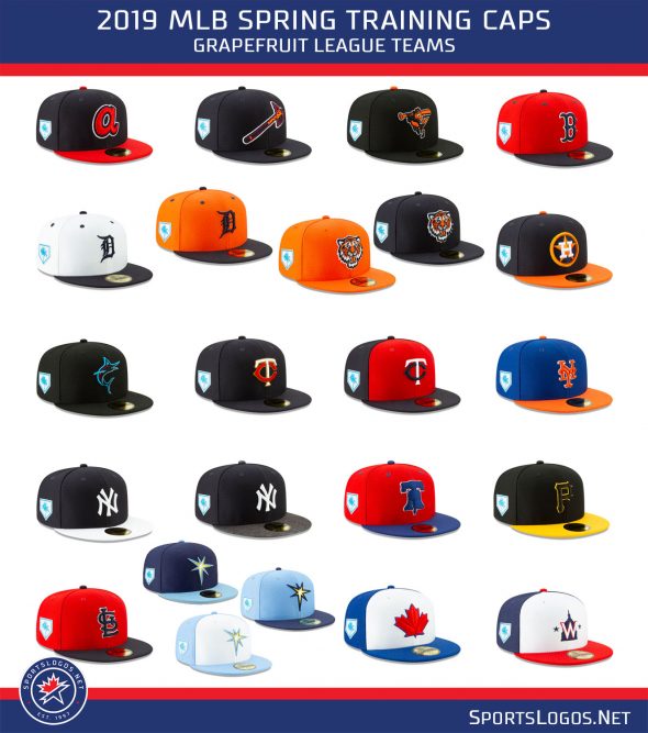
Earlier this off-season we examined all the team caps that will be worn this Spring, here those are again:


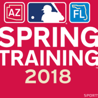
And finally, a look back at all of the Spring Training logos from way back in 2018.


