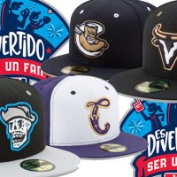
Minor League Baseball’s Copa de la Diversion program has grown from just four teams in 2017 to 33 last year to 72 this season. It’s so many that we had to break our post into two parts. Below are the second set of 36 unveiled over the course of the day today. For part one, see here.

Mariachis de Nuevo México (Albuquerque Isotopes)
Last year, this entry took home awards from both Minor League Baseball and this website. The name celebrates a traditional Mexican musical style and the logo features Catrin, the male version of Catrina, who was born as a protest symbol of social inequality in Mexico and who has come to represent the Day of the Dead.

Corpus Christi Raspas (Corpus Christi Hooks)
Another holdover from last year, the Hooks rebrand in the image of a popular frozen treat in Texas.

Margaritas de El Paso (El Paso Chihuahuas)
Last year the Chihuahuas simply changed their team colors but kept the same name. This year, they’ll take on the moniker of a drink that traces its origins back to their hometown in 1942.

Piñatas de Erie (Erie Seawolves)
This nickname, full of surprises, of course, is an homage to the childhood memories of team owner Fernando Aguirre.

Monarcas de Eugene (Eugene Emeralds)
The nickname is Spanish for Monarchs, like the butterfly. Per the team, “The focus of the new brand revolves around the multi-national ethnicities that make up our Latino community. The Monarch butterfly performs one of the most spectacular journeys and has become a subtle and beautiful symbol for the migrant community.”

Everett Conquistadores (Everett Aquasox)
The Aquasox turn their groovy frog into an explorer of the Pacific northwest.

Lowriders de Fresno (Fresno Grizzlies)
Already proud owners of the alternate Tacos identity, the Grizzlies celebrate another aspect of their rich cultural heritage. The Lowriders pay tribute to the colorful cars found in the area, sometimes at one of the frequent auto shows.

Cucuys de San Bernardino (Inland Empire 66ers)
The 66ers take on the image of the mythical boogieman prominent in Hispanic culture used to scare kids into staying on the straight and narrow.

Cadejos de Lake Elsinore (Lake Elsinore Storm)
There are two versions of this logo to represent the two different identities of the mythical wolf beast—who can be both good and evil.

Viento de Lancaster (Lancaster Jethawks)
Spanish for the wind, the nickname represents the driving force of the team.

Reyes de Plata de Las Vegas (Las Vegas Aviators)
The Las Vegas 51s have taken on a new permanent name, but their popular Copa brand is back again. The name translates to “Silver Kings,” a reference to mining in the area.

Leyendas de Lexington (Lexington Legends)
The Legends translated their nickname directly, and converted their logo to aqua and magenta.

Murciélagos de Louisville (Louisville Bats)
This is one of my favorites. The Bats adopt a bat of another kind—an ancient Mesoamerican hieroglyph of the Cuban greater funnel-eared bat.

Matamoscas de Midessa (Midland Rockhounds)
Spanish for fly swatter, Matamoscas, per the team, “hold a multi-faceted role in many Hispanic/Latino households: Bug control, discipline tool and toy for the creative minds.”

Alebrijes de Modesto (Modesto Nuts)
The Alebrije is a a spirit guide, and as a team logo, it’s meant to represent the way minor league baseball guides its players to the next level.

Pelícanos de Myrtle Beach (Myrtle Beach Pelicans)
The Pelicans translated their name into Spanish and updated the logo with a new design and colors.

Vihuelas de Nashville (Nashville Sounds)
The Sounds stayed on brand with a musical theme, taking on the name of a high-pitched Mexican guitar.

Cielo Azul de Oklahoma City (Oklahoma City Dodgers)
The name “Blue Sky” incorporates Dodger blue and the blue skies of OKC, and is a reference to Fernando Valenzuela, who looked to the sky while pitching.

Cazadores de Tormentas de Omaha (Omaha Storm Chasers)
A direct translation of their permanent name.

Rancho Cucamonga Temblores (Rancho Cucamonga Quakes)
The Quakes translated both their nickname and logo directly into Spanish.

Peleadores de Reading (Reading Fightin Phils)
Derived from their permanent nickname, Peleadores means “the fighters.”

Corazones de Reno (Reno Aces)
With a permanent nickname that references one suit in a deck of cards, the Aces picked another card for their Copa brand. Corazones, or Hearts, is also meant to represent love for the Latin community.

Round Rock Chupacabras (Round Rock Express)
This nickname references the dreaded, legendary creature of Latin American origin who drinks the blood of goats (keep him away from Hartford).

Sacramento Dorados (Sacramento River Cats)
California is the Golden State, and dorado means gold. A luchador mask in the logo represents a team ready for battle.

San Bernardos de Salem (Salem Red Sox)
Salem takes on a sugar skull version of their Saint Bernard mascot Mugsy.

San Antonio Flying Chanclas (San Antonio Missions)
A popular brand from last year, this is from the team’s website: “The club honors the matriarch of the Latino family, the Abuelita, and her symbol of strength, discipline and love with its on-field persona for this special series of events. The chancla has long been symbolic of the Abuelita as she maintains the structure and order of la familia.”

San Jose Churros (San Jose Giants)
This was around last year, though not officially as part of the Copa de la Diversion. The Giants played as the Churros for their food-based promotion and will use the brand this year in the Copa.

Vejigantes de Scranton Wilkes/Barre (Scranton Wilkes/Barre RailRiders)
The RailRiders’ permanent brand is a porcupine on a train, so they don’t shy away from multi-facted concepts. This Copa brand is based on a jester or joker character found in the celebrations or festivals of many cultures.

Caballos de Stockton (Stockton Ports)
The “Iron Horse” is a reference to trains that brought the first immigrants to San Joaquin County in California.

Familia de Tacoma (Tacoma Rainiers)
The Rainiers promote the slogan “We R Family” (with a Rainiers R, of course), so their La Familia Copa brand nestles right in.

Viñeros de Tri-City (Tri-City Dust Devils)
Easily the most adorable of the Copa brands, the Viñeros celebrate Washington’s wine country.

Petroleros de Tulsa (Tulsa Drillers)
A rough translation—the name in Spanish and English both reference people who drill for oil.

Visalia Toros (Visalia Rawhide)
The name means Bulls, which relates to the team’s normal nickname, Rawhide.

Calaveras de West Michigan (West Michigan White Caps)
The name, which means skulls, pays tribute to the Day of the Dead. The logo contains references to the team’s permanent identity, with a wavy jawline and a 616, the area code for Grand Rapids.

Winston-Salem Rayados (Winston-Salem Dash)
Per the team, “The name recalls the pinstripes worn from previous Winston-Salem teams, and the term ‘Rayo’ also loosely translates to ‘Bolt,’ the Dash’s mascot.”

Cascabeles de Wisconsin (Wisconsin Timber Rattlers)
The name translates to jingle bells, a reference to the sounds rattle snakes make.
And now that we’re done, here’s all 72 Minor League Baseball alternate identities revealed for the 2019 edition of Copa de la Diversion:


