Hey! Baseball’s back!
It’s Opening Day back across the pond as Major League Baseball begins its 2019 regular season campaign with a full slate of games starting this afternoon. How wonderful, and the timing is perfect then for our annual Major League Baseball logo and uniform preview post! Where we detail all the changes across the league to each team’s logos and/or uniform sets.
Starting league-wide, Major League Baseball is celebrating the 150th anniversary of the first professional baseball team, the 1869 Cincinnati Red Stockings, with a special MLB150 patch.


This relatively small patch will be worn near the cuff of the right sleeve of twenty-nine Major League team jerseys – the Reds are the only team not to wear the patch, they will instead wear a custom patch referring specifically to that Red Stockings team. Teams will also wear the MLB150 patch on the side of their caps for their 2019 regular season opening game only.
The league has previously celebrated the 100th and 125th anniversaries of this in 1969 and 1994 respectively, the first of which resulted in MLB’s “Batterman” logo still used now fifty years later. So, hey, a very happy anniversary to that famous mark too!
Without alphabetical order, there would be alphabetical disorder, which is why we’re starting with the Atlanta Braves. If your team isn’t listed in the article below, it’s because they aren’t changing anything, a cause for either celebration or disappointment, depending on your team of choice.
ATLANTA BRAVES
The Braves made changes of varying degrees to four of their five regular uniforms. The biggest and best of these were done to the red and blue alternate jerseys.
The red “USA!” jersey dropped the patriotism, removing the stars from the logo and the flag from the sleeve and returned the “Braves” usual uniform wordmark to the front matching it better to the rest of their set, the piping down the front and around each sleeve dropped the white and is now a single blue line. The navy blue-on-navy blue alternate gave it’s head a shake and corrected the colours of its logo, now red on blue as it should be, also adding silver piping down the front and at the sleeves. The cream home alternate jersey simply added new piping to the sleeves.

A slight tweak was made to the “Atlanta” script on both the road and navy blue alternate jerseys. You can see from the side-by-side below it’s now much more upright, of course good posture is important, even in logos.

It’s the first change to either the Braves home or road jerseys in over thirty years! Since the team went back to the throwback-style set before the 1987 season.
BALTIMORE ORIOLES
Baltimore made a change that matters only to those who use this site, swapping around the official designations of their primary and alternate logos. In reality, the Orioles had been using the Cartoon Oriole logo as if it were their primary for nearly a decade, now it’s just official. You’ll likely notice no change because of this outside how the logos are categorized on SportsLogos.Net.

What you will notice, however, is the Orioles paying tribute to former player and manager, Hall of Famer Frank Robinson, who died during the off-season. The Orioles will honour Robinson with a patch featuring Frank’s uniform number 20 in orange on a black circle on their right sleeve throughout the entire 2019 season.

The Orioles are one of three teams who will pay their respects to Frank Robinson on their jerseys during the upcoming season. Coincidentally, those other two clubs just happen to follow the Orioles directly in this post.
CINCINNATI REDS
With the 150th anniversary of professional baseball being celebrated this year, the home city of that historic first ballclub is going all out for the occasion. First, they’ll be the only team who will *not* wear the special MLB150 patch in 2019, opting instead for their own patch marking the 150th anniversary of the 1869 Cincinnati Red Stockings

As you can see from the graphic above, there are two versions of this patch, one for use on their road grey jersey and a much more elaborate design to be worn on the others — the logo shows the main entrance of The Palace of the Fans, a former ballpark in Cincinnati which opened in 1902 and perhaps the best baseball stadium name in Major League history.
Cincinnati will also note the anniversary with fifteen, yes, fifteen different throwback uniforms throughout the year, each one honouring a different design used by the Reds throughout the entirety of the 20th Century. All the uniforms, their original season worn, and the date you’ll see them this season shown below:

The Reds are making sure to also pay respects to Frank Robinson who spent the bulk of his playing career with Cincinnati and went into the Hall of Fame wearing a Reds cap.

The Reds will wear a black circular patch over their hearts with Robinson’s number 20, a mockup of how that could look in the graphic above.
CLEVELAND INDIANS
Well, 2019 begins a new era of Cleveland Indians baseball, no more Chief Wahoo. We all knew the departure of the logo was inevitable yet despite the this, the team seemingly did nothing to prepare itself to replace it with anything worthwhile. Was this intentional? Did the team know Wahoo was so popular whatever replaced it would be immediately hated? It’s fun to speculate. For now, Wahoo has been replaced with a simple block “C” on the team’s home cap and with the 2019 MLB All-Star Game logo on the jersey sleeve.

More than just the elimination of Wahoo, the Indians also made some changes to their alternate uniforms. The “Indians” blue jersey, which was worn as if it were their primary home and road jersey for the last several seasons in no more, replaced with a red version for use at home and a blue top with “CLEVELAND” arched across the front for the road.

As mentioned earlier, the Indians are hosting the Major League Baseball All-Star Game this summer. The logo for this game will be worn on the left sleeve of all their jerseys, and an abbreviated version of it on the side of their caps.

The Indians will also wear a special patch for former player, manager, and player-manager Frank Robinson, a similar design to the Reds and Orioles.

As of now, the Indians are scheduled to wear the patch just once during their home opener on April 1, 2019.
COLORADO ROCKIES
The Rockies didn’t add a new cap, didn’t change their jerseys, nor did they tweak their logo… what’s left? The pants!

It’s not too common you see a team *only* update their pants, but the Rockies did just that. What’s new is what you see paired with the purple and black jerseys above, just a plain pair of white pants for their solid sets — previously the Rockies wore their home pinstriped pants with these.
KANSAS CITY ROYALS
Another logo designation change much like the Orioles, the Kansas City Royals swap around their primary and alternate logos.

In addition to that swap, however, is the elimination of the black drop shadow from the “KC” insignia of the logo, the official end of the use of black by the Kansas City Royals after it was first introduced in 2002.
LOS ANGELES DODGERS
No logo swaps for the Dodgers or uniform changes, but they are remembering Don Newcombe, the former Dodgers pitcher who died in February 2019 at the age of 92.

The Don Newcombe memorial patch features his nickname “NEWK” above his jersey number 36 in blue on a black circle.
MIAMI MARLINS
If not for alphabetical order, these guys would’ve been leading off this post, but I can’t control who I am, so down here in the middle-of-the-pack is the first team to do a complete logo and uniform overhaul in the Major Leagues since the 2013 Houston Astros.

Goodbye orange and yellow, and welcome back bluey-teal. The Marlins new logo kept the idea of a stylized marlin leaping out of the water and modernized it. Like 2018, the uniforms options are white, grey, and black and still go with MIAMI on the home whites.

The Marlins also showed off a blue jersey along with the three you see above, which I think will quickly become the favourite of the set:

A quick comparison showing how the Marlins colours have evolved over the years, and haven’t changed quite as drastically as one might have assumed:

The new blue is much closer to the previous one than the original teal, still, a welcome change.
MILWAUKEE BREWERS
There seems to be a competition as to who can get away with the most minor of changes to their uniforms, the Brewers taking their best shot here:

In case you couldn’t spot the difference, the spot in the webbing of the glove (or between the ‘m’ and the ‘b’) of the logo is now white, it used to be transparent. This change is applied across the board on the Brewers set, their lighter blue version of this cap and the one worn on yellow for Spring Training as well.
PHILADELPHIA PHILLIES
A real logo change here for the Philadelphia Phillies, the diamond behind their logo is gone, the Liberty Bell has been re-drawn, and they’ve darkened their shade of blue:

You likely wouldn’t have noticed the darker blue without a side-by-side, you can see how subtle a change it is here (the red stays the same):

This darker shade of blue carries over to the uniforms, the most noticeable place you see it is on the blue cap worn with the home cream alternate uniform.
A few other minor changes to the uniform, the outlines around the “Phillies” wordmark have lost some weight — compare the road greys and alternate reds to get the best look at it.

And no, I’m not going to just ignore the new alternate uniform that slid itself in there! The Phillies have been wearing the powder blue throwbacks so often the last few seasons that the club has just gone ahead and made it an official alternate uniform in 2019. Good job!
PITTSBURGH PIRATES
In what’s becoming an annual tradition for the Pirates, they’ve updated the cap that goes with their camouflage alternate set to use the Memorial Design put out by Major League Baseball the year prior.

So… I guess this will be another one-year-wonder. We’ll see what happens when Nike takes over everything in 2020.
ST. LOUIS CARDINALS
The powder blue revolution is in full swing here in 2019, folks! The St. Louis Cardinals join the Philadelphia Phillies in bringing back the popular road uniform colour throughout baseball from the 1970s and 1980s. Take a look at these beautys:

The Cardinals will wear the baby blues every Saturday road game, the design of the uniform matches the cream set the club wears on Saturdays at home.
SAN DIEGO PADRES
The Padres are looking back to their past one last time before they jump all in next season. San Diego celebrates the 50th anniversary of their inaugural 1969 season this year with a commemorative patch featuring the “Swingin’ Friar”

Three different colourways for this patch to match the various colour schemes the Padres use these days. A blue-and-gold version for use with their home, road, blue alternate, and blue camouflage jerseys; a brown-and-yellow version for their retro-inspired brown alternate uniforms, and a brown-and-gold for their brown digital camouflage alternate.

The Friar got a bit of an update as well, he got a haircut, a pedicure, and his eyes are now connected to the top of his head. The unnecessary “Padres” wordmark has also been removed from the bat.
TAMPA BAY RAYS
Hey, another logo swap around. The Tampa Bay Rays have promoted their uniform wordmark up to primary logo status — basically their previous primary logo sans ball diamond (rough year for ball diamonds in logos, see: Phillies). The diamond logo lives on as an alternate.

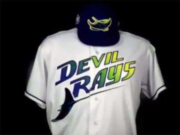
More importantly, the devil ray patch has finally been added to the team’s navy and powder blue alternate jersey sleeves. It has always been present on their white and greys.
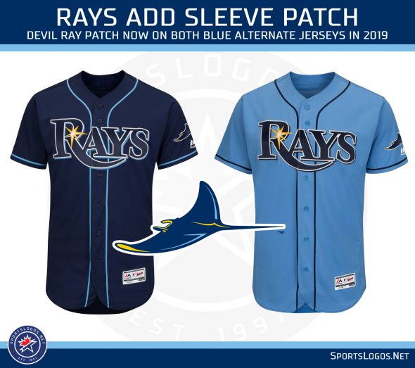
The Rays will also bring back their 1998-style “Devil Rays” throwback uniforms which they wore for a few last season.
TEXAS RANGERS
The Texas Rangers are getting set to say farewell to their stadium after just twenty-five seasons. “The Ballpark in Arlington”, as it was originally called, will be replaced with a new park right across the parking lot for the 2020 season.

Texas will wear the patch above on just their home white and alternate red jersey sleeves in recognition of all their years at the old yard.
MAJOR LEAGUE BASEBALL
Elsewhere around the league, as mentioned earlier the 2019 All-Star Game will be held in Cleveland on July 9th and hosted by the Indians. The logo features a guitar shape in reference to Cleveland being home to the Rock & Roll Hall of Fame, as mentioned earlier the Indians will wear this logo on their uniform sleeve and side of their ballcap throughout the year.


Batting practice/Home Run Derby uniforms appear in the MLB19: The Show video game, it shows “American” and “National” wordmarks arched upwards similar in shape to the primary logo for the event.

The Mariners and Athletics kicked off the regular season with two in Tokyo, Japan a week ago. Both clubs wore sponsor patches for the games, not unusual in the league for overseas contests. These patches will not be worn by either club the remainder of the season.
In other international contests, the Cardinals and Reds will play two at Monterrey, Mexico on April 13-14; the Astros and Angels will also visit Monterrey a month later from May 4-5. The Red Sox and Yankees will play two in the United Kingdom, specifically London, from June 29 to 30th (with both teams wearing their home white uniforms for both games!)

Two more neutral site games in 2019, the Royals and Tigers head to Omaha on June 13th to help kick off the College World Series, and the Pirates and Cubs go to Williamsport, Pennsylvania on August 18th for the Little League World Series where they will most certainly wear this year’s Players Weekend uniforms.
The 2019 holiday uniforms have yet to be unveiled by the league but MLB19: The Show features a collection of “Stars and Stripes” cap designs that show some interesting patriotic/retro logos for each club:

I cannot confirm that this will be what is worn for July 4th, but that’d be alright, wouldn’t it? Expect the league to officially release the entire 2019 holiday collection sometime in mid-April. Also still yet to be revealed is the 2019 Postseason and 2019 World Series logos, it really shouldn’t be too long until we get to see those.
Alright! We’re all set! Let’s play some ball.


