The Women’s National Basketball Association unveiled a new set of league logos on Monday one year in advance of its official on-court debut.
Keeping orange as the primary colour (now known as “Fire”), the new look takes the silhouette out of the box used by both the NBA and NBA G-League and places it on its own next to an updated wordmark. The silhouette has also received an update including the elimination of a pony tail in favour of a bun.

It’s the third logo change the WNBA has gone through since its establishment for the 1997 season. The original logo featured a red-white-and-blue colour scheme and stayed close to the look of the NBA. The league got its own colour scheme when it re-designed in 2013 focusing on a predominantly orange and “oatmeal” palette.
All of the new logos for the WNBA have been added to the site, you can check those out as well as the entire history of the league’s logos here
Related stories:
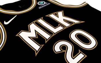
 WNBA Reveals Five New Team Uniforms for 2023 Nike Rebel Series
  A Detailed Look at The New 2021 WNBA Uniforms from Nike
  WNBA Unveils Uniforms for 2018 All-Star Game
  WNBA Teams to Honour Title IX with Special Uniforms