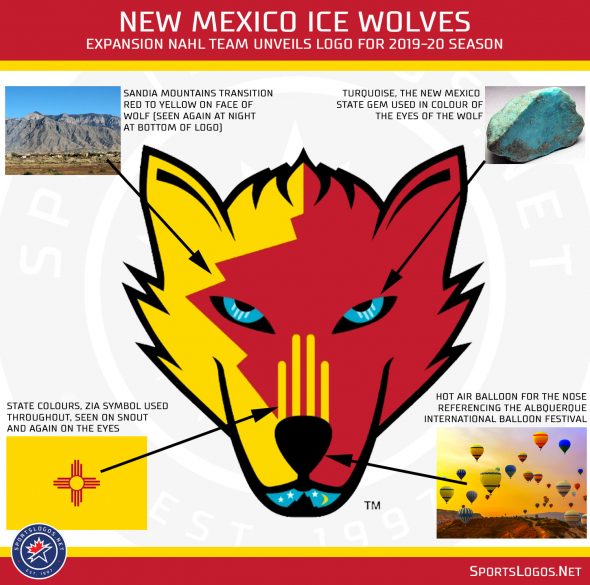
The New Mexico Ice Wolves, one of two new expansion teams joining the junior North American Hockey League, unveiled their team logo yesterday. Since the expansion announcement was made in February, the team had been using a temporary logo based on that used by the local New Mexico Ice Hockey Foundation who also uses the Ice Wolves name.
Featuring a bevy of local New Mexico iconography, the logo is red and yellow from the state flag, the Zia symbol from the flag is also incorporated into the snout of the wolf. Eyes are turquoise in reference to the state stone, the Sandia Mountains reflected in the transition from red to yellow on the face of the wolf.
“The logo means to capture both the old and the new of our amazing state as it is poised with the firm resolve of the emerging culture and commitment of our ice hockey team”, said Ice Wolves owner Stan E. Hubbard.

On the nose of the wolf is a hot air balloon in reference to the Albuquerque International Balloon Fiesta while the bottom of the wolf’s face includes the scene of a typical New Mexico night sky (which isn’t really too exclusive to the state, but a nice scene nonetheless).
The logo was designed by Jim Bergquist of JLB Design Studio.
“Without being literal, we wanted to create an Ice Wolf that is all our own that tells our story with the Land of Enchantment living within the team logo in a way that all of New Mexico will understand, appreciate and embrace,” Hubbard added in the press release.
The New Mexico Ice Wolves will play out of the Outpost Ice Arenas in Albuquerque, New Mexico. The 2019-20 NAHL season will get underway in September with the Ice Wolves joining the Maine Nordiques as expansion franchises bringing the league up to 26 teams.


