To celebrate its designation as a preeminent university, the University of South Florida last fall introduced a brand new academic logo, which featured a full-bodied, lime-green bull.
The “Charging Bull” was met with immediate and heavy criticism by students and alumni, who cited similarities to the logo used by investment management company Merrill Lynch.

The university attempted to modify the logo, which is based on elements from the bronze bull statues at its three campuses — Tampa (stance), St. Petersburg (upward-angled head) and Sarasota-Manatee (curved tail). But the changes were hardly noticeable when it was re-released in March.
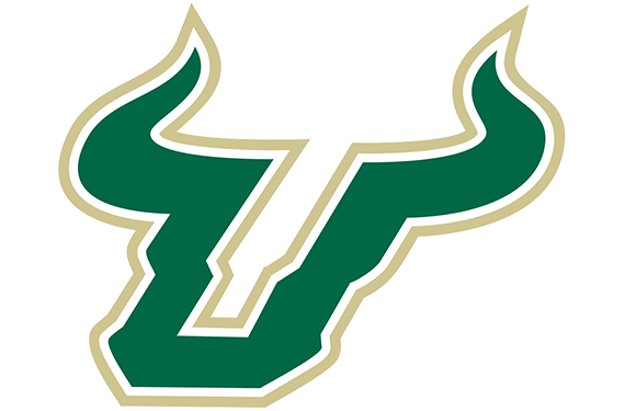
After much deliberation, USF announced on Monday it would abandon the new logo instead adopt the “Bull U” logo used by the athletic department for nearly 15 years for its official marks. The university will also return to its traditional green and gold color scheme, ditching the lime green — or “Horizon,” as USF calls it.
“We believed [the logo] was a positive representation of our pride and optimism,” vice president of communications and marketing Joe Hice said in a statement. “We know that the feedback comes from a place of great pride and passion for USF, and we have listened.”
Implementation of the changes will begin immediately and continue throughout the summer, though USF paid more than $1 million for the new logo — including a $200,000 marketing campaign that produced t-shirts, flags, signs and banners. That merchandise will be sold in campus stores, so the university will recoup some of the cost.
Related stories:
 NCAA Unveils Logo For 2023 Men’s Final Four
  Northwest Conference Reveals Updated Brand Identity
  USF Bulls Unveil Slime Green Alternate Uniforms
  UAlbany Great Danes Unveil Refreshed Athletic Identity
  UC Riverside Highlanders Unveil New Academic, Athletic Identity
  Montclair State Red Hawks Unveil Refreshed Logo Set, New Wordmark
  USF Unveils New Uniforms, Adidas Template

