The 2019 NHL Draft gets underway tonight and will continue into tomorrow at Rogers Arena, home of the Vancouver Canucks.
This year’s NHL Draft caps, like last year, are branded by Fanatics, have a very straight-to-the-point design — perhaps welcomed by many of us looking for an alternative to what is usually a collage of random elements all thrown together.
Primary team logo on the front, solid single colour crown, solid single colour visor… and that’s all there is on the outside.

You wanted simple, you got it.
The only “we gotta do *something*!” element to this cap is on the underbill, a street map of the team’s hometown with the city name scrawled across it.

There is no consistency with what city gets listed – obviously for the most part it’s the team’s home market: St Louis, MO or Boston, MA or for some teams named after states they go with the obvious Denver, CO or St. Paul, MN… but then you get the Devils listing just “NEW JERSEY” while the Panthers use “SUNRISE, FL”, or the Coyotes say “GLENDALE, AZ”. The Islanders go with “NEW YORK, NY” rather than Brooklyn, Uniondale, or (what may have worked better) just New York to represent the state.
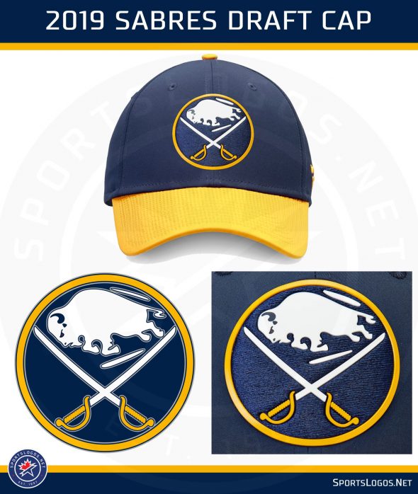
What did I find interesting? Check out the logo on the Buffalo Sabres cap:

No silver lines! Is this some foreshadowing? Golly, I hope so. Remove the silver please, Buffalo.
Here’s a look at the entire league, there’s a good dose of teams using black who normally don’t because we just can’t quite shake the last lingering clutches of the early 21st century

2019 NHL Draft Caps available here for U.S. customers, or here if you’re in Canada and would like some Canada-friendly shipping options


