The Houston Rockets unveiled three new uniforms during their NBA Draft party last night with promises of a fourth still to come.
Simplifying things is the overall theme of the new look to the team, the wordmark across the chest now presented without any frills or fanfare – a simple “ROCKETS” arched across in a sans serif. The chevrons that were on the side the jerseys have also been removed, replaced with a solid bar.

The stripe on the side of the jersey flows into the shorts to create the propulsion tails of a rocket launch.
Black has been added to the colour scheme replacing grey due, in part, to the popularity of the team’s all-black “Statement” (alternate) uniform. The black “Statement” uniform from last season is returning for 2019-20.

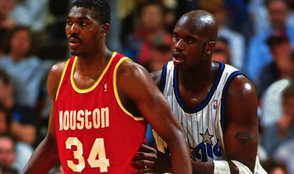
Pass the Ketchup and Mustard! In celebration of the 25th anniversary of their last championship, the Rockets are also bringing back the uniforms worn during that 1994-95 season as their “Classic Edition” set. With the exception of the Nike logo and jersey advertisement, the design is the same as what we saw in the days of Hakeem Olajuwon and Robert Horry just now on the new modern Nike jersey cut. The classic edition jersey will only be back for one season.

Let’s take a look at the differences between the old and new Icon (road) and Association (home) uniforms:

Sure, it’s a boring update, but it’s undeniably an upgrade – just the changes to the wordmark alone.
Houston will add a new “City Edition” uniform to their set in November (and I presume a “Earned Edition” in December). The club said it would *not* be a Chinese language version of their uniform as their past City Edition uniforms had been teasing only that the new look would be “out of this world”… so, you know, space-themed. The Rockets will have a special alternate court design for use during the Lunar New Year celebrations, still to be unveiled.
Earlier this month the Rockets unveiled a new “Global Logo” featuring a globe and orbits around their “R” primary icon.


