The logo for both the 2024 Summer Olympic Games and Paralympic Games in Paris, France was unveiled late last night by The Organizing Committee for the Olympic and Paralympic Games Paris 2024. For the first time, the logos for both events are identical with the exception of the Olympic rings being replaced with the Paralympic Agitos.
The logo is made up of three symbols acknowledging both the games and the host nation of France — the Olympic/Paralympic flame, a gold medal, and the face, a representation of Marianne, a French national symbol “which embodies the revolutionary spirit that infuses the Paris Olympic and Paralympic Games”.

The typeface used for PARIS 2024 is an original font created specifically for this logo and takes its inspiration from Art Deco, “which reached its height during the 1924 Olympic Games in Paris”.
“I congratulate Paris 2024 on the launch of their new emblem,” said IOC Coordination Chair for the 2024 Games, Pierre-Olivier Beckers-Vieujant in the official release. “It perfectly reflects their vision and desire to put people at the heart of the Olympic Games Paris 2024. The combination of the gold medal, the Olympic flame and Marianne brings together the values, history and French touch that will make these Olympic Games truly special. I believe that this innovative design will be quickly recognized around the world and be a wonderful calling card for the Olympic Games Paris 2024.”

On the use of the Marianne symbol as the main focus of the logo, the press release stated that “she embodies the revolutionary spirit that infuses the Paris Olympic and Paralympic Games” and “encapsulates the desire to bring the competitions out of the stadium and into the heart of the city” as well as being “a reminder that these Games will be Games for everyone, Games that will belong to the people.”
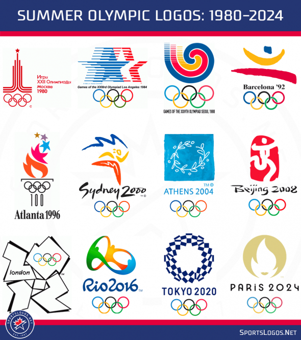
A look back at how the new 2024 Summer Olympic logo stacks up alongside the logos of the Olympic Games over the 44 years which precede it.

With the exception of the outlier in 2012, the logos of the Olympic games are starting to follow a formula… from top to bottom Shape/Text/Rings, which is a bit of a shame. Of the group above, which of these stands out (in a positive way)? I’ve always liked the simplicity of Barcelona’s from 1992 and I thought the Atlanta 1996 logo’s use of the Olympic rings plus the acknowledgment of the 100th anniversary to create the base for the torch was clever.
Share your favourites in the comments and look back at all the Summer Olympics logos pre-1980 here.


