The ball-in-glove Milwaukee Brewers logo is back.
Officially.
But this time it’s been reinvented and modernized enough to let it live as the team’s primary mark without being changed enough to lose the essence of the original 1978 design.
Getting there, though, that wasn’t simple. “It was very tricky, man,” says Rodney Richardson, president of RARE Design of Mississippi, the firm that helped the Brewers create an entirely updated visual identity, from logos to uniforms. “It was one of the scariest projects I have worked on because you respect the mark so much, you respect the brand and all it represents.”

As the Brewers unveiled four new uniforms to go with a new ball-in-glove primary mark and two secondary marks that will adorn sleeve patches for home and away uniforms, they will also celebrate 50 years. That isn’t why the ball-in-glove is making a comeback, though.
“From our perspective, from designing the project and getting into the story of the team you start to understand the heritage of this team and how they have done an amazing job of remembering that story and telling that story,” Richardson says. During the design process, the team didn’t place restrictions or guidelines on the designers, willing to walk through the discovery process without a predetermined outcome. Still, it quickly became apparent to both the club and the design group that anything new with the Brewers had to encapsulate the old.

“I think we all knew it would have a place,” Richardson says about the ball-in-glove logo during the planning stages, “just not exactly what that place would be. The decision to reelevate that mark to primary status was a very big discussion and one that everybody took seriously. We had to weigh out do you change it at all or just reelevate it.”
Changes came.
Richardson says it was a balance between respecting the heritage that fans, players, coaches, and team personnel all adored, but still creating a mark that allows the club to move forward. Richardson and his team tested boundaries of how far is too far and how far is not far enough? During the explorative phase, the team looked at the evolution of the game as inspiration, especially the equipment and fielding gloves. With every iteration it became clear, Richardson says, that going too far lost the beauty of the mark, but that it did need an update. “The original logo will always have a place,” he says, “but as we move forward, we need one that moves forward with us while respecting the character of the original logo.”
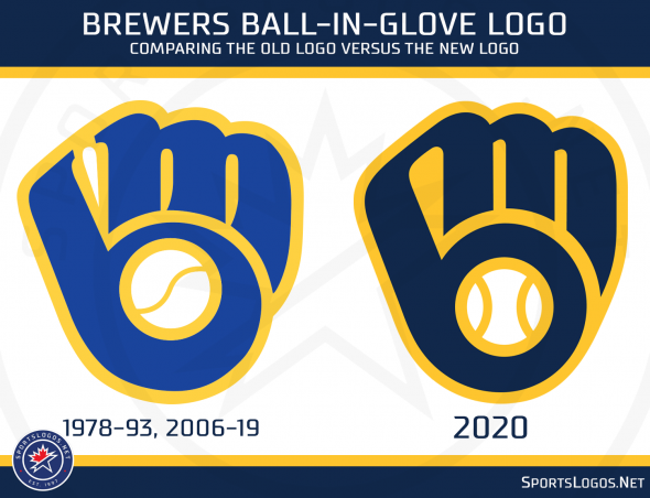
The new mark embraces the navy in use since 1994 as the main color, but still uses the yellow that has served as a tie to the brewing heritage of the city. The use of royal blue as an accent in the keeps that tie to the 1970s color scheme. The mark moved inside a round shape with a wordmark of Milwaukee Brewers above and below the mark as a nod even deeper into the club’s history of the 1970s logos and a tribute to the Barrelman logo.
When it came to the actual ball-in-glove, the most major of the changes is the tying together of the M and the lowercase “b.” Richardson says from a storytelling perspective, the physical tie shows that the bond between the Brewers and the city of Milwaukee is unbreakable. From a pragmatic production standpoint, there were inherent difficulties in the negative space in the webbing sometimes being blue, white or yellow. By connecting the negative space it eliminates that confusion.

The look of the glove itself evolved to a modern shape while losing a little of the serifs of the M on the fingers. “Cleaning that up is more in line with the industrial nature of the city,” Richardson says.
The ball also got an update to two vertical seams while getting centered.
“There is a way to update the logo and make subtle changes we think will enhance it, but stay true enough to the original,” says Rick Schlesinger, Brewers president of business operations. Whether centering the ball and giving it two seams, connecting the M and B or bringing in the navy while updating the glove image, he says that “those things made sense and we think it enhanced the great work and were subtle enough not to alienate fans who wanted the classic ball-in-glove but added enough new elements to embrace changes and be exciting.”
While the bulk of the time was spent getting the primary logo just right, the Brewers didn’t want to lose touch with other parts of the team history, allowing two equally prominent secondary marks.
“We looked at things within the history of the club, things that have been popular with fans of the team, things that even though the formal identities of the team had moved on they were still important marks to the fan base,” Richardson says. “Why let these continue to sit in the background? How can we reelevate them to the prominence they deserve?”

The “secondary club logo” offers the “M” logo sitting on a Wisconsin state outline clad in brick. Bringing brick into the mark for the first time plays on the popular “Cream City” moniker Milwaukee enjoys while embracing the “M” logo. “It is a new element and something very special and unique to the city,” Richardson says.
The navy and yellow wheat “secondary club art” logo allows the recent past to stay represented. They are the Brewers,” Richardson says, “that is the totem of this team. The wheat has been a popular element in the identity, and it didn’t make sense to throw it away.”
While they explored incorporating the wheat into the primary mark, it just didn’t work and from a production standpoint, the kernels of wheat fall away when they get too small, as they would have had to in a primary mark.

Schlesinger says that while the ball-in-glove update ties everything together and brings into focus what they are trying to do with the visual identity of the team, having different sleeve patches and uniform colors offer a “nice blend of simple and also versatile,” adding that there is something for everybody in the brand identity system.
The introduction of new marks and a four-uniform set will lead the team to more discipline for on-field wear. Fan apparel, though, allows more room to explore secondary and miscellaneous team art, such as the update to the Barrelman brand that offers two new official “miscellaneous art” options.

“I think we spent a lot of time on exactly how to honor the past, blend elements of our primary logos of the past and weave them into a system that made sense,” Schlesinger says. “We spent many hours working with (RARE) and the goal was to bring in elements of the Barrelman that predate the Milwaukee Brewers, the M that carried us from Seattle in the early ‘70s, the ball-in-glove of the late ‘70s and ‘80s and elements of wheat. We did consciously try to weave those elements together in a narrative that made sense and in a way that was deliberate and thoughtful.”
Studio Stories is a regular column from Tim Newcomb that explores the stories behind some of the designs dominating the sports landscape. Follow Tim Newcomb on Twitter at @tdnewcomb.


