Welp. They can’t all be winners.
This morning, the Chicago Fire of Major League Soccer unveiled their new logo, colour scheme, and name (they’re now Chicago Fire FC)… all of which were met largely with disappointment and disbelief from fans of the team as well as fans of logos in general.
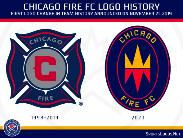
The new logo, being called the “Fire Crown” by the team, shows an orange crown with a mirror image below of red flames. This mark is placed within a navy blue oval trimmed in red, “CHICAGO FIRE FC” is written around it in orange. It’s the first logo change in the 20+ year history of the team.

“As a Chicagoan, it was important to me that our new brand identity reflect the power of our city’s origin,” Chicago Fire Joe Mansueto said in a statement to the Chicago Tribune. “I’ve always loved the Chicago Fire name. I think of the people who rolled up their sleeves and committed to rebuild what would become a world-class city, one that my family and I love so much. The new badge including the ‘Fire Crown’ represents that spirit.”
In reference to the event for which the team is named, the flames are for the Great Chicago Fire of 1871, destroying much of the city and causing an estimated 300 deaths. While the crown placed above it is for the “triumph over adversity”.
Graham Parker at ChicagoFireFC.com explains:
“After the firefighting, the reckoning with loss, and the shock and adrenaline of the first few days of the Great Fire, there was a moment, a day later, when some brave Chicagoans made the decision to stand. And that made all the difference.”
It replaces the Florian cross, resembling a fire department badge, that the team had used since their first season in 1998. The colour scheme — previously navy blue, red, and silver — is now blue, red, and orange.

No new uniforms were unveiled along with the logo change.
While much of the online chatter involved disappointment with the new look there was some positive out there… others even noticed similarities to the looks of other MLS clubs — one commenter pointed out the colour scheme was now the same as Real Salt Lake while an MLS team took to their Twitter account to note a resemblance in the logo:

They’ve got a point there… or six.


