
Hello friends and welcome to the 8th Annual Creamer Awards, celebrating the best in new sports logos over the past twelve months.
In 2019, for the first time ever, the results were determined entirely by you! The ten finalists for each category were based on those logos with the highest user ratings throughout SportsLogos.Net, the winners in each category then chosen by a vote held over five days. In total, we had over 16,000 votes cast – thanks to each and every one of you for helping to pick these winners!
Before we begin, a reminder that to be eligible for a 2019 Creamer Award a logo had to make its in-game debut during the 2019 calendar year, when the logo was unveiled is not relevant. Any new logos that may have come out recently to be used in seasons yet to be played (such as the San Diego Padres or Norwich Sea Unicorns) were not considered, they’ll have their shot next year.
2019 CREAMER AWARDS
BEST PRIMARY LOGO
A primary logo is designated as such on the official stylesheets by either the team or the league in which they are a member of. In most cases, the primary logo is the team’s most prominent and frequently used logo though it isn’t uncommon of late to see a team prefer to use an alternate or secondary logo more often, especially in the NBA.
Our nominees for the best new primary logo of 2019 are the Orlando Apollos (AAF), SIU Salukis (NCAA), Kansas City Roos (NCAA), Montreal Alouettes (CFL), Miami Marlins (MLB), Arizona Hotshots (AAF), Philadelphia Phillies (MLB), Idaho State Bengals (NCAA), San Diego Fleet (AAF), and the LIU Sharks (NCAA).
Previous winners
2018 Newfoundland Growlers, 2017 Memphis Redbirds,
2016 Toronto Maple Leafs, 2015 Milwaukee Admirals,
2014 Amur Khabarovsk, 2013 Creighton Bluejays, 2012 Toronto Blue Jays
With 16.3% of the overall vote, the winner of the 2019 Creamer Award for Best New Primary Logo is…
2019 CREAMER AWARDS
BEST PRIMARY LOGO WINNER
Montreal Alouettes, Canadian Football League
Designer: GRDN Studio, Montreal
It’s a bird, it’s a plane… it’s, it’s… an award-winning logo! The Als mashup of several elements certainly turned heads when it was first leaked back in November 2018 before it was ultimately unveiled two months later. The logo combines the aforementioned bird and plane with a fleur-de-lis to form a letter “M” for Montreal.
“I love it”, I wrote upon seeing the logo for the first time. “That M-Bird looks like it’s right out of that magical era of logo design – the late ’60s/early ’70s, it can slide right up there next to the 1960s Alouettes logo as well as the old Atlanta Hawks and Flames in terms of style and quality.”

Alouettes President and CEO Patrick Boivin said in the press release. “We came to the conclusion that our DNA must reflect Montreal’s DNA even more. We intend on better connecting with Montrealers in different areas that define our city such as music, gastronomy, fashion and culture, among other things.”
Congratulations to the Montreal Alouettes and GRDN Design on winning the 2019 Creamer Award for Best New Primary Logo!
A look at how all the nominees in the Best New Primary Logo category fared:
Coming in second, despite no longer existing, were the Orlando Apollos of the Alliance of American Football (designer Joe Bosack) with 13.5% of the vote followed by college team Kansas City Roos with 11.7%. It was a close race overall as third through ninth place all fell within three percentage points of each other, congratulations to all who cracked the top ten!
2019 CREAMER AWARDS
BEST SECONDARY LOGO
A secondary logo for the purposes of these awards are any additional logo created by a club which are not designated as a “primary logo” on their official stylesheet. They are usually officially labelled as an “alternate”, “secondary”, or “tertiary” logo, or are sometimes just lumped together as “additional club artwork”.
Our nominees for the best new secondary logo of 2019 are the Pittsburgh Panthers (NCAA), Miami Marlins (MLB), Kansas City Roos (NCAA), Nashville Sounds (MiLB), LMU Lions (NCAA), Amarillo Sod Poodles (MiLB), Traverse City Pit Spitters (NWL), Fresno Grizzlies (MiLB), Golden State Warriors (NBA), and the Erie Otters (OHL)
Previous winners
2018 Denver Nuggets, 2017 Memphis Redbirds,
2016 Great Lakes Loons, 2015 Utica Comets, 2014 Philadelphia 76ers
With 16.1% of the votes and finishing just TWO VOTES ahead of the runner-up, the winner of the 2019 Creamer Award for Best Secondary Logo is…
2019 CREAMER AWARDS
BEST SECONDARY LOGO WINNER
Fresno Grizzlies, Minor League Baseball
Designer: Brandiose, San Diego
With the team named after the extinct California grizzly bear featured on the state’s flag, it only made sense for the Fresno Grizzlies to incorporate the flag into their new logo set unveiled in January 2019.
The logo features a grizzly planting a modified California state flag, the flag itself updated to feature the Grizzlies logo in place of the bear that traditionally graces it. The California flag is based on the so-called “Bear Flag Revolt” in 1846, a precursor to the Mexican-American War, which ultimately led to California becoming the 31st state of the United States in 1850. The Grizzlies incorporated that terminology (though they used the alternate “Bear Flag Rebellion” instead of “Bear Flag Revolt”) into their promotion of these new logos.
Congratulations to the Grizzlies and Brandiose (who won the award in this same category in 2016) on winning the 2019 Creamer Award for Best Secondary Logo!
As we mentioned this category was incredibly close, the Grizzlies won by just two votes or 0.04%. If this were an election that would be more than enough to trigger a re-count! Here are the final results and rankings:
The almost-winner was the Traverse City Pit Spitters, another Brandiose design. There’s was a clever design featuring a baseball glove catching a falling cherry from a cherry tree placed together to form a map of Michigan. Personally, it may have been my favourite new logo of the year.
Following the Pit Spitters, the OHL’s Erie Otters placed third in another close race finishing under ten votes ahead of the Miami Marlins in fourth. Congratulations to all teams and designers for placing in the top ten, there are a tonne of logos eligible for this category each year and to be one of the ten best is a mighty impressive accomplishment! Well done!
2019 CREAMER AWARDS
BEST EVENT LOGO
An event logo for the purposes of these awards is the designated primary logo for any league-run event held during the 2019 calendar year — an All-Star Game, the Playoffs or Championship round, and the Draft are all examples of the types of logos which would qualify for this, our final category of the year.
Our nominees for Best Event Logo of 2019 are the NCAA Men’s Final Four at Minneapolis, the NHL Winter Classic at Notre Dame, the NHL Draft at Vancouver, the MLB All-Star Game at Cleveland, the KHL All-Star Game at Tatarstan, the AFC Asian Cup at UAE, the WNBA All-Star Game at Las Vegas, the Alliance of American Football Championship Game, the California League All-Star Game at San Bernadino, and Major League Baseball’s World Series.
Previous Winners
2018 MLB All-Star Game at Washington,
2017 NWL/PL All-Star Game at Hillsboro,
2016 NHL All-Star Game at Nashville,
2015 NHL Draft at Florida,
2014 NBA All-Star Game at New Orleans
The winner with 20% of the vote…
2019 CREAMER AWARDS
BEST EVENT LOGO WINNER
National Hockey League Winter Classic at Notre Dame
Designers: Fanbrandz, Montclair/NHL Creative Services, New York
The NHL’s annual outdoor New Year’s Day game came to South Bend, Indiana’s Notre Dame Stadium this year, home of college football’s legendary Fighting Irish. It made a logo for the game itself quite obvious, but in an age where event logos can tend to have as many references as possible thrown into one design, it was nice to see such a clean, simple logo for a host which called for one. The logo features a shamrock in green with the NHL’s usual Winter Classic script and icicles added to it, a banner below in gold and navy blue lists the location of the game.
Simple. Well done. Award-winning.
Congratulations to the National Hockey League Creative Services Department as well as Fanbrandz on winning the Creamer Award for Best Event Logo of 2019.
The rest of the field finished as follows:
The NCAA Men’s Final Four held earlier this year in Minneapolis came in second with baseball’s Mid-Summer Classic, a logo designed to resemble a guitar for the host city of Cleveland finished in third.
That’s it for 2019 and that’s it for the 2010s! Another decade in the books for us here at SportsLogos.Net, I look forward to roaring into the ’20s to enter my fourth different decade of running this site (Gordie Howe would scoff if he could). I thank all of you for your support and for reading over the past year and welcome you all back for more fun in 2020.
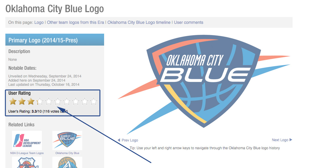
Didn’t like the finalists chosen? You should’ve rated the logos! On each logo page throughout SportsLogos.Net you’ll see a series of stars to the left, simply click on the star to rate that logo from 1 to 10, the scores at the end of the year are what I use to pull out the top ten logos to include in voting!
If you’ve got time to kill, then please, check out our past Creamer Awards posts: 2012, 2013, 2014, 2015, 2016, 2017, and 2018.