With Super Bowl LIV set for this Sunday (6:30 p.m. ET on FOX), we’ve conducted a two-part series analyzing the logo history of both the AFC champion Kansas City Chiefs and NFC champion San Francisco 49ers.
For a complete rundown of the 49ers’ logos, click here. And for a look back at the Chiefs’ history, continue reading below.

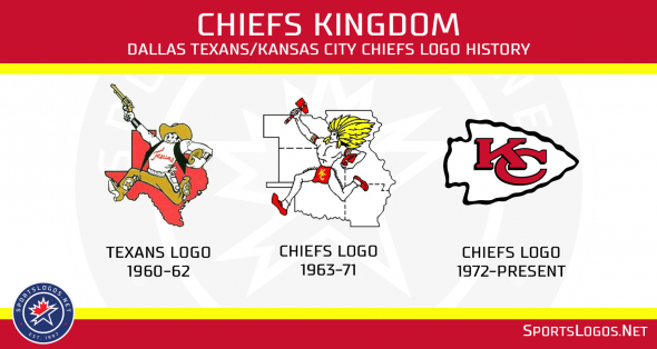
Founded in 1960 as the Dallas Texans, the franchise’s first logo featured a gun-slinging cowboy carrying a football in front of the state outline. It was created by Bob Taylor, a renowned cartoonist for the now-defunct Dallas Times Herald.
Team founder Lamar Hunt intended for the Texans’ color scheme to include Columbia blue and orange, but chose red and gold instead after the Houston Oilers owner Bud Adams selected a similar scheme for his franchise.
The team then relocated to Kansas City, Missouri, in 1963, and Hunt considered keeping the Texans’ name. But general manager Jack Steadman convinced him otherwise, and the two decided on the Chiefs over other options including the Mules, Royals and Stars in honor of then-mayor Harold Roe Bartle, who was popularly referred to as “The Chief” after spending many years as an executive with the Boy Scouts.
Kansas City’s uniform remained virtually unchanged with the exception of a new helmet logo, which featured an interlocking “KC” inside a white arrowhead surrounded by a thick black line. Interestingly enough, Hunt drew inspiration from the oval-shaped design on the 49ers’ helmets.
That logo didn’t become the Chiefs’ primary logo until 1972, however.
When the team relocated to Kansas City in 1963, Taylor was actually commissioned to create a new logo that remained similar to his original design for the Texans. But this time — rather than use a cowboy — his new design featured a Native American wielding a tomahawk and carrying a football with the states of Arkansas, Iowa, Kansas, Missouri, Nebraska and Oklahoma serving as the backdrop.
That logo was prominently displayed at Municipal Stadium, as well as the franchise’s headquarters and practice field at Swope Park, until the Chiefs’ promoted their helmet logo to primary status in conjunction with the opening of Arrowhead Stadium in 1972.
You’ll find the application of said logo has been surprisingly inconsistent over the years, however.
As first pointed out by our good friend Paul Lukas at Uni Watch, there are multiple iterations of the interlocking “KC” — particularly regarding shape of the “C” — on helmets, team merchandise and various publications. Kansas City’s public relations team had no explanation for the differences, though it’s believed the open “C” is the version Hunt sketched in his napkin when brainstorming the logo back in 1963.
Photos via the Kansas City Chiefs.


