
Yes, the XFL is back this weekend!
The inaugural games of the (second) inaugural season of the league will be played on Saturday with the Seattle Dragons visiting the DC Defenders at 2 pm ET followed by the LA Wildcats travelling to Houston to take on the Roughnecks at 5 pm. The Vipers and Guardians, as well as the BattleHawks and Renegades, make up the Sunday schedule.
As is the case with any new league, it’s hard to remember who’s who, what’s what, and which players we’ll all temporarily grow very attached to before forgetting they ever existed all within the span of about eight weeks. Fun rides but here’s hoping the XFL pulls it off this time because the only thing better than sports is more sports.
Below you’ll find our recap of all the new teams, their logos, and their uniforms for the 2020 XFL season. Enjoy.
DALLAS RENEGADES
Deep in the heart of Texas beats a different kind of pulse. A spirit untamed A swagger that can’t be denied. Where big meets bold meets badass. This is outlaw country, inside the lines. This is hell on wheels, between hash marks. This is their home on the range. The Dallas Renegades. Raising hell. – XFL
Good news, Oilers fans. Powder blue has returned to the Texas gridiron! But it’s in Dallas. Sorry.
The Dallas Renegades logo is powder blue and black with a hint of red, the logo showing a renegade (a person who deserts and betrays an organization, country, or set of principles, says OED) with a hat on its head and a bandana over the lower half of its face, the red eyes the only visible feature.
Playing at Globe Life Park, the former home of the Texas Rangers, the Renegades will be wearing a mostly black uniform with a fair amount of light blue throughout.
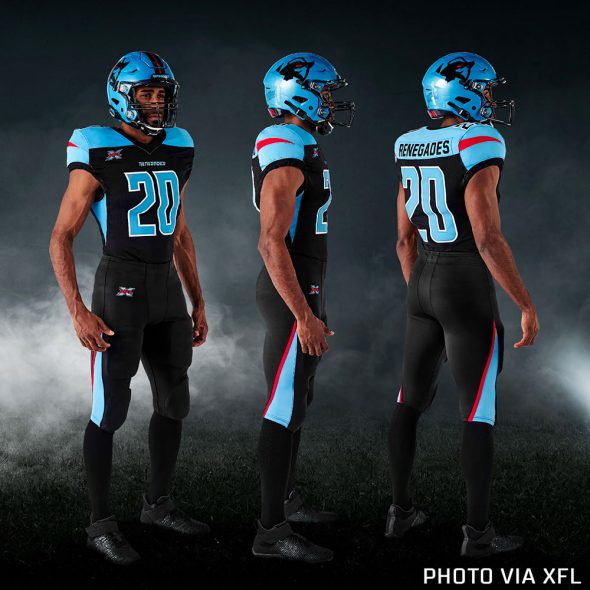
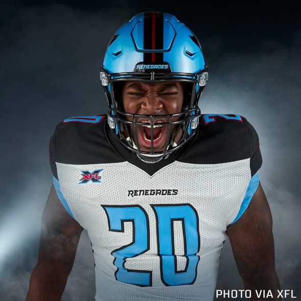
At home, the jerseys are black with light blue shoulders and a red line on each sleeve; there’s also a single black stripe right at the end of the sleeve. The light blue continues down each side of the jersey from the armpit to just above the waist forming a triangle shape. Numbers are light blue with white trim, the team wordmark across the front collar.
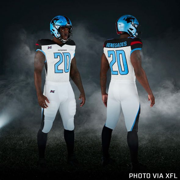
On the road, the jerseys are white with black shoulders with a light blue stripe around the end of the sleeves. Like the home set, there’s a single red stripe on each sleeve and the shoulder colour (in this case, black) continues down the side to form a triangle under the armpit. Player numbers are light blue with black trim and the team wordmark is again under the front collar.
Pants for both sets match the jersey colour and feature a reverse stripe coming up from the bottom of the pants up to around the knee.
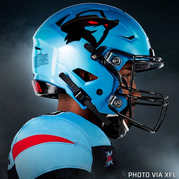
Helmets are a light blue shell with black facemask, a single black stripe up the middle and the team logo on either side.
DC DEFENDERS
On the shoulders of giants, they stand tall. Unconquerable. Unyielding. Marching ever forward, a force united. One quest. One purpose. One resolve. Seeking glory through grit. Victory through valour. The DC Defenders. Taking their stand. – XFL
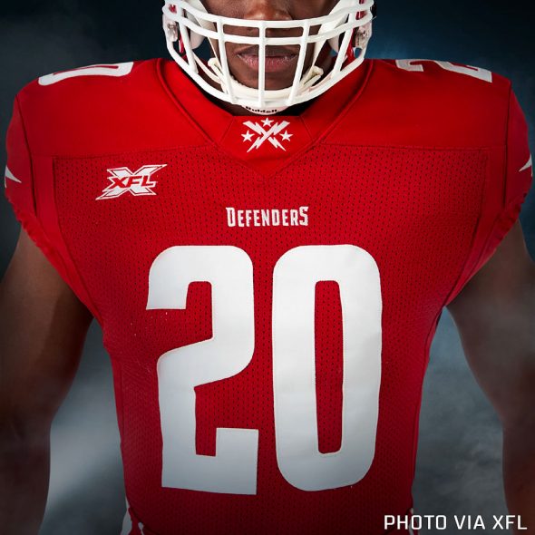
Washington’s newest football team (likely unintentionally) named two other Washington-area “football” teams in the video introducing their team name – “Valor” and “United”, of the Arena and European varieties of football respectively. The DC Defenders are red and white, the logo is a red shield with two crossed lightning bolts on it as well as three stars.
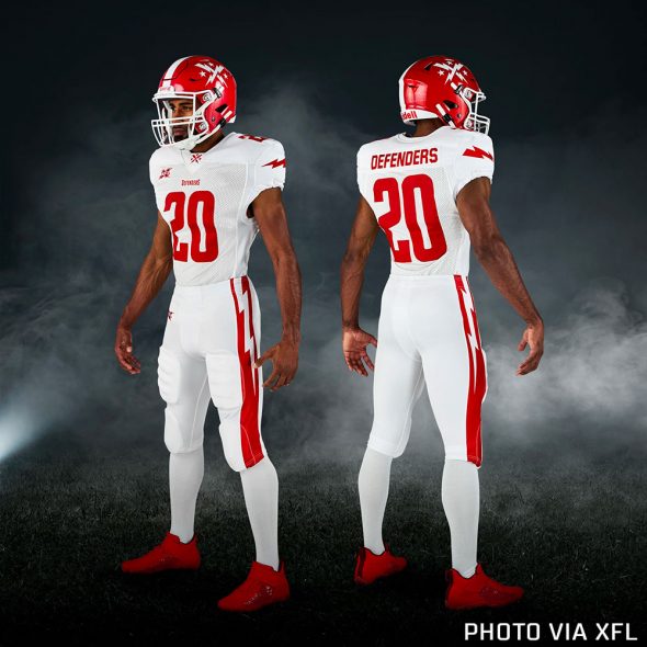
Playing out of Washington’s Audi Field (also home to DC United of Major League Soccer). The Defenders uniforms continue the basic red-and-white colour combo from the logo with no striping on the jerseys.
The XFL says the red is for the colour of the DC flag and “our Founding Fathers’ coat of arms” while the white represents the monuments of Washington.
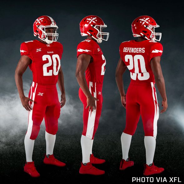
A single lightning bolt is shown horizontally across each sleeve, a simplified version of the team’s logo (two crossed lightning bolts with three stars surrounding it) is placed at the front collar with the team’s wordmark logo reading “DEFENDERS” just below it. Numbers are a single-colour sans serif, player names as well. The XFL logo is worn as a patch on the upper left side of the jersey front. No manufacturer logo is visible.
Pants match the jersey colour for both the home and road set, there’s a thick stripe down each side of the pant leg with a lightning bolt starting at the waist and continuing down to around the knee. The XFL logo on the front of the right pant leg.
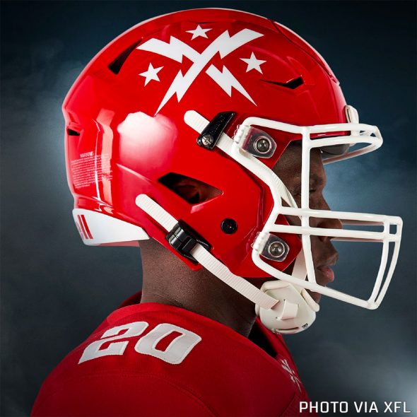
Helmets are red with a white facemask, single white stripe up the middle and the team’s logo in white on either side.
HOUSTON ROUGHNECKS
Resolute. Rippling with heat. Railing against fatigue. Unceasing and often unseen, they labour deep in the trenches. Mercenaries in the muck. Brawlers in blackened dirt. Not just for three hours. Not just when the lights are bright. These are the scratching, grinding, never-bending few. The Houston Roughnecks. Going to work for you. – XFL
Good news, Oilers fans (seriously this time), Your oil derrick is back, but this time in the colours of the Houston Texans. The derrick in red, blue, and white with the bottom half in the shape of an H, a red star at the top.
Now when we first saw the logo, we kinda hoped we’d get a Houston Oilers-inspired uniform. We didn’t. But hey, those are some Tennessee Titans-lookin’ numbers they got there, so let’s go ahead and call it a tribute anyways.
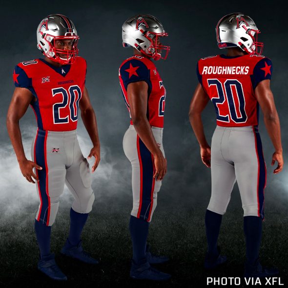
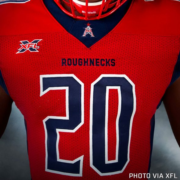
At home, the Houston Roughnecks are wearing red jerseys with blue sleeves and a red star on each. The blue stripes continue down each side of the jersey and are also featured around the collar. Speaking of the collar, the team’s primary logo – an oil derrick in the shape of an “H” with a red star above – is there as a patch above the team’s wordmark. Numbers are blue with white trim and, as mentioned earlier, kinda remind me of the numbers worn by the Houston Oilers of 2019 — the Tennessee Titans. Player names are single-colour white.
On the road, the Roughnecks are wearing grey jerseys with red sleeves/side stripes/collar and a blue star on each sleeve. Player numbers are blue with red trim and the player name on the back is blue.
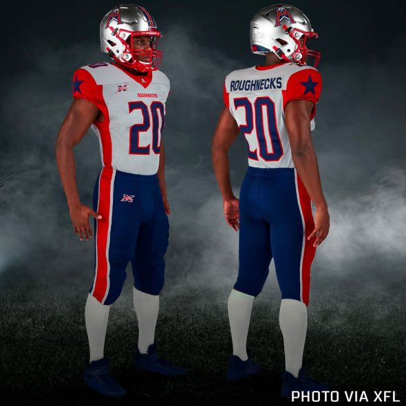
Pants are grey with red/blue/red striping on the side when paired with the home reds and are blue with grey/red/grey stripes on the road.
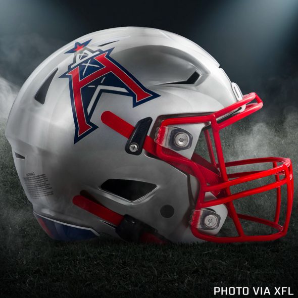
The helmet has a grey shell with blue/white/red/white/blue striping down the middle and the primary logo on each side. Facemask is red.
LOS ANGELES WILDCATS
In the land of bright lights. Far from the flash and fame. They’ve already begun to prowl. Enter their den and be dominated. Run away and be ripped apart. This is prime time meets primal instinct. This is showtime with a snarl. This is our time to roar. The L.A. Wildcats. Unleashed. – XFL
Who are we? The Wildcats!
A far cry from the Los Angeles Xtreme of the original XFL, the LA Wildcats give us about as traditional of a name as you can give us… and I’m okay with that. The logo is orange and red, a stylized “LA” – perhaps the flourish from the “A” is meant to be the tail of a wildcat?
Playing out of Carson, California in the same stadium as the NFL’s Chargers, the LA Wildcats will wear black, red, and orange uniforms for their inaugural season in 2020.
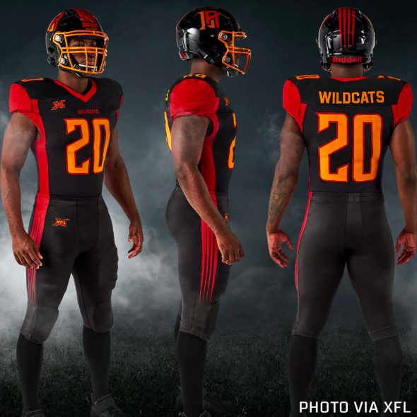
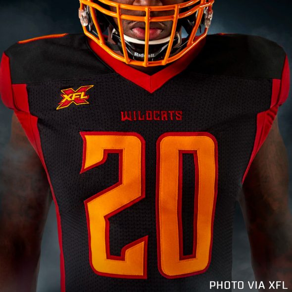
For their home games, the Wildcats will be dressed in black with red sleeves and red stripes down each side of the jersey. The collar is also red and includes the team wordmark below. Player numbers are orange with red trim, names are in orange.
On the road, the Wildcats are in white with orange sleeves, a single black stripe at the cuff. Like the home set, the sleeve colour continues down the side of the jersey to the waist. The collar on the road jersey is black, as is the wordmark logo below it. Player numbers are red with orange trim, player name in black.
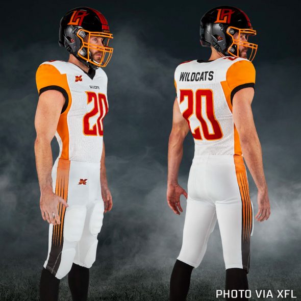
Pants are black at home, white on the road — both pants matching the jersey colours. They both incorporate a scratching design down the side of each pant leg, on the road whites this is enclosed within a wide black stripe that goes down the entirety of the leg.
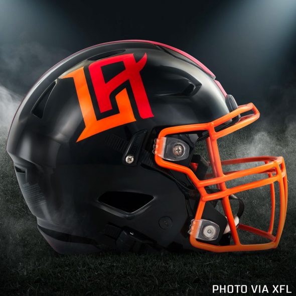
The helmets carry on with the scratching theme, using it as the centre stripe in red on a black shell. The team logo is on either side in orange and red and the facemask is orange.
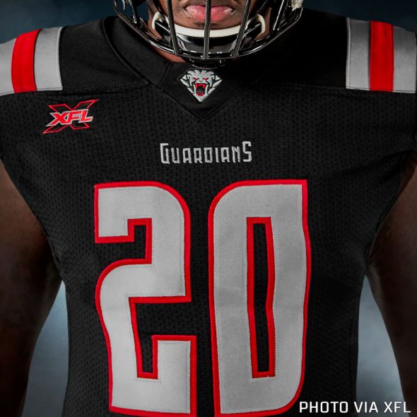
NEW YORK GUARDIANS
Sentries carved of stone. Watchdogs over the metropolis. A prehistoric predator. A beast evolves, turned loose in a new kind of jungle. All teeth and talons, eyes unblinking. They know fear because they feed off it. They are your first line of defence, and there is no need for a second. The New York Guardians. On duty. – XFL
A reference to the gargoyle statues seen on buildings throughout New York, but the Guardians logo looks more like a lion to me, perhaps inspired by the two lion statues *guarding* the New York Public Library? Ghostbusters fans know what I’m talking about. The colour scheme for the Guardians is black, silver, and red and like all of New York City’s pro football teams, they’ll be playing in New Jersey.
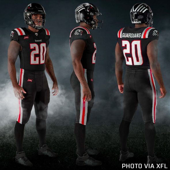
At home, the uniforms are black with a grey/red/grey striping pattern on each shoulder, the team’s primary logo as a patch on the sleeve under the stripes. At the collar is the team’s alternate logo with their wordmark logo below in grey. Player numbers are grey with red trim and player names on the back are single-colour grey.
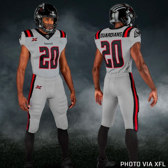
On the road, it’s the same exact same design but with grey and black flipped. The jersey and pants are both grey with black/red/black striping on the shoulders. Pants match jersey colours for both and mimick the shoulder striping pattern down the side of each pant leg.
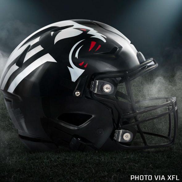
Helmets are black with a black facemask and no striping across the shell, instead the team’s primary logo encompasses each side entirely.
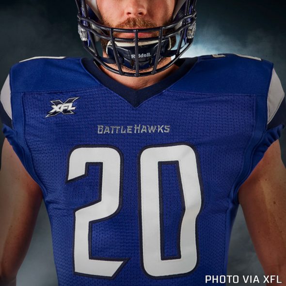
ST. LOUIS BATTLEHAWKS
Winged warriors. Preparing for flight. Preparing to fight. They await their orders. Then attack as one. Diving, dodging, swooping, striking. Their mission: create chaos. Their mandate: Win at all costs. The St. Louis BattleHawks. Cleared to engage – XFL
St Louis gets its own pro football team again, no nothing relocated this time, and they’ll be known as the BattleHawks (one word, capitalized midway through) with a colour scheme of blue and silver. The logo features a sword with two wings.
At home in the dome, the BattleHawks will wear blue jerseys with silver pants while simplifying things a bit to just blue-and-white while on the road.
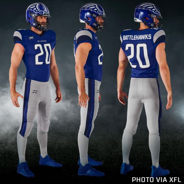
Their home royal blues have two swooping stripes on each sleeve, one silver and one navy blue, a single thin royal blue stripe right at the cuff. The collar is navy blue with no decoration aside from the team wordmark logo in silver just below. The player number is white with navy blue trim, names are single-colour white.
On the road, jerseys are white with royal blue and navy blue swooping stripes on the sleeves and a royal blue collar. Wordmark is, of course, there at the neck now in navy blue. Player numbers are royal blue with silver trim, names are navy blue.
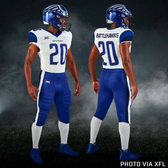
Pants are silver at home, royal blue on the road. Both colours have double stripes down each pant leg, navy blue-royal blue on the silver pants and navy blue-white on the royal blue pants. Each stripe is of equal width.
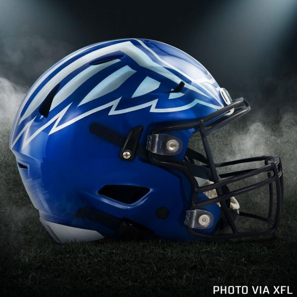
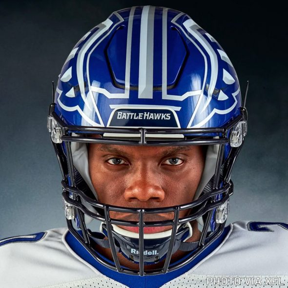
The helmets are where the BattleHawks have some fun, in a style similar to the NFL’s Philadelphia Eagles, the ‘Hawks have a wing on each side of the helmet and then a sword right down the middle which – when viewed all together – forms the team’s full primary logo of a sword in between two wings. Love this. Shell is royal blue, facemask is navy blue.
SEATTLE DRAGONS
Rising from the turbulent sea. Beneath the darkening skies of their weather-hardened home. Relentless, ruthless, ravenous. Not of mythology, but of muscle and might. Not of folklore, but of football. This is your darkest fantasy…in cleats. The Seattle Dragons. Breathing fire. – XFL
I said consummate V’s!
The Seattle (or UAB?) Dragons are blue, green (because Seattle), and orange with a dragon head breathing fire as its logo. Another good old-fashioned name for the new league, one which we first saw as a possibility for this team two months ago (and if I recall correctly, Dragons was my choice from that list, so… I suppose I’m pleased)
The Seattle Dragons will play their home games at CenturyLink Field, joining Los Angeles, New York, and Tampa Bay as teams to share their stadium with the local NFL team.
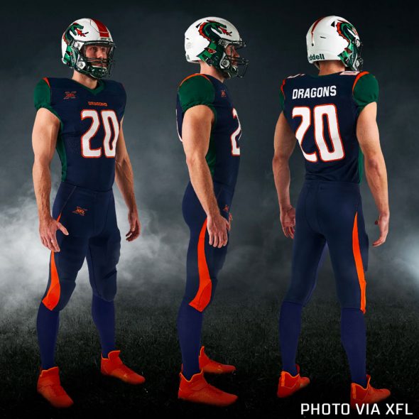
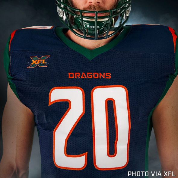
Seattle wears navy blue at home with green sleeves and a thin orange stripe on the shoulder, green striping continues down the side of the jersey. It’s the same jersey template as the Tampa Bay Vipers but in Dragons colours. Wordmark at the collar is orange, numbers are white with orange trim, player name is white.
On the road the Dragons wear white, the striping is identical in positioning and colours as their home jersey. Player numbers are orange with navy blue trim, names are in blue.
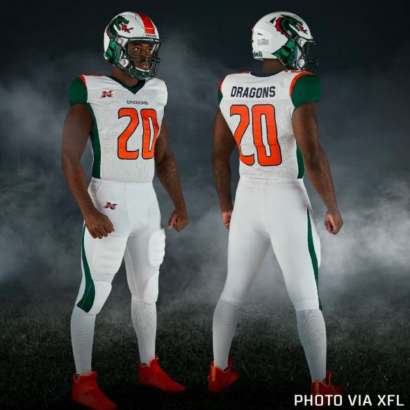
Pants are navy blue at home and white on the road to match their respective jerseys. Both have a stripe that curves and runs up from the bottom of the leg up to the waist tapering off as it goes higher.
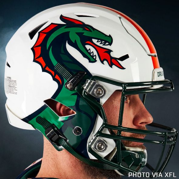
Helmets have a white shell, the dragon from their primary logo coming up from the bottom of the helmet on either side. A single orange stripe starts thick at the face and continues getting gradually smaller until it forms a point near the back of the head. Facemask is green.
TAMPA BAY VIPERS
In the shadows, they wait. Demons, born in darkness. Hunters by instinct. Cold-blooded by nature. Their bite, unavoidable. Their grip, inescapable. They slither and stalk their competition. Luring all who challenge them into the jaws of defeat. The Tampa Bay Vipers. Ready to strike – XFL
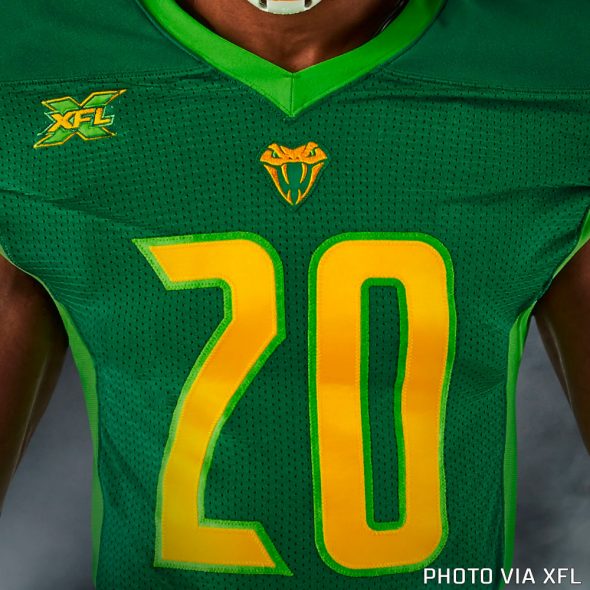
Finally, we have the Tampa Bay Vipers. A green and gold colour scheme (nice) with a logo that’s both a “V” for Vipers and the fangs/lower-head area of a snake.
Well, I suppose every league needs its Seattle Seahawks, its Oregon Ducks, its… Arizona Diamondbacks? The Tampa Bay Vipers fill that role nicely for the XFL. With a colour scheme of green, brighter green, and gold, the Vipers are named for the snakes “that slithered out of prehistoric Gulf Coast swamps”.
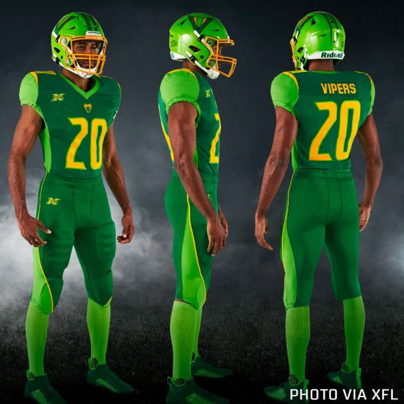
At home, the Vipers are wearing re-coloured Seattle Dragons jerseys. They’re green jerseys with green pants, light (“action”) green sleeves, side stripes, and collar. There’s a single, thin gold stripe on each shoulder between the main body green and the lighter green on the sleeve. Player numbers are gold-trimmed in the lighter green and the team’s secondary logo – a snake’s head – is at the collar. No wordmark here! Breaking the mould we’d seen so far throughout the XFL.
For road games, it’s a little less jarring with white uniforms (they really could’ve gone gold here and it might not have been too bad), and green sleeves/side stripes. That same gold stripe seen on the home uniforms is here on the shoulders of the road. Player numbers are green with “action” green trim.
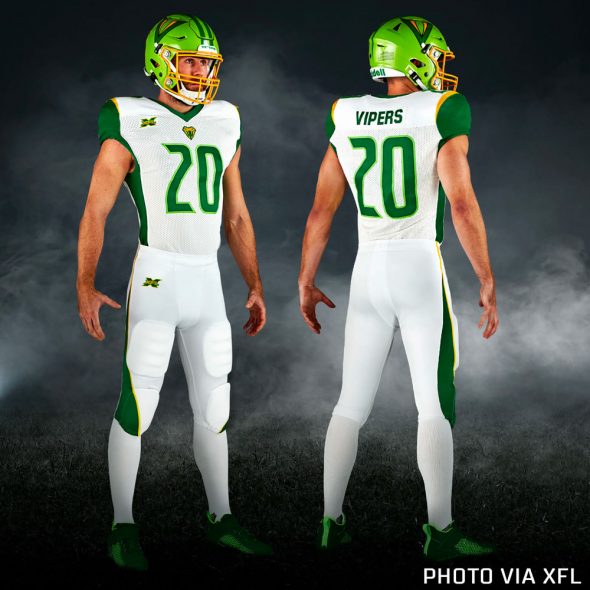
Pants are green at home and white on the road, both have thick striping that begins at the bottom and thins out as it moves up to the waist with thin gold piping running alongside.
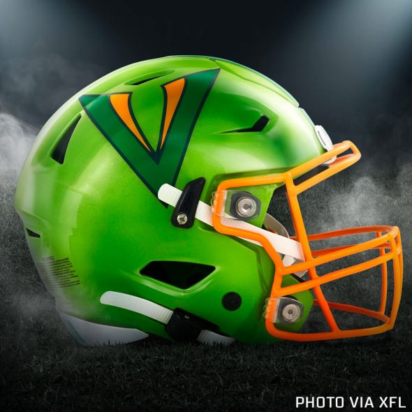
The helmet is where I think they made a mistake, the shell is the lighter “action” green which might work okay with the home uniform but looks very out of place on the road whites which have hardly any “action” green outside the helmet. The dark green would have worked better here, in my opinion. Facemask is gold, the primary logo is on the sides, and there are two green stripes up the middle.

“The XFL is about football and fun, and our team identities are intended to signify just that,” said XFL President Jeffrey Pollack in a press release. “Now it is up to our fans and players to help write the story. What happens on the field and in the community in the years ahead will determine the true spirit of each team.”
The re-born inaugural 2020 season for the XFL begins on Saturday, February 8th with the championship game set for April 26th.
Related stories:
 XFL Unveils Under Armour Uniforms For 2023 Reboot Season
  XFL Facing Potential Lawsuit From Olympians Over New Logo
  NFL, Titans Oppose Trademark of Roughnecks XFL Logo
  XFL Unveils Team Uniforms for 2020 Re-Born XFL Announces Names, Logos for All Eight Teams
  Seattle XFL Trademarks Five Potential Team Names

