The Los Angeles Rams unveiled a new logo set and color scheme on Monday afternoon as a precursor to the opening of their new state-of-the-art stadium this summer.
The final result was a two-year collaborative effort between the franchise, Nike and the NFL, and the goal was to blend multiple eras of Rams football to create identity that would resonate with fans of all ages, backgrounds and cultures — while also leveraging some of the unique features of SoFi Stadium to produce something unlike anything else in professional sports.
That said, it was clear from the beginning of the process that the Rams were not going to deviate from a blue and yellow color scheme or the horns that have adorned their helmets since 1948.
“We met with former players and fans to try to decide what things from our history that make sense and what are the things that we can do to push us forward and make sure we’re part of the future of Los Angeles,” Rams creative director Cory Befort told SportsLogos.net. “Out of all these conversations, we understood the horns were that sacred cow that everyone resonates with. It’s been a part of our identity since our inception in Cleveland and through our time in Los Angeles, St. Louis and back, and we wanted to make sure that was very prevalent in the entire identity system moving forward. And then the colors seemed to be of the utmost important, as well.”
The Rams have used some shade of blue with either yellow, gold or white for the majority of their existence, and those focus groups made it resoundingly clear that one particular shade resonated more than the others. That’s how they ended up with Rams Royal and Sol, which are slightly more vibrant versions of the team’s retro colors.

“We also introduced some accent pieces you see in the gradation (of the horn),” Befort said. “The gradient from white to yellow on the part of the ‘A’ signifies that transition of our history in Los Angeles, which includes periods with white and yellow horns. And then, when you get into the other break of the horn, you start to see orange, and the idea there is to signify the sunset, which is something that is so powerful in Southern California and something that really resonates with our fan base.”
While the team’s history played a significant role in the design process, the Rams wanted to create something new that fit into a more modernized world.
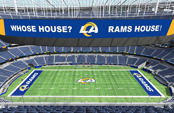
“Our new stadium is really this groundbreaking environment that’s full of 4K HDR real estate with more than 80 million pixels worth of video board space,” Befort said. “There’s this digital space that is completely immersive and unlike any other venue in the world, and we felt that the way our colors could be applied in a digital space, it make sense to take a digital-first approach. Most sports teams and brands don’t really have that advantage, and we felt really comfortable pushing further into that space.”
To get to that point, though, the Rams went through more than 300 different logo concepts.
“We looked at a full gamut of options,” vice president of merchandise Tyrel Kirkham told SportsLogos.net. “We wanted to really use this exercise as an opportunity to explore other options.”
However, those concepts always led back to the horns, which is why they play such a prominent role across both logos — and can event be used as a standalone mark. The horns also give the Rams flexibility, which is why neither the “LA” logo or the ram head are considered by the franchise to be its primary mark.

“We really wanted to be strategic and smart about not necessarily utilizing one mark of the other, so while the NFL may designate the ‘LA’ as the primary mark in terms of a logo slick, we don’t really consider it that way,” Befort said. “That’s why the horn has the same shape and form across the identity, and that’s something we felt really strong about looking back into the historical side of things.”
Along those same lines, the Rams have already created stencils that would allow them to paint either logo at midfield.
“You could see one for a primetime game versus and afternoon game or could alternate every game,” Befort said. “The idea is to have flexibility and knowing that we could lean into one more than the other for any reason.”
The reaction to the logos have been as expected, according to Befort, who added the leaked draft hat put them behind the eight ball when it came to introducing the new set.
“From our sense, we weren’t really able to tell our narrative and our story the way we wanted to because of the leaked version of our mark that breaks brand guidelines,” Befort said. “That should have never seen the light of day, and that’s what’s disappointing. People didn’t get to see it in its entirety up front, but that’s just the way it works.
“Once you see the uniforms in the stadium with the way we’re utilizing our designs and the identity system as a whole, I think you’ll really start to see how and why we’ve done everything.”
So if that’s the case, why not introduce the logos and the uniforms all at once?
“With us unveiling a new stadium, new marks and new uniforms, this idea of being able to have multiple splashes throughout the year gives us more bites at the apple and to tell our story,” Befort said. “If you put all of your eggs in one basket, it’ll have an impact. But if you leverage it over time into three moments, I think you get much more of an opportunity to reach the masses.”
The group was unwilling to share any details when it comes to the new uniforms, other than that they’ll be unveiled between now and SoFi Stadium’s grand opening in July. And while they’re prepared for a negative response, they’re hopeful the fans will grow to love the look just as much as their throwback designs.
“Change is hard, and we were always under the understanding that this was going to be a challenge,” Befort said.
Related stories:
 Los Angeles Rams Tease Alternate Uniforms In 2021, 2022
  Los Angeles Rams Unveil New Uniforms
  A Look At The Tampa Bay Buccaneers’ Logo History
  Los Angeles Rams COO Kevin Demoff Reads Mean Tweets About New Logo
  Los Angeles Rams Reveal New Logo, Color Scheme
  A Look At The Los Angeles Rams’ Logo History
  Los Angeles Rams To Unveil New Logo, Color Scheme On March 23
  Los Angeles Rams COO Trolls Fans With New Logo On Twitter

