
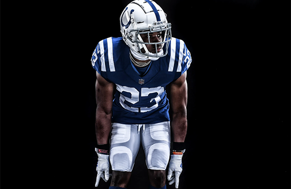
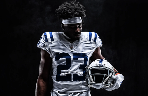
The Indianapolis Colts on Monday morning introduced a new secondary logo and wordmark, which will appear on the team’s updated uniforms in 2020.
The Indianapolis Colts on Monday morning introduced a new secondary logo and wordmark and made corresponding updates to their uniforms.
“The Horseshoe remains our most iconic and timeless mark, worn by some of the greatest players in NFL history and loved by some of football’s greatest fans, Colts Nation,” Colts vice chairman and owner Carlie Irsay-Gordon said. “These new logos – particularly our new Indiana logo – honor our rich history, cement our real and lasting connection to Indiana and embrace the exciting future that lies ahead.”

The new secondary logo is the outline of the state of Indiana carved out of the “C” included in the Colts’ new wordmark to “honor the team’s home state and community.” It features seven grommets to mirror the team’s primary horseshoe logo.
Indianapolis’ most significant changes comes in the form of the new wordmark, which incorporates the serifed font used by the Colts during the 1950s and 1960s, as well as their Color Rush uniform.

The uniforms, meanwhile, are mostly the same, aside from the inclusion of the updated number font and the team’s new tertiary color, Anvil Black, on the Nike Swoosh on the road jersey. The Colts also interestingly retained Nike’s Elite 51 template but removed the patented Flywire, rather than switch to the the Vapor Untouchable template used by most NFL teams.


The new secondary logo can be seen on the inside of the back collar of the uniform, while the new wordmark is prominently displayed on the front and back helmet bumpers.


One additional — albeit small — change to the Colts ensemble is the logo on the helmet, which now matches the team’s primary design. The previous version was not as wide and featured upward facing notches, while the notches on the primary logo face downward to make for a quirky inconsistency across the brand.


Photos via the Indianapolis Colts.
Related stories:
 Los Angeles Rams Unveil New Uniforms
  New England Patriots Unveil New Uniforms With Wrong Pants
  Cleveland Browns Unveil New Uniforms
  A Look At The Cleveland Browns’ Logo History
  A Look At The Tampa Bay Buccaneers’ Logo History
  Los Angeles Rams COO Kevin Demoff Reads Mean Tweets About New Logo
  Tampa Bay Buccaneers To Unveil New Uniforms On April 7
  Atlanta Falcons Head Coach Dan Quinn Discusses New Uniforms

