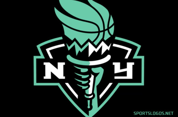
The New York Liberty this morning unveiled a brand new primary logo and colour scheme in anticipation of the 2020 Women’s National Basketball Association season (we hope, anyway).
With the team’s relocation from Madison Square Garden in Manhattan to Brooklyn’s Barclays Center, the Liberty have shed all of their visual ties to the New York Knicks. The team’s new look has switched from a predominantly blue and orange colour scheme to a more Brooklyn Nets-friendly black and white. The Statue of Liberty-inspired seafoam green, which has been unique to the team since its 1997 inaugural season, remains with the change.

“While this new logo pays homage to our franchise history and the history of New York City, it also nods to our future and modernizes the team’s overall look,” Liberty Chief Operating Officer Keia Clarke said in the press release. “This new chapter of Liberty basketball in Brooklyn will begin with the rollout of a new visual that energizes and excites our Liberty Loyals.”
The overall look of the new logo is very similar to the team’s alternate logo that had been in use since 1997, both featuring a shield and Liberty’s torch held high between an “NY”, the font also remaining the same:

While the new logo could easily be explained as “you know, we just updated the old one a bit and changed the colours to match Brooklyn”, that’s just not how things work anymore…
Officially, the shield “demonstrates the franchise’s impenetrable pride and love for its city”, the torch is a “symbol of enlightenment”. Seafoam green (in addition to representing the colour of the Statue), is for “strength, power, and resilience”, while black and white “symbolizes the differences that unite players, fans, and the city” (plus the association with the Nets).
A look at the new uniforms:


It’s a nice update overall, the team certainly needed to break away from the Knicks colours with the move to Brooklyn and this was a suitable way to do so. Several ties to the original look were retained, which I always look for in a new look, you need some way to connect the franchise’s history over time — in this case, the overall design with the shield/torch/letters in addition to the font, and (most importantly) the seafoam green. Well done.
A look back at the old logo next to the new:

This change leaves the Los Angeles Sparks as the only team left in the WNBA to still be using the same logo since the league’s inaugural season 23 years ago.


