The results are in!
We’re pleased to announce that SportsLogos.net received more than 150 submissions for the Arizona Cardinals redesign contest on social media and via email. And after careful consideration, we’ve narrowed it down to 11 of our favorite designs, and even added our own concept to boot.
If you were among those who submitted a design but do not see yours included below, don’t fret. We’ll have another contest soon!
So, without further ado, the results of the Arizona Cardinals redesign contest. Make sure to vote for your favorite at the bottom of the article!
Best Introduction Of A New Color – Alex Burtin (@the_burtinator)
Burtin’s Color Rush concept is primarily turquoise as a nod to the State Gem often used in Native American jewelry. He also included a gradient pattern that reflects the various rock layers of the Grand Canyon, which is roughly a three-hour drive from the Cardinals’ stadium.

Best New Helmet – Jesse Alkire (@JesseAlkire)
Following the Los Angeles Rams’ lead, Alkire’s non-traditional road uniform mimics the gray body of the desert cardinal. It’s his helmet that stands out the most, though, as it carries over the black area around the bird’s eyes to create a winged design, similar to that of the Michigan Wolverines.


Best New Logo – Nate Sweitzer (@natesweitzer)
Sweitzer aimed to capture the essence of an Arizona sunset with the addition of yellow and navy accents on the sleeves, as well as a navy alternate uniform. It was his redesigned logo that set his concept apart from the rest, however.

Best Pat Tillman Tribute – Mike Joseph (@SansfordAndSuns)
Joseph’s Salute to Service alternate uniform honors the late Pat Tillman by incorporating various Army Ranger elements, including the use of dark green on the helmet, numerals and pants, as well as sand tones as trim.

Best Throwback Design – Tim Batzinger (@uncool_2020)
Batzinger’s home, road and alternate uniform concepts were centered around the sun rays featured on the Arizona State Flag. His throwback design, on the other hand, was inspired by the Chicago Cardinals’ uniforms of the early 1920s.

Best Use Of Copper – Allen Bertsche (@Allenin140)
Arizona is known as the Copper State thanks to its abundance of the mineral, which is why both the Arizona Wildcats and Arizona State Sun Devils have prominently featured the color on alternate uniforms in the past. Bertsche now brings that same idea to the Cardinals, with a copper helmet, pants and trim.

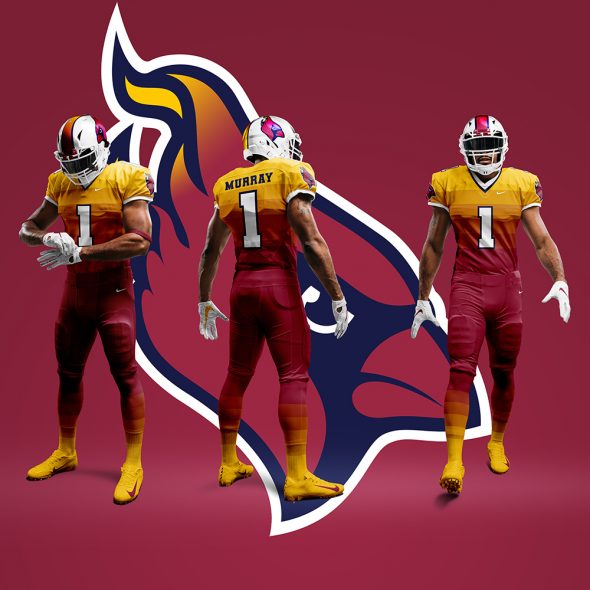
Best Use Of Gradients – David Smith (@TheUrbanDoodle)
Similar to the Utah Jazz’s City Edition uniform, Smith’s Color Rush design uses a gradient effect that moves from gold to cardinal on the uniform and then back to gold down the socks and onto the cleats. His custom logo also pays homage to the nearby city of Phoenix and the mythological bird that shares its name.
Best Use Of Sublimation – Justin Shipley (@shipleysportsstudio)
Pulling inspiration from quilts and tapestries seen throughout the Southwestern United States, Shipley’s concept uses sublimated geometric triangles throughout the entire uniform. He gets bonus points, too, for using the Cardinals’ logo from the 1960s.


Best Use Of The State Flag – Hunter Wolas (@HWolas95)
Thanks to Kyler Murray’s comments, the Arizona State flag was a prominent fixture on 75 percent of the concepts we received. But Wolas’ application on the sleeve caps and the addition of blue to the color scheme made his design more visually appealing than the rest — even if he did borrow the Cincinnati Reds’ number font.

Most Traditional Design – Matthew Drake (@MJD7Design)
Drake swapped Arizona’s over-designed piping for a traditional striping pattern, similar to what Louisville did ahead of the 2011 season. The only discernible difference between the two Cardinals is the striping (or lack thereof) on the helmet.


Most Unique Pattern – Justin McKeever (@jmckeev5)
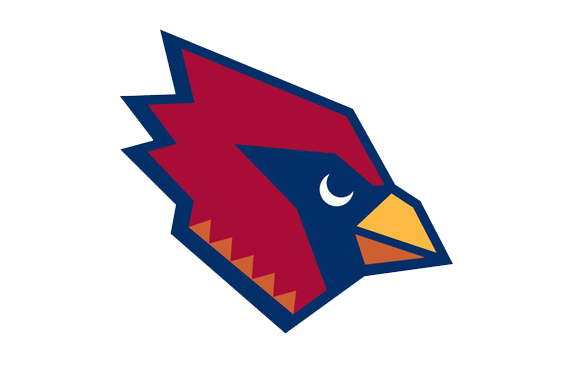
McKeever’s home and road concepts incorporate Native American patterns for striping on the sleeve and pants, while the helmet includes a custom logo (seen in the header photo above) that features a crescent moon as an eye and a diamond pattern on the neck.

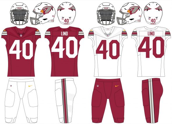
Our Submission – Andrew Lind (@AndrewMLind)
SportsLogos.net’s submission pulls inspiration from the Pyrrhuloxia (or desert cardinal) and the Arizona State Flag, most notably on the Color Rush set. It also includes a small tribute to Tillman on the inside of the back collar.

[socialpoll id=”2647423″]


