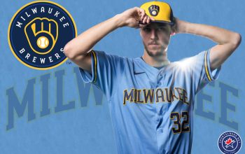
Back to the ball diamond here in Our Best Logo Ever! Tournament, with the recently refreshed Milwaukee Brewers. After fifteen years of wearing it as a throwback uniform, the Brewers finally returned to their classic “Ball-in- Glove-Logo” for the 2020 season.
Special thanks to everyone who has participated in our past polls, the results of the Pittsburgh Penguins best logo poll have been announced, check those out here. If you missed it, earlier we all decided on the greatest Los Angeles Rams logo of all-time, as well as the Washington Bullets/Wizards, and the Baltimore Orioles. We’re up to somewhere around 19,000 votes cast in the tournament thus far!
As always, the poll is down near the bottom of this post, but we like to start with a little history lesson first because really, who doesn’t love a little history lesson?
How did the Milwaukee Brewers Get Their Team?
Milwaukee was home to two previous Major League Baseball teams before the Brewers came to town, well, the modern Brewers anyways. Milwaukee’s original MLB team was an American League club, also known as the Brewers, who joined the league for its inaugural season in 1901. Those Brewers would only last a single season after the AL was formed before moving to St. Louis becoming the Browns (and who still play today as the Baltimore Orioles).
In 1953, the Boston Braves moved west to Milwaukee. The Milwaukee Braves lasted just over a decade in Wisconsin, even winning a World Series during their brief time before relocating to Atlanta in 1966. The Braves were the first Major League club to leave a city without a team since the original Baltimore Orioles folded in 1902.

A local car leasing business owner (and former Braves minority owner) by the name of Allan “Bud” Selig immediately got to work trying to bring Major League Baseball back to Milwaukee. Selig tried to woo the Chicago White Sox even getting the team to move several of their home games in the 1968 and 1969 seasons to Milwaukee. Selig made a bid to purchase the White Sox but it was denied by the league who did not want to lose the Chicago market.
At the conclusion of Spring Training in 1970, the Seattle Pilots faced a debt of $8.13 million after just one season. It was clear they would not be able to pay it off. Two options faced the club, remain as the Pilots propped up by the American League or sell to a group in Milwaukee led by Selig. As the sale to Milwaukee entered bankruptcy proceedings, the State of Washington threatened an $82 million antitrust suit if the team relocated. Finally, on the evening of March 31, 1970, just one week before opening day, a federal bankruptcy referee approved the sale of the Seattle Pilots for $10.8 million, a signature on the document made the relocation to Milwaukee official a day later on April 1st and the Brewers played their first game on April 7th. Now that’s efficiency.
Why are the Milwaukee Brewers Called the Brewers?
The Milwaukee Brewers are named both for the beer brewing industry in the city as well as its baseball history. The Brewers name had been used by several different pro baseball teams in Milwaukee from 1884 through 1952 (with just a couple of seasons without a team in that span during the 1880s and 1890s).

When Bud Selig launched his campaign to bring baseball back to Milwaukee following the relocation of the Braves he used the name Milwaukee Brewers Baseball Club Inc. Programs for the regular season games the White Sox moved to Milwaukee County Stadium in 1968 and 1969 came with a cover featuring the Minor League team’s “Beer Barrell Man” logo in red, white, and blue with the words “The Milwaukee Brewers Present Major League Baseball”.
Milwaukee Brewers Logo History
As mentioned in the previous paragraph, before they got their team, the Milwaukee Brewers group promoted themselves using a red, white, and blue logo. When the blue and yellow Seattle Pilots relocated to Milwaukee with only a week before the start of the season, the Brewers were essentially forced to recycle their uniforms and use their colour scheme. Funny how things work, fifty years later the Brewers never did switch to the red, white, and blue, and only a few months ago now returning to a scheme resembling those original blue and yellow colours to great admiration from their fanbase.
Milwaukee’s original logo was a blue and yellow version of the Beer Barrell Man logo originally used by the Minor League Brewers. Despite only lasting 8 seasons, you can still see the Beer Barrell Man walking around Brewers home games as a secondary mascot and it was also brought back as part of the new 2020 logo package as an alternate logo.

In 1978 the Brewers switched to, perhaps, one of the more iconic logos in North American sports. The famed ‘mb’ baseball glove logo. The realization that this logo was more than just a ball in a baseball glove is what got me into loving sports logos. Milwaukee used this logo through the end of the 1993 season but it reappeared on a throwback/alternate cap from 2006 through 2019 before coming back as a full-time logo in an updated format in 2020.

Looking to modernize along with the rest of the sports world in the 1990s, the Brewers dropped their (at the time) quickly ageing “ball-in-glove” logo and blue and yellow colour scheme for navy blue and green with gold. The “MB” initials were still the feature of the logo, now interlocked within a diamond and two crossed bats. The Brewers would use this logo for seven seasons.

As the club was originally scheduled to move into the new Miller Park, the team unveiled an entirely new logo for the occasion (a fatal construction accident forced the team to delay the move to the 2001 season). The new look dropped the green and introduced a new scripted wordmark which many said resembled the logo of a beer company. The Brewers would use this longer as their primary logo longer than any other in team history, only replacing it after 17 seasons.

In 2018, the Brewers made swapped their primary and secondary logos (uniforms stayed the same). The “M” logo most commonly seen on their caps was now the primary logo with the scripted “Brewers” moving to secondary status. This move lasted just two seasons.

After several years of fans pushing for a return to the 1978-1993 “Ball-in-Glove” logo, the team finally gave in for the 2020 season. An updated glove was introduced with the addition of light blue to the colour scheme. Gold was eliminated in favour of classic yellow.

So now it’s time to vote! Again we’ll be accepting at least two votes for your favourite Brewers logo to prevent any vote-splitting between the two ball-in-glove logos. This poll will likely be open through to the end of the weekend after which it’ll be back to the NBA!
[socialpoll id=”2664777″]
After voting, be sure to check out our complete Milwaukee Brewers logo and uniform history here and of course, don’t forget to look back at our other past winning logos so far for the Baltimore Orioles, Los Angeles Rams, Pittsburgh Penguins, and Washington Wizards.


