
The 2020 Major League Baseball season is here… seriously this time. Of course, it may have taken four months later than originally scheduled and we have no idea where the Toronto Blue Jays will play but… baseball!
Every year we do a run-down of all the changes heading into the new season, this year we had quite a few! From the return of classic logos in Milwaukee to classic colours in San Diego, the re-birth of powder blue across the league, and the introduction of the Nike swoosh to the front of the team uniforms. There was a little bit for everyone.
We’ll start with the league-wide changes and logos before moving on to our team-by-team changes.
THE NIKE SWOOSH
In case you haven’t noticed… Nike takes over from Majestic Athletic as the official uniform supplier across Major League Baseball in 2020. Though for the first two years of the deal the physical uniforms will be identical to the Majestic uniforms players have been wearing for several years. Part of baseball’s new deal with Nike involves the addition of the Nike Swoosh to the front of every single on-field jersey and to the back pocket of every pair of pants.
JACKIE ROBINSON DAY
While originally cancelled along with the rest of the first two-thirds of the season, Jackie Robinson Day will still be happening after all. Typically held on April 15th to commemorate the anniversary of Robinson’s first game in the Major Leagues, Jackie’s legacy this year will instead be celebrated on August 28th in recognition of the anniversary he signed his first Major League contract. Like typical Jackie Robinson Day events, all players will wear Robinson’s #42 as their uniform numbers.
NEGRO LEAGUES CENTENNIAL

On August 16, 2020 all Major League Baseball teams will wear a red and white patch celebrating the 100th anniversary of the founding of the Negro National League. This patch will be worn on the upper left corner of the player’s jersey.
Much more information on this patch can be found here.
2020 WORLD SERIES LOGO
While it hasn’t been officially released (from what we can see), prior to the end of the world we started seeing the 2020 World Series logo popping up here and there, on marketing materials and in video games. Naturally, we snagged a screencap!
The logo uses the same font as the 2019 logo (which, yes, is the same font we’ve been using for five years… trendsetters), “WORLD SERIES” is written out on either side of a blue and gold version of the league’s primary logo and the year acting as the bread to the Batterman sandwich.
Still no word on the rest of the Postseason logos. There was also the 2020 All-Star Game logo but… that’s been cancelled and the logo rolled ahead to 2022. You can see that logo here.
WATCH: Every New MLB Uniform and Logo for 2020
Time for the team-by-team changes, let’s get through this in alphabetical order.
ARIZONA DIAMONDBACKS

WHAT’S OLD: Gradient diamondback-snakeskin pattern removed from all caps and all jerseys. The very dark grey from the road uniforms gone. Teal-trimmed “A” cap and its teal-grey road uniform dropped. Red trim removed from “D-backs” wordmark on the red alternate jersey.
WHAT’S NEW: Traditional grey road uniform. The teal-trimmed cap now features the snake-head logo. Changes to player name colours on the grey, teal white, and red jerseys. “D-backs” wordmark on the red jersey in now just black with beige trim.

Essentially, the Diamondbacks have rolled back some of their more “out there” designs, which were first introduced for the 2016 season and reverted to a more overall traditional and simplified uniform set.
Gone is the diamondback snakeskin gradient pattern which was all over the caps as well as on the shoulders and down the sides of their jerseys (and at one point even on the pants).
RELATED: Arizona Diamondbacks Unveil Updated Nike Uniforms
Also gone are the two extra-dark grey road uniforms, the standard road uniform was replaced with a more traditional shade of grey while the teal-trimmed version of the road uniform was eliminated completely. There’s now just one road grey uniform and it’s your standard light grey, paired with a simple black cap featuring the team’s “A” logo. With this lighter shade of grey, the road jersey will now have player names in black rather than beige.

Teal isn’t gone entirely, it returns but will just now only be worn for home games. As is the case with the rest of the uniform set, the diamondback pattern has been removed from this jersey. In past seasons, this jersey was worn with the usual “A” logo trimmed in teal but this cap has been turfed, replaced with a new cap featuring the club’s “snakehead” logo trimmed in teal. Like the road set, player names on this jersey have been changed and will now be in teal instead of black.
The red alternate jersey also saw some minor changes. Across the chest the “D-backs” wordmark has eliminated an extra outline, what was once black lettering with red and beige outlines will now simply be black lettering with a single beige outline. Player names on this jersey are now beige instead of black, and like the logo on the chest, the extra red outline has been removed the player’s numbers on this jersey.
CLEVELAND INDIANS
WHAT’S OLD: All-Star Game patch
WHAT’S NEW: Clean sleeves
The 2019 All-Star Game logo patch has been removed from the club’s jersey sleeve. It will not be replaced with anything, nope not even the block “C” logo. All sleeves across the Indians’ entire uniform set in 2020 will be bare.
CINCINNATI REDS
WHAT’S OLD: Red alternate jersey with wishbone-C style logo on chest and running mascot logo on sleeve has been eliminated
WHAT’S NEW: Red alternate jersey with scripted “Reds” logo on chest and mascot head on sleeve has been added

Cincinnati made a switch to their red alternate jersey, worn both at home and on the road. The jersey previously featured the team’s primary “C” logo on the upper left chest with the player’s number on the right, white piping down the front and a logo showing their mascot running while carrying a bat on the left sleeve.

The new version of this jersey removes the piping, moves the player number to the lower left, and replaces the “C” logo with the “Reds” scripted in white with a black drop shadow across the entire chest. The mascot logo on the sleeve has been altered to only show its mustachioed baseball head wearing a pillbox cap rather than the full-body.
DETROIT TIGERS
WHAT’S OLD: The Tigers-Blue Jays rivalry
WHAT’S NEW: Memorial patch for Al Kaline

One of the greatest ballplayers of all-time, Al Kaline, died this past April at the age of 85. Kaline, who was a *15-time All-Star* spent his entire 22-season career with the Detroit Tigers between 1953 and 1974.
To rememer Kaline, the Tigers will be wearing his jersey number 6 in white on a black circle on their jersey sleeve throughout the 2020 season.
KANSAS CITY ROYALS
WHAT’S OLD: Memories of 2015…
WHAT’S NEW: Memorial patch on right sleeve of all jerseys
The Royals have added a memorial patch to the right sleeve of all their jerseys in honour of David Glass. Glass owned the Royals for twenty seasons and sold the team just this past offseason prior to his death on January 9, 2020.

The patch features Glass’ initials “DG” in blue with a gold crown above it, both are placed together inside a white circle trimmed in blue. This patch will be worn by the Kansas City Royals throughout the 2020 season.
WATCH: Every New MLB Uniform and Logo for 2020
MILWAUKEE BREWERS
WHAT’S OLD: Everything! Logos, colours, uniforms all gone
WHAT’S NEW: Everything… and a 50th anniversary patch!
Welp, the Brewers finally listened to the “Ball-in-Glove” crowd, the logo is back in a big way! The new 2020 version, designed by Rodney Richardson and his team at RARE Design, is largely a throwback to the primary logo the team used from 1978-1993 but updated slightly. The colours have been darkened significantly, and it’s now enclosed inside a circle — darker colours and a roundel, it’s just how we do ’70s logos in the 21st century.
Colours and roundel aside, some of the differences between this and the original include that the “webbing” of the glove is now connected, the baseball has updated its stitching and it’s now centred in the palm of the mitt. There’s also a thin light blue outline near the outer edge of the circle.
The team also introduced a whole slew of new alternate logos to accompany the new primary logo — the Beer Barrel Man returns, an updated State of Wisconsin logo, and there’s a mark mashing together a baseball and wheat.

The new colour scheme is navy, yellow, and royal blue. The team said that the new yellow represents Milwaukee’s “rich brewing legacy” and “joyful nature”, and the royal blue represents “the era that produced two postseason berths and a World Series appearance”. The Brewers wore the lighter shade of blue originally from 1970 up until 1993 including their appearance in the 1982 World Series.
Four new uniforms came with the logo update.

The new home set is cream (a nod to the “Cream City” nickname for Milwaukee) with “BREWERS” arched across the chest in navy blue and yellow. Caps are navy blue with the new glove logo on the crown. The “wheat ball” logo and blue/yellow/blue stripes on the sleeves. The new alternate home uniform is basically the same as the regular but with navy blue pinstripes and is white instead of cream. The striping on the sleeves is also removed.
On the road, we have the usual grey option with “MILWAUKEE” arched in navy blue and yellow, sleeve stripes much thinner than those on the home creams. The Wisconsin logo on the sleeve. The road alternate is navy blue with Milwaukee scripted across the front in yellow with yellow piping down the front and around the sleeves. Cap is navy blue with a yellow front panel, again the Wisconsin logo is on the sleeve.
Milwaukee will also wear a 50th anniversary patch on all their jersey sleeves in 2020, the patch marks 50 years since the team moved from Seattle in 1970.
MINNESOTA TWINS
WHAT’S OLD: The team! Happy 60th birthday, Twins.
WHAT’S NEW: Baby blue uniform and a 60th season patch
The Minnesota Twins jumped right onto the baby blue bandwagon in 2020 by bringing back a classic look from their past to help celebrate their 60th season.

To be worn both at home and on the road. The uniform is designed to resemble the road uniform the Twins wore from 1973 to 1986 (except now as a button-up instead of a pullover) and, as the Twins say in the press release, it recalls “the era of Rod Carew batting titles and Bert Blyleven curveballs, through to the early days of Kent Hrbek, Gary Gaetti and Kirby Puckett.” The uniform is paired with their usual home and road navy blue “TC” cap (the one without the gold outline on the logo).
The 60th season patch will be worn on the right sleeve of all the team’s uniforms in 2020. The patch shows a combined Minneapolis and St. Paul skyline behind the Stone Arch Bridge over the Mississippi River.
The Twins moved to Minnesota in 1961 after playing exactly sixty seasons in Washington as both the Senators and Nationals from 1901-1960. Following this season, the franchise will now be evenly split in years played in both Washington and Minnesota.
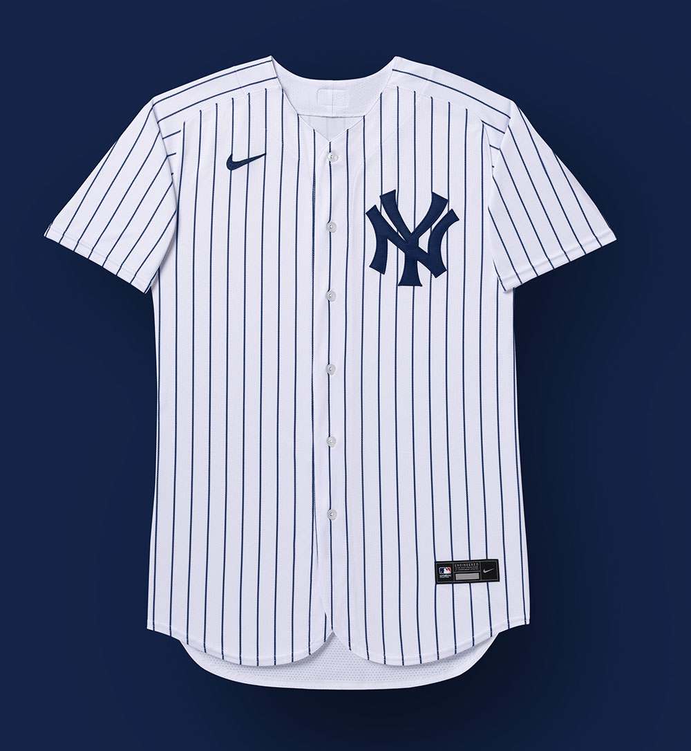
NEW YORK YANKEES
WHAT’S OLD: Pinstripes free of a manufacturer’s mark
WHAT’S NEW: A memorial patch for Hank Steinbrenner

For the 2020 season, the New York Yankees will be wearing a black oval with the initials HGS on their uniform sleeves, this patch has been added to their home white and road grey jerseys in memory of Hank G. Steinbrenner who died in April.
Steinbrenner had been running the day-to-day operations with his brother Hank since 2007, he was the oldest of longtime Yankees owner George Steinbrenner’s four children.
PHILADELPHIA PHILLIES
WHAT’S OLD: White Liberty Bell when logo is on red backgrounds.
WHAT’S NEW: Blue Liberty Bell when logo is on red backgrounds.

The Philadelphia Phillies made the most minor of changes to their overall logo and uniform package this season, and that was how their primary logo should be displayed when it is to be used on a red background. The Liberty Bell should now be blue.
Previously the club had said the Liberty Bell featured on their logo should be white when used on anything dark, this will still the case when it is used on a blue background.
PITTSBURGH PIRATES
WHAT’S OLD: Road grey jersey with arched “PITTSBURGH” lettering. Retro 1970s black and gold uniforms with pillbox caps.
WHAT’S NEW: Road grey jersey and black alternate jerseys with scripted “Pittsburgh” logo. A new black alternate cap with a double-outlined gold “P”

The Pittsburgh Pirates will have new grey road and black road alternate uniforms in 2020. Both uniforms feature the same retro-inspired scripted “Pittsburgh” wordmark across the front of the jersey, both are black with gold trim. Pittsburgh had previously worn this style of script across their road jerseys for eleven seasons starting in 1990, through three straight NL East Division championships, before dropping them following the 2000 season.

The new road uniform features the same striping at the sleeves and around the collar as what was worn last year except with that new Pittsburgh wordmark across the front. Yesterday it was rumoured that the shade of grey on the uniform would be darker but it appears to be unchanged.
The new alternate uniform, which is specifically classified as an “alternate road”, has been added at the expense of the retro throwback 1970s uniforms which had been worn for each Sunday home game the last few seasons (yes, the ones with the pillbox-style caps).

With the new alternate road uniform comes a new cap as well, the cap is similar to the other alternate cap the team wears but this one has an extra gold outline outside the “P” rather than a white one. The cap with the white outline remains to be worn with the other black jersey the Pirates will continue to wear.
SAN DIEGO PADRES
WHAT’S OLD: Navy blue. Mistakes.
WHAT’S NEW: What brown can do for you. Updated “SD” logo, the Swinging Friar returns, pinstripes!
Brown is back! Finally! After a nearly 30 year hiatus, the Padres returned to brown and as a double-retro-bonus paired it with gold, giving the team a look somewhat similar to what they wore for their first 15-or-so seasons in the big leagues.

The three new Padres uniforms include the primary home whites, the primary road browns, and the alternate road “sands” (the team also has two camouflage options but those designs, “Friar” patch aside, are basically the same as what they’d worn before).
At home the Padres will be wearing a white uniform with brown pinstripes, “PADRES” arched across the chest in a darker brown and brighter gold trim in an updated wordmark (but similar to what has been worn in recent seasons). Brown and gold trim around the collar and uniform sleeves, a new Swingin’ Friar patch laid on a yellow circle.
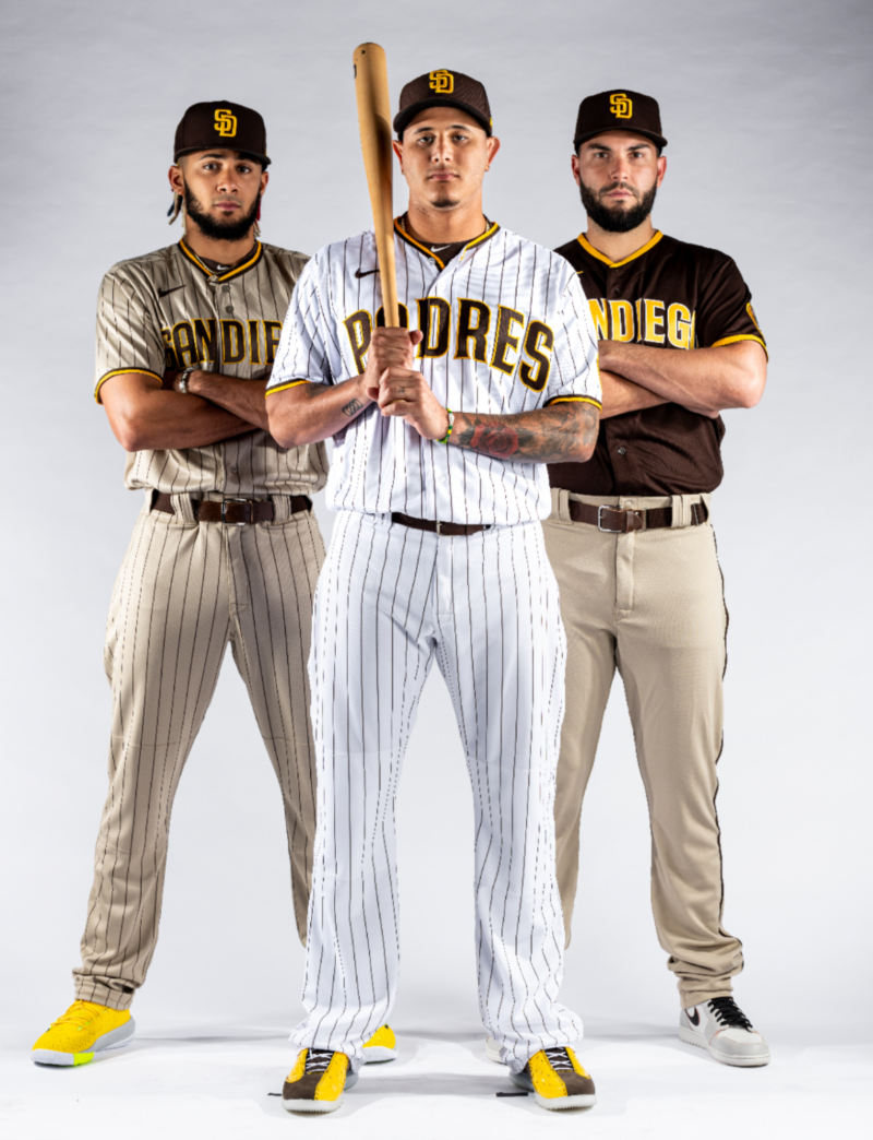
On the road, it’s brown, not grey, with “SAN DIEGO” arched across the chest in gold and white, gold trim on the sleeves and collar. The brown jersey paired with sand pants with a single solid brown stripe down the side.
To accommodate Major League Baseball’s request that a light option is available, a second road uniform was created in this new sand colour (it’s “sand”, not grey, though it looks kinda grey) with brown pinstripes. “SAN DIEGO” arched across the chest in brown with gold trim. The pinstripes carry on down the pants. The Padres are now the only team in the league to not have a “grey” uniform.
As for the logos, the primary mark is the updated “SD” rather than the new Swingin’ Friar which is classified as an alternate logo. Starting with the “SD” there were some inconsistencies with the old logo that were updated and the colour was shifted from navy blue to brown. The only way you’ll ever see the changes is to put them side-by-side.

Fortunately for you, we love doing side-by-sides. Note the serifs/points at the end of each letter are a little shorter in 2020, lines throughout the logo also line up a lot better than they did in 2019.
SAN FRANCISCO GIANTS
WHAT’S OLD: The secondary grey “SF” road jersey. Gone.
WHAT’S NEW: A patch celebrating 20 seasons at their current ballpark.
The San Francisco Giants will be celebrating their 20th season at PacBell, SBC, AT&T, Oracle Park with a special commemorative jersey patch.

The patch shows the silhouette of the statue of Willie Mays found outside the stadium and reads “20 AT 24” in orange and white within a black rectangle. “20 AT 24” references 20 years at 24 Willie Mays Plaza, the stadium’s address.
This patch will be worn on the left sleeve of each of the San Francisco Giants jerseys throughout the 2020 season.
San Francisco has also eliminated their alternate road grey jersey with the “SF” logo on it, the retro-inspired jersey was re-introduced in 2012. The Giants will have just one grey road uniform this season, the usual one reading “SAN FRANCISCO” arched in black and orange.
ST. LOUIS CARDINALS
WHAT’S OLD: Inconsistencies.
WHAT’S NEW: OCD therapy.
Did you ever notice the Cardinals “STL” cap logo was a little… off? You didn’t? Well too late, now you never will because it’s been fixed. The Cardinals synched up the top and bottom serifs of each of the letters, rounded the pointed edges, straightened the arm of the “T” — which previously had ended at an angle on both ends, reduced the thickness of the navy blue outline (to increase the negative space), all of which gives the logo a better overall balance.

This change applies to both the Cardinals red and blue caps which feature the “STL” logo.
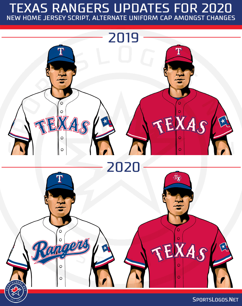
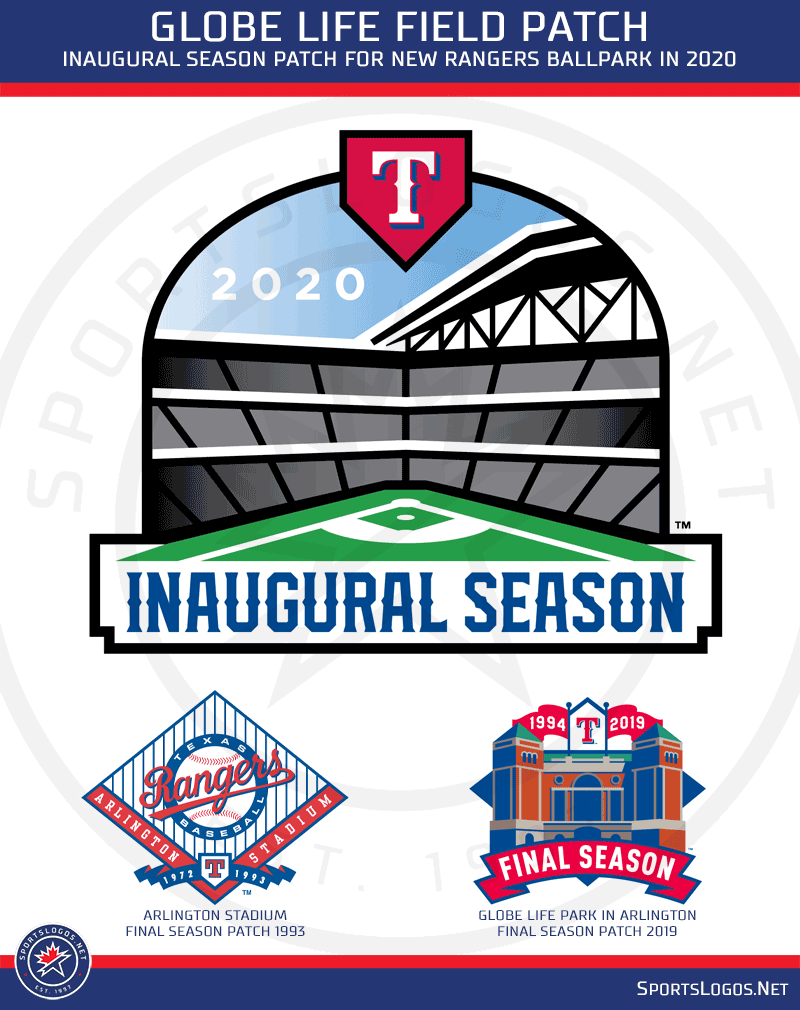
TEXAS RANGERS
WHAT’S OLD: “TEXAS” wordmark removed from home jersey.
WHAT’S NEW: Home jersey script. Powder blue uniform. Red cap with the new “TX” logo. Thicker sleeve striping (powder blue stripe added to the royal blue jersey’s sleeve). Drop shadow on player’s names and numbers. Smaller Texas flag sleeve patch. Commemorative patch for the inaugural season at Globe Life Field.
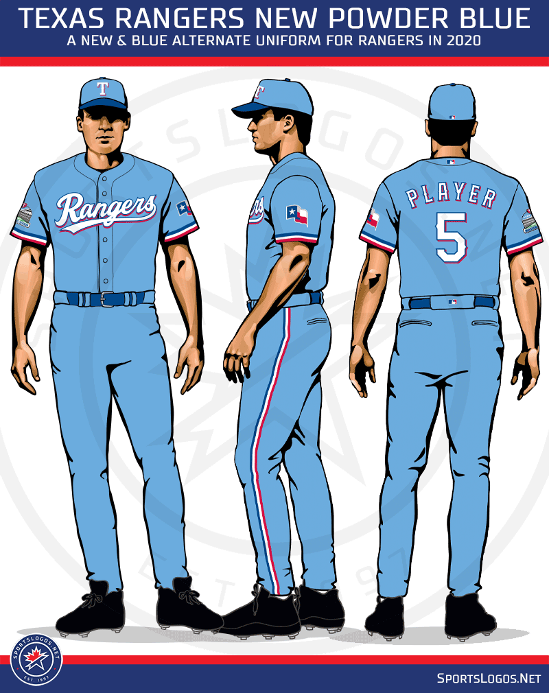
Carrying on baseball’s Powder Blue Revolution, the Rangers new powder blue alternate uniform will be worn for every Sunday home game, the Texas Rangers new powder blue uniform features a new “Rangers” scripted wordmark across the front in red, complete with matching pants and cap.
This new “Rangers” wordmark will also replace the “TEXAS” on their home white uniform along with thicker sleeve striping and a Texas flag sleeve patch which has been reduced in size. The alternate red uniform is now paired with a new red and blue cap featuring a new “TX” state map logo. The thicker sleeve striping also appears on the red alternate as it does on the road grey and blue alternate.
The Rangers are also celebrating their inaugural season at a brand new ballpark (yes, again). The commemorative Globe Life Park patch will be worn on the right sleeve of each jersey throughout 2020.
TORONTO BLUE JAYS
WHAT’S OLD: Primary logo. The shade of red. Official “alternate uniform” status of their red uniform.
WHAT’S NEW: Powder blue alternate uniform with a new navy blue cap. Tony Fernandez memorial patch. Last year’s cap logo is now the primary logo. The shade of red adjusted slightly throughout. Matte batting helmets.

Baseball’s barnstormers! The Toronto Blue Jays had no idea they wouldn’t have a home stadium this season when they introduced these new powder blue uniforms back in January. The uniform features navy blue lettering, striping, and player name/number and has been paired with a new navy blue and powder blue cap.
Toronto also swapped their primary and alternate logos, the version with the full team name inside the circle is now the alternate logo, while the logo with just the blue jay (seen on the team’s caps) is the primary team logo going forward. They’ve also slightly adjusted the shade of red, we really don’t know why.

The Blue Jays will wear a memorial patch on their sleeves in 2020, this is in honour of former Jays shortstop Tony Fernandez who sadly passed away in February. The patch features Tony’s uniform number 1 in the team’s retro font style inside a black circle.
WASHINGTON NATIONALS
WHAT’S OLD: Navy blue “USA! USA!” alternate cap and jersey. Appearing on “longest World Series drought” lists
WHAT’S NEW: “Nationals” scripted white alternate uniform. Two new alternate white-front-panelled caps. 2019 World Champions sleeve patch and celebratory gold-trimmed jersey.

The Champs made a couple of changes following their big win over the Astros last fall. There’s a new white alternate jersey which includes a scripted “Nationals” wordmark across the chest, similar to the navy blue alternate they wore during the 2019 Postseason run. This gives the Nats three white uniforms to choose from, this new one, their usual home jersey, and the patriotic “USA!” style jersey.
Two new caps were also introduced, both with white front-panels and both based off older Washington Senators and Nationals logos from the 1950s and 1960s. One cap, the one featuring the U.S. Capitol Dome, was worn as their batting practice cap in 2019 but is now a bonafide “alternate” regular season option.

Washington will also celebrate their championship with a year-long patch saying so on their sleeves, as well as the customary gold-trimmed jersey which we presume they’ll wear on opening day (though we’re really not sure, I mean, why *wouldn’t* they wear it?).

That’s it! All that’s left to do now is (finally) play ball! Enjoy it, sixty games, wild… it’ll be a season that we’ll never ever forget no matter what happens here on out.
Thanks for reading, let’s hope for good health to all players and team/stadium staff as they try to complete the year during these incredible circumstances.
Related stories:
 All Pirates Wearing #21, Rest of MLB Wears Patches in Honour of Roberto Clemente
  Pirates “Rewrite the Script”, Unveil New Road, Alternate Uniforms
  Studio Stories: Modernizing the Brewers Ball-in-Glove Logo

