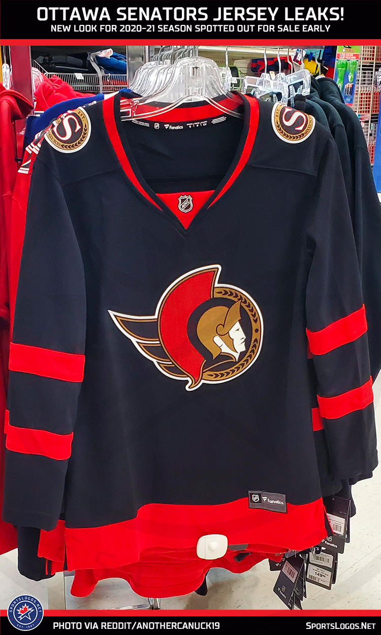
There was another leak of, what is probably, the new Ottawa Senators rebranding yesterday.
While previously we’d seen photos of merchandise courtesy the official NHL Shop (that’s a good source, right?), now we have our first look at the new uniform thanks to user “anothercanuck19” on Reddit.
The leaked photo shows a Fanatics-branded replica women’s jersey, so it’s on a cut that’s not quite the same as what the players wear on the ice (note the collar style). The design matches what my sources had earlier described to me as to what to expect for the Senators uniforms in 2020-21, which is a design basically identical to what the club wore in the 1990s.
Before we get into all that, here’s the leaked photo:

Like I said, that collar doesn’t line up with what the players wear on the ice. Again, this is because it’s a Fanatics replica women’s cut. This collar style has been used for the replica women’s jersey for several years now:

See?
As for the design of the jersey itself… It feels familiar, right? It’s almost exactly the same jersey as what the team wore on the road during their first few seasons in the 1990s. From this, we can safely assume the white version of this design will also match what the club wore during this period.

You gotta think they’d go with the 1993-95 style of player numbers right? I mean, there’s a reason why they changed it after just one season.
And yes, you’ll note I said it’s “almost exactly the same”, what’s changed? Well, jersey cut aside, the logo has been altered ever-so-slightly from red trim in the cape in the original logo to a gold trim in 2020-21 (regular readers of this site will already know this as we covered it a couple of months ago). A side-by-side:

While the move to the original (expansion) Senators jersey is an upgrade over what the team has been wearing since 2007-08 I’m still a bit disappointed overall. A perfect opportunity for the club to give a bit of a modernization to what was, to be blunt, a very dated logo and uniform design from 30 years ago.
Just take a look at what the Buffalo Sabres did recently. Yes, they also threw it back to an old design (one much older than the Senators are about to), but they at least cleaned up the logo a bit, fixed the problems that long existed with the old design while also retaining the overall colours and design. What the Sabres did this is year is how you effectively evolve an older brand to work well in modern times. Compare that to what the Senators appear to be doing, which is just going ’round in circles.
I’ll reserve my judgement until we see the actual jerseys, I dunno, maybe the embroidery technique is interesting and adds some life to it. We’ll see.
Share your thoughts in the comments.


