Alright everyone, act surprised.
Okay, ready?
The Ottawa Senators released their new logo today and it’s basically the same as what they wore in the ’90s but the cape is now gold instead of red!
You didn’t act surprised.
Well no, of course, you weren’t, this logo was leaked on several different occasions over the past month-and-a-half, the team today simply made official what we had all already long known.
As we saw then, the logo is the same as what was used from 1995-2007, the two-dimensional version of their Centurion logo placed in a black circle. This the result of several years of focus group tests, consulting the season ticket holders, going back and forth between leaning towards the “O” and going in a totally new direction. You could say it’s slightly disappointing despite the massive upgrade versus what they had been using since 2007.
Check out the Ottawa Senators All-Time Logo History

I dunno, update the guy’s face or something a bit. Evolve!
Ultimately all they did was change the cape from red to gold and rounded a few of the corners at the top and bottom. I can’t even be sure the colours have changed (as they appear to have here) because we haven’t yet seen the official shades.
There was some news, however, from all this. The team will unveil their new uniforms on October 6th at the 2020 NHL Draft, we also learned that there will be no alternate uniform in 2020-21 and that the striping on the jerseys will be slightly different than what we saw in the ’90s.
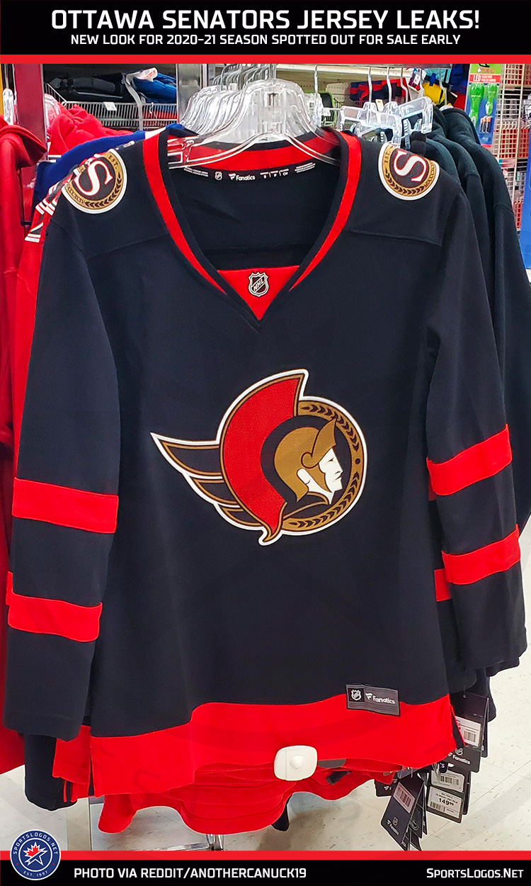
That last fact basically confirms the jersey leak we saw earlier this month which showed the new logo on a black jersey with red striping, the waist stripe placed lower than originally worn.

It’s a return to an original look for the Senators, joining the Buffalo Sabres this off-season in embracing an expansion design.
While Ottawa saw some pretty awful years with this set, they also experienced some awful pretty moments, such as a trip to the 2007 Stanley Cup Final, their only trip past the third round since the team joined the league in 1992-93.


