
The Toronto Raptors new uniform for 2020-21 (which we first reported on back in the summer) leaked earlier tonight courtesy a photo posted to Reddit. My sources have confirmed this photo to be legit.
It was bound to happen.
As we described at the time, the new look features a chevron across the chest similar in construction to the jersey worn as the Raptors clinched the 2019 NBA Championship. At the time of our post, that was the only real detail we had.
Thanks to the photo we now know the chevron is black on the red Icon jersey (rather than white, as it was in ’19), the team name is laid out within the chevron following the shape in red letters trimmed in white. Below the chevron is the player number in black with white trim.
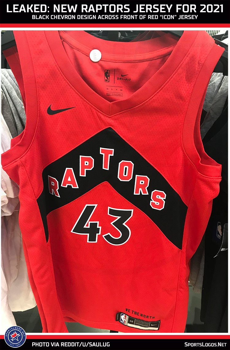
There’s no striping at either arm, nor is there any on the collar or up the sides. Just the chevron across the front. The team’s motto of “WE THE NORTH” is again in the bottom left by the jock tag, it’s no longer positioned upside-down as it was with the previous uniform design.
As of now, it’s only the red Icon uniform that’s been leaked though we can speculate on the Association style. White with a red chevron, probably “RAPTORS” in white within it trimmed in black and a black number below with red trim. Again, that’s speculation but really, what else could it be?
Toronto Raptors logo and uniform history
I can’t say I’m too thrilled about this design now that I’m seeing it on an actual uniform, while I get that the team wants to run with its own unique look, one that will be forever etched into the memories of Raptors fans due to the championship… this just ain’t it. As always I’ll reserve my final judgement until I see it in action on the court, but so far, not a fan.
The now previous style, which had been worn since 2015 and was certainly nothing exciting, was certainly a better look than this. That jersey included the chevrons as a striping pattern up each side, a nice way of including an element that the team has used since 1999. That they had also flipped them to instead point up (to the north) was a fun little nod to the team’s location and motto. Change the lettering and numbering on that jersey from plain black to red with black trim and I think we could’ve called it a day.
This isn’t the only change coming to the Raptors for 2020-21, in addition to the three other new jerseys (“Association”, “Statement”, and “City”) joining the red “Icon” jersey you see in this post, the Raptors will also have a new logo. We reported on it a few weeks ago, but in case you missed it you can see the new logo for the team here.
Related stories:
 Back in Black and Gold… Again, Raptors Unveil 2021 City Uniform
  Spurs, Raptors Among Seven New NBA Jersey Leaks
  Heat, Warriors Latest New 2021 NBA Jerseys Leaked
  Photos of LA Lakers New “Classic” Jersey for 2021 Leaks
  Return of the Pinstripes! Charlotte Hornets Unveil New Uniforms

