Adidas and the NHL continue their sneak peeks into their new Reverse Retro jersey series, what we believe is the addition of a third (or fourth) uniform to all 31 of the league’s teams, throwing back to an old design but re-colouring or tweaking the designs to give them a more modern look.
Throughout the day Thursday, Pacific Division teams were releasing teaser photographs showing glimpses of their Reverse Retro designs, this confirmed a lot of the guesses and theories we had yesterday (and proved wrong a few of the others, it happens!)
A look at some of the teaser photos released today, check out the video embedded above for some more of our analysis plus predictions as to what each of these designs will be based on.

The Anaheim Ducks will bring back their original Mighty Ducks logo on jade/teal shoulders and black trim, the player’s name on the back will be in a scripted font similar to their 1996 Wild Wing alternate uniforms which this set is most definitely based off of.

The Arizona Coyotes are sporting a purple jersey with this gecko logo on the shoulder, they last wore this logo on the shoulder of their green alternate uniforms of the late ’90s which featured the Kachina logo head on the chest and a desert landscape across the bottom. Could this be a purple version of that design? It sure seems like it.

Vancouver is sticking with the green and blue, but based on the year teased yesterday (2001) and the green shoulders here it looks like the Canucks are going to be bringing back their red-to-blue gradient alternate uniforms (of course, re-coloured). A surprise as this was a uniform we thought would be buried and forgotten in Canucks history.

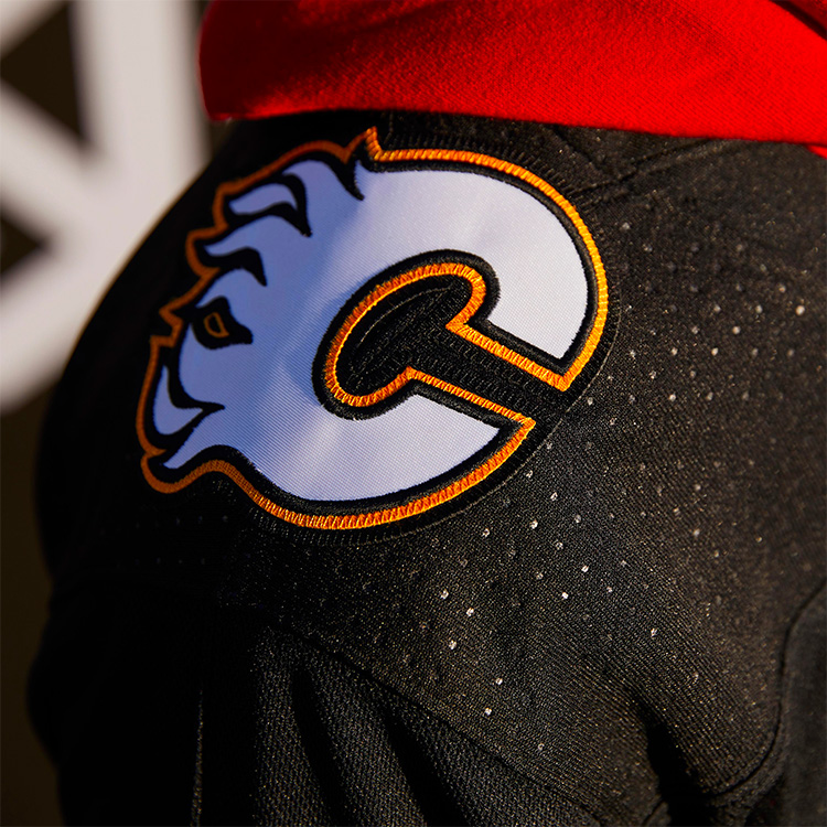
The Calgary Flames teased this photo of the white version of their logo on a black jersey. Yesterday they said 1998 was the year they were throwing back to which suggests the old alternate “Blasty” the horse uniforms — however, those uniforms were already black, so what are they doing here? Perhaps new striping? The Flaming C on that jersey was originally red, not white as shown above, perhaps that’s a clue for what’s to come.

Vegas will be throwing back to 1995 (yes, we know) but all reports tell us that they’ll be paying tribute to the old IHL Las Vegas Thunder. The teaser photo above shows a red jersey with the team’s primary logo on the shoulder, suggesting the alternate logo goes on the chest.

The Los Angeles Kings are going back to their original purple and gold colour scheme but the striping (and the year) looks more like their black and silver template, so it looks like we could have a combination of eras with the Kings wearing their black and silver Gretzky-era jerseys re-coloured in purple and gold.

Between this and the teaser yesterday, we’re not expecting much of a surprise from the Edmonton Oilers. Essentially a more orange-heavy version of their original 1979 home whites. The only variable, is the logo on the front going to be orange too? They used to do that when they were in the WHA and it could be enough to make this Reverse Retro a little more worthwhile.

Finally, the San Jose Sharks who appear to be wearing a silver or grey jersey with teal and black trim. They’re throwing back to 1998 so it’ll likely be that set with the funky striping up the arms, a design I honestly forgot even existed, the team certainly seems to have had no interest in throwing back to that design up until now.
We expect the other three divisions to be released on the daily between now and the big reveal date of Monday, November 16th.


