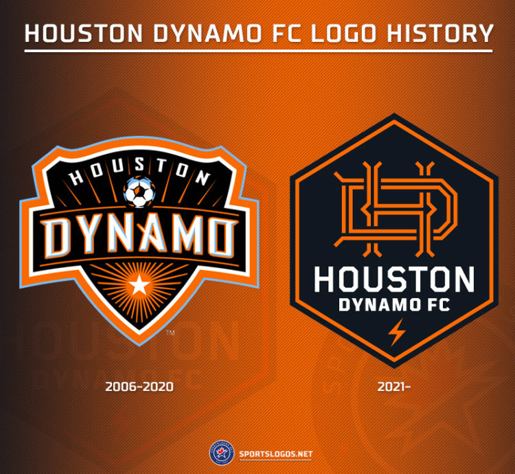
Major League Soccer’s Houston Dynamo FC this afternoon unveiled their new primary logo, along with a new logo for the National Women’s Soccer League’s Houston Dash.
Both logos feature a similar design, an orange split-letter “H” on a black hexagon — the Dynamo adds a “D” into their design and the Dash instead incorporates “Space City Blue” as a third colour.
The logos are displayed on a hexagon – a six-sided shield – to represent the six wards of Houston (the Dynamo say this is also for their first season of 2006, while the Dash have added that it’s “the strongest shape in nature”). The lettering features channels for Houston’s bayous, a lightning bolt at the bottom of the Dynamo logo to note the city’s status as “Energy Capital of the World”. The full explanation from the team:

This marks the first logo change in both the team histories of the Dynamo and the Dash, the Dynamo as you may have forgotten actually started as the Houston 1836 but changed their name and logo before even playing a game.

And here’s a good look at the new Houston Dash logo, side-by-side with their original logo which had been in use for eight seasons before being replaced earlier today:

The Dash swapped out the lightning bolt for a star, this is in reference to Houston’s “Space City” nickname and history.


