A social media post circulated earlier this week claiming that the Super Bowl this year would be *the very first* in the history of the game in which both teams used the exact same primary colour. The claim was then verified as true, this courtesy a fact check written up by USA Today which was then spread throughout their network of news sites.
Here’s the original Tweet which was posted by sports business guru @DarrenRovell:

And the USA Today backing it up as true:

So who’s gonna be the one to tell ’em?
Alright, I will.
Both facts in this claim are very wrong. I can forgive Rovell for this, people make mistakes all the time, especially on Twitter. But the fact-checkers at the USA Today? How did you whiff so badly on this one? It’s literally your job to confirm or deny stories, and this ain’t exactly a story in which the answer was hidden anywhere.
First, the claim that this is the first Super Bowl to ever feature the same primary colour for each team.
Wrongo.
With special thanks to TruColor.net (which is *by far* the best and most accurate resource for sports team colours out there), it’s happened four times in the past, and each time it was with teams who use the same shade of blue — this includes three instances in the past ten years alone:

And yes, I can already hear you screaming at your screen, the Rams did wear throwbacks (with a slightly different blue) at Super Bowl LIII, and yes, the Broncos did wear orange jerseys at Super Bowl XLVIII. Sure, fair. But let’s not forget the claim was that the *primary colour in both team’s logos* was the same, not their uniforms. Despite what they wore in those games, the primary colour in both team’s logos was Pantone 289. And fine, even if you want to ignore those two despite the fact that they meet the criteria, there are still those *two other* examples.
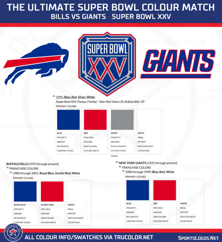
My favourite exact colour match at the Super Bowl was for Super Bowl XXV between the Buffalo Bills and New York Giants. Not only do the Bills and Giants have exact matching primary blues (287), but they have exact matching secondary reds (186). If that wasn’t enough of a match for you, the Super Bowl XXV logo also used the exact same shades of blue and red. And again, serious props to TruColor.net for this historical colour information:
This one Super Bowl game alone renders the entire claim extremely incorrect.
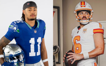
But we’re not done yet because yes, there was another error with this fact. I really don’t know how the USA Today’s “Fact Checkers” missed this one — the Tampa Bay Buccaneers and Kansas City Chiefs don’t even use the same shade of red! Not even close!
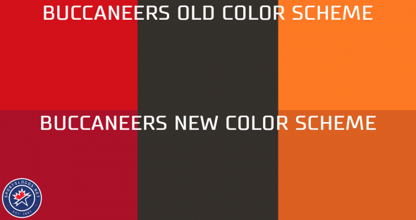
Just take a look at the official team stylesheets from this season, look how much darker Tampa Bay’s red is compared to Kansas City:

Now if we were playing this game a year ago, yes, absolutely, we’d have a match (not the first match in Super Bowl history, but you already know that). Tampa Bay used 186 up until the end of the 2019 season but they changed their red in April of 2020. However, back here in 2021, the Chiefs use Pantone 186 and the Bucs use Pantone 187.
Not a match, the board goes back.
The Bucs’ colour change was well documented when the team announced their new logo and uniform set last year. At the time we even made this graphic showing a pretty clear change to their colour scheme:
Our ruling: Are You Kidding?!
Not only have several previous Super Bowls featured two teams with the exact same primary colour in their logo, but these two team’s logos don’t even use the same exact colour! We rate this claim as DOUBLE FALSE.
RELATED LINK: Tampa Bay Buccaneers complete logo history
RELATED LINK: Kansas City Chiefs complete logo history
Special thanks to TruColor.net for their help with the research on this story.
Related stories:
 All The New NFL Uniforms And Logos For 2022
  Super Bowl LVI Uniform Matchup Possibilities
  Kansas City Chiefs Add “Run It Back” To Uniform For Super Bowl LV
  Every Super Bowl Uniform Matchup Ever: Cartoon Edition
  Bills-Chiefs, Bucs-Packers, Who’s Wearing What in the Conference Championships
  What Uniforms will we see in Super Bowl LV?