
We’re halfway through a parade of ten Appalachian League rebrands, with the fifth announcement in four days coming today: The erstwhile Greenville Reds are now the Greenville Flyboys, a tribute to a historic airfield that existed on the site where the team’s stadium stands now.
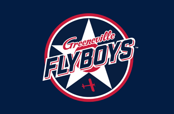
“Pioneer Park, Tusculum University, literally sits on what used to be an airfield in 1947, obviously shortly after World War II,” said Jeremy Boler, Vice President with Boyd Sports, during an unveiling ceremony. “With that, we wanted to pay some tribute to that and our military and our fallen heroes.”
The star behind the logo, per Boler, “is the original Army Air Corps star during World War II,” with a bit of a tweak to match the team’s colors.
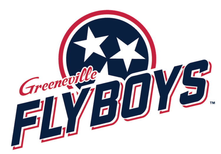
Speaking of stars, while the logo features a military theme, it definitely has a Tennessee flare. Many of the logos feature an element common to the state’s flag.
“Gotta have the tri-stars,” Boler said. “This is Tennessee, people.”

We’re waiting for clean images of some of the logos, but screen grabs from the unveiling online show that the home cap will have a single star, a la the Army Air Corps of the 1940s, and the road cap will feature Tennessee’s tri-stars.

The team also unveiled uniforms this afternoon, saying that they’ll be the “only team in the league with that 1940s cream color.”
The new-look collegiate summer Appalachian League will debut June 3.
Related stories:
 Danville Otterbots unveil “cold” uniforms
  Appalachian League Rolls Out the Danville Otterbots
  Appy League unveils Bluefield Ridge Runners
  Appy League’s Kingsport Axmen pay tribute to Daniel Boone
  Appy League introduces Elizabethton River Riders
  Appy League introduces Bristol State Liners in flurry of rebrands
  Stirring Up Debate: Introducing the Burlington Sock Puppets
  Appalachian League changes mean new team names