

With the 2021 MLS season set to kick off on Friday, April 16, let’s take a look at the new kits that fans will see on the pitch this year …
ATLANTA UNITED
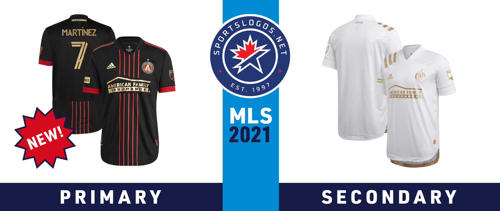
To celebrate their fifth season in MLS, Atlanta United has unveiled a new primary jersey, which they are calling the “BLVCK Kit.” It features five thin red stripes down the front of the black jersey, which is a departure from previous home kits that featured red and black stripes of even widths. The cuffs and adidas shoulder stripes are red, while the collar is black. The motto “UNITE & CONQUER” appears on the back near the collar.
Atlanta’s secondary jersey remains from 2020, a mainly white shirt with gold accents.
AUSTIN FC

The newest club in MLS, Austin FC, unveiled its first-ever primary kit back in November 2020, which features green and black vertical stripes. That motif is carried over from the club crest, which depicts two intertwined oak trees that represent the club and the community of Austin.
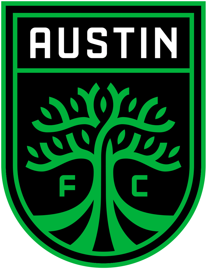
Austin FC’s secondary jersey is dubbed the “Legends Jersey” and features green accents on a white shirt. According to the club’s website, the jersey “celebrates Austin FC’s early supporters who helped build the club from the ground up.” A jock tag celebrates the club’s first supporters’ group, Austin Anthem, as does the collar tape.
Cooler and drinkware manufacturer YETI, which is based in Austin, appears on both jerseys as the main sponsor.
CHICAGO FIRE

Chicago Fire, a member of MLS since 1998, is the only club other than Austin FC to introduce two new kits for the 2021 season. Dubbed the “Lakefront” kits, they are inspired by the city of Chicago. The primary jersey is navy blue with red accents. The words “Bold. Brave. Big-Hearted” appear on the neck tape inside the collar as a tribute to the people of Chicago, while the four six-pointed stars from the city flag appear on the jock tag.
The secondary kit is mainly white, with a light blue pattern on the front that depicts the same six-pointed stars from the city flag. The neck tape on this jersey reads, “Make No Little Plans,” a quote from storied local architect Daniel Burnham, and the jock tag includes a red outline of Soldier Field, the Fire’s home stadium.
FC CINCINNATI
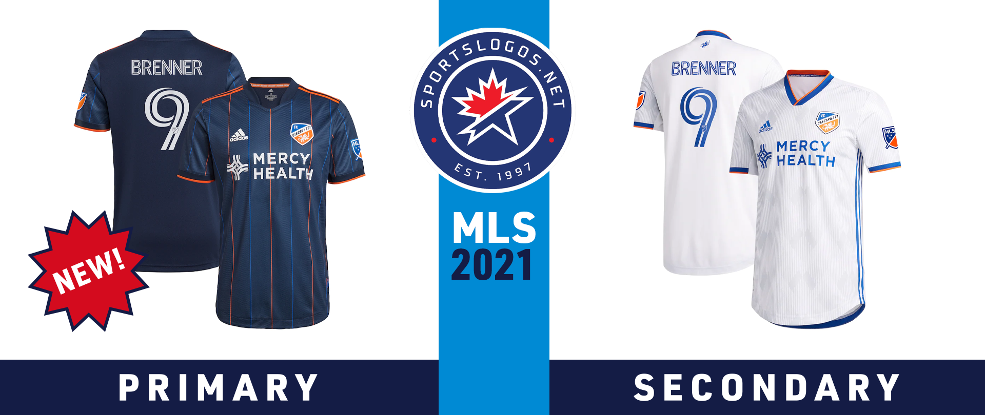
The new primary jersey for FC Cincinnati celebrates the opening of the club’s new West End Stadium, slated for mid-May 2021. The jersey is navy blue with orange and royal blue pinstripes, which, according to MLSsoccer.com, are “a nod to the exterior LED Fins on the West End Stadium exterior.” The city’s motto, “Juncta Juvant” (“Strength in Unity”) is printed inside the collar, while the jock tag features the West End Stadium logo along with the Roman numerals “MMXXI.”
The away jersey remains from 2020, a white shirt with a tonal pattern and blue and orange accents.
COLORADO RAPIDS

The scenic beauty of the Rocky Mountains inspired the Colorado Rapids’ new secondary jersey for 2021. Dubbed the “Class 5” kit – referring to a scale used to rank the difficulty of mountain climbing routes, where “Class 5” is the most difficult – the shirt is a pale mint green, with topographic maps of six of Colorado’s highest peaks embossed on the front. The green accents harken back to the colour scheme the Rapids used when they first joined MLS in 1996.
The Rapids’ primary jersey from 2020 carries over to 2021, a burgundy shirt with tonal diagonal stripes down the front and sky blue accents.
COLUMBUS CREW

Another new jersey inspired by a new stadium will take the field in 2021, this time for FC Cincinnati’s in-state rivals, the Columbus Crew. The Crew’s secondary kit features a grey and white pattern that mimics the architecture of New Crew Stadium, which is set to open in July 2021. The back of the jersey is solid white, and it features black and yellow trim on the cuffs and collar.
The Crew’s primary kit from 2020 continues to 2021, a primarily black jersey with a tonal dot pattern on the front and yellow accents.
FC DALLAS

FC Dallas is paying homage to the history of soccer in North Texas with their new secondary kit. The base of the jersey is powder blue, the same colour worn by the Dallas Tornado, a team founded by Lamar Hunt that played in the North American Soccer League from 1967 to 1981 (the Hunt family owns and operates FC Dallas). It has red and blue specks on the front and sleeves, representing FC Dallas’s colours, the state flag of Texas, and “the fan support FC Dallas receives from a variety of backgrounds across North Texas.” It also features blue and red trim on the collar and shoulders.
The primary jersey from 2020 will continue to be worn in 2021. The jersey is red with blue stripes of increasing width down the front, and white adidas stripes wrapping over the right shoulder.
MTX Group, Inc. – which describes itself as a “global implementation partner … that enables organizations to modernize their business with cloud technologies” – comes on board as FC Dallas’s main jersey sponsor in 2021, replacing Advocare, which now moves to the right sleeve.
D.C. UNITED
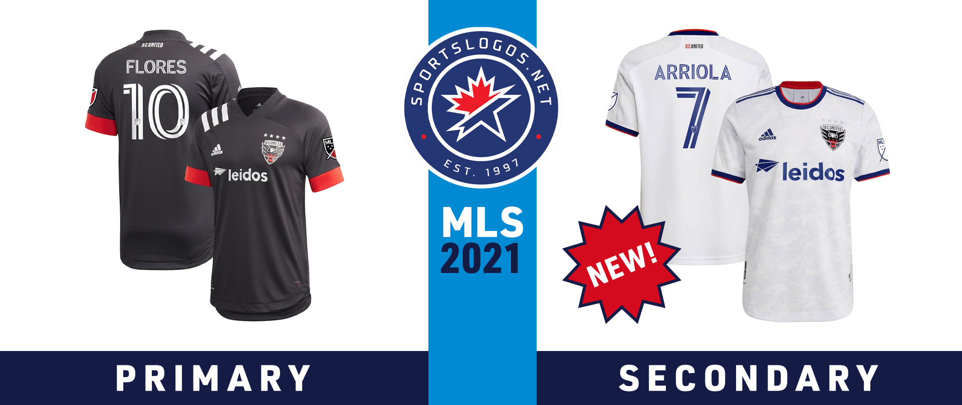
D.C. United is drawing inspiration from the national monuments in and around Washington, D.C., for its new secondary kit for 2021. The kit features a tonal marble pattern on a white background, evoking the strength and resilience of the material used to construct many of those monuments. It has red and blue trim around the collar and cuffs, and a jock tag that reads “Unite the District.”
The primary kit from 2020 carries over to 2021, a primarily black shirt with red cuffs and white adidas stripes wrapping over the right shoulder.
HOUSTON DYNAMO

To go along with a simplified crest, Houston Dynamo FC have unveiled a simplified primary kit. The jersey is solid orange with black and silver trim around the collar and cuffs. The club’s motto – “Hold It Down” – is printed inside the collar. On the back near the collar, there is a black, orange and silver version of the Texas state flag inside a hexagon.

The new Dymano logo features an interlocking HD monogram overtop the team name and an orange lightning bolt inside a black hexagon.
The secondary kit from 2020 remains almost untouched, with the only change being the new logo added to the left chest.
LOS ANGELES FOOTBALL CLUB

LAFC’s new secondary kit for 2021 is what the club is calling the “Heart of Gold” kit. It is a pale gold colour with black accents, and the words “LOS ANGELES” stitched into the cuffs (or printed on the cuffs on the replica version). It is meant to pay tribute to essential workers in health care, emergency services, agriculture and other areas in the Los Angeles area.
The base design of the primary kit remains the same as 2021, a black shirt with tonal black stripes on the front and gold accents. The main jersey sponsor has changed, however, with FLEX Power Tools taking that bit of real estate over from YouTube TV. Target remains a sponsor on the right sleeve, while the logo for food delivery service Postmates will appear on the left sleeve.
LOS ANGELES GALAXY
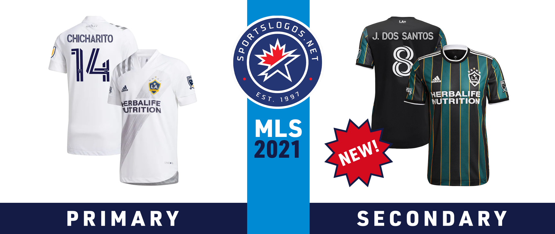
Another original MLS club is taking cues from its past for its secondary kit in 2021. The Los Angeles Galaxy unveiled the new kit in February, which features vertical stripes the black, tech green and collegiate gold colour scheme the club first wore in 1996. The club’s website says the kit is “a celebration of the fans who have been with the club since day one.”
The primary kit from 2020 remains in use for 2021, a predominantly white jersey with a silver brush stroke sash, silver adidas stripes on the right shoulder, and navy blue names and numbers.
INTER MIAMI

Inter Miami didn’t stray too far from their previous secondary kit when they unveiled their new kit for 2021 in February. The jersey remains predominantly black with pink accents. However, the new iteration does feature an embossed palm tree pattern – palm trees signify “unity, triumph, longevity, victory, royalty and honour,” according to the team’s website – and has blue accents on the collar tape and inside the hem, which are tributes to nearby Biscayne Bay.
The primary kit from 2020 remains in use, a white jersey with a henley collar and pink accents. Since making its debut in 2020, Inter Miami has not had a main jersey sponsor, but the South Florida Sun-Sentinel reported in July that the club is in discussions with “multiple companies” for a deal for that space.
MINNESOTA UNITED
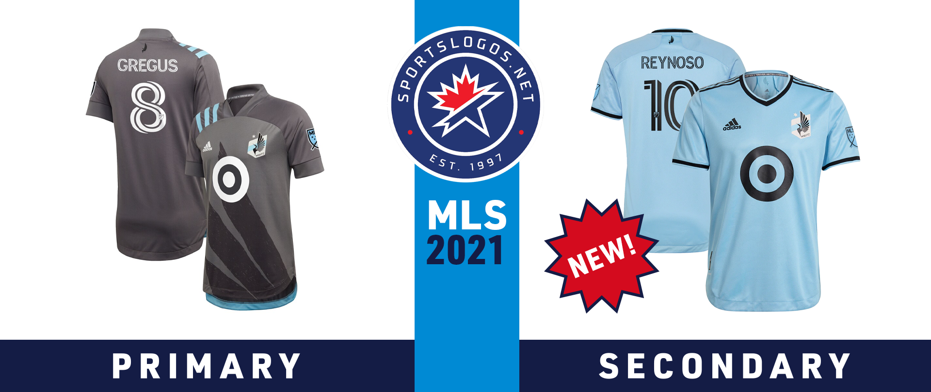
Minnesota United didn’t go chasing waterfalls; they stuck to the rivers and the lakes that they’re used to. The club’s new secondary kit for 2021 is inspired by the Mississippi River that flows through the state. While blue has been part of MNUFC’s colour scheme for years, this is the first time it has been used for anything more than accents. The kit features an embossed ripple pattern, as well as black accents on the collar and cuffs. The loon from the club’s crest appears in black on the back near the collar.
MNUFC’s primary “Wing Kit” from 2020 remains in use for 2021. It is predominantly grey with blue accents, and features the loon wing from the club’s crest writ large across the front. The club motto “Forever United” is printed on the collar tape of both jerseys.
CF MONTRÉAL

The team formerly known as the Montréal Impact have a new name and a new primary kit for 2021. CF Montreal unveiled the kit in February, which is predominantly black, with the snowflake pattern from the crest embossed on the front and sleeves. It has blue accents on the shoulders, collar and cuffs – a shade of blue that is darker than what the club previously used.
The team rebranded as Club de Foot Montréal in January 2021, introducing a new circular crest that uses Ms and arrows (representing the city’s Metro subway system, according to MLSsoccer.com) to form a snowflake. The crest also features two fleurs-de-lys to represent the province of Quebec and a blue border to represent the St. Lawrence River, which surrounds the island of Montréal.
The secondary kit remains the same as in 2020, save for the new crest. It is mainly gray, with white pinstripes and black accents. The jock tag includes an outline of Quebec.
NASHVILLE SC

Like Inter Miami, Nashville SC is also headed into its second season in MLS. And like Inter Miami, Nashville SC didn’t stray too far from their original secondary kit with the new version for 2021. The kit remains dark blue with yellow accents. The biggest change, however, is the N pattern from the club’s crest that is now embossed on the front and sleeves. The jersey also has an outline of the state of Tennessee on the jock tag, and a soundwave pattern on the back near the collar depicting supporters’ groups saying “Nashville’s Blue and Gold.”
The club’s “Forever Gold” home kit remains in use for 2021. It is mainly yellow with blue accents, and an inaugural season logo in the jock tag space.
NEW ENGLAND REVOLUTION

With their new secondary kit for 2021, the New England Revolution are paying tribute to the supporters who have turned Gillette Stadium into a fortress for the past 25 years. The kit is mainly white and features a pattern that is “inspired by the block work of American Revolution Era war forts in the New England area,” according to the club’s website. This pattern also references The Fort, the dedicated supporters’ section at Gillette Stadium. The kit features navy blue accents on the left side of the shirt and sky blue accents on the right, as well as a New England flag on the back near the collar, and a monochromatic crest.
The New England flag also features in the same spot on the Revs’ primary kit, which carries over from 2020. It is mainly navy blue, with a white brush stroke across the front and white adidas stripes wrapping over the right shoulder.
NEW YORK CITY FC

New York City FC has gone “Bronx Blue” with its new primary kit for 2021. The kit features the club’s signature powder blue colour with white accents. Down the front of the jersey are embossed stripes that contain the ‘NYC’ monogram from the club’s crest. The flag of New York City appears on the back near the collar.
The secondary “Gotham Kit” from 2020 carries over to 2021. It is navy blue with white accents, and a pattern on the front that is inspired by the architecture of the Brooklyn Bridge.
NEW YORK RED BULLS
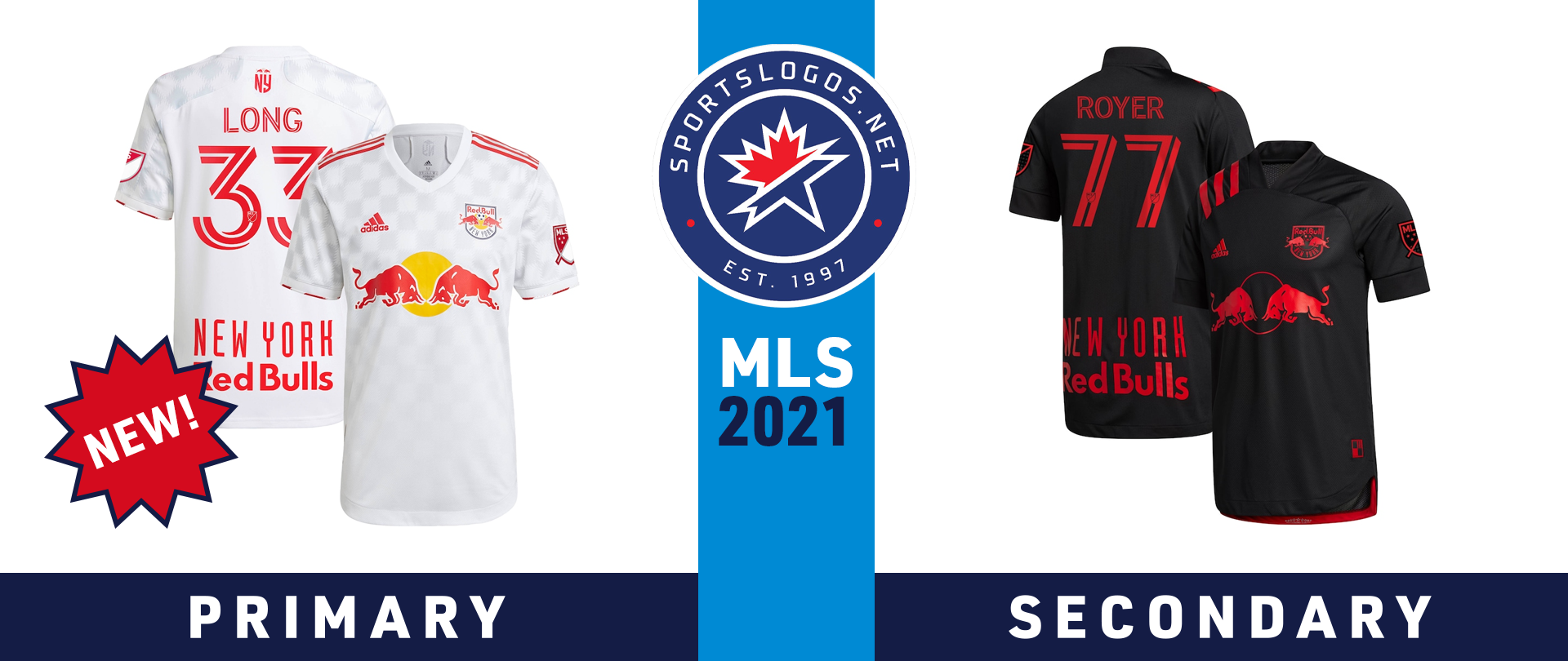
The New York Red Bulls’ new primary “1Beat” jersey for 2021 is predominantly white with red accents, but it does feature a tonal checker pattern across the front and sleeves. The collar is white, while the trim on the cuffs alternates between red and white. The monogram on the back near the collar features the letters “NY” beneath the two charging bulls and soccer ball from the team’s crest.
The team’s “Dark Mode” secondary jersey from 2020 carries over to 2021. It is mainly black with red accents, an homage to the colours the club wore when it was known as the New York/New Jersey MetroStars. The jock tag also features a pattern reminiscent of the original MetroStars crest.
ORLANDO CITY
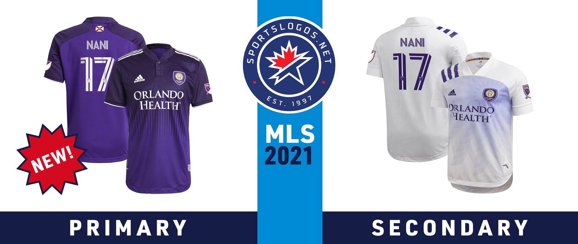
Orlando City unveiled their new primary kit in March, dubbing it the “Thick N Thin” kit. The transition from a dark shade of purple to a lighter one is meant to represent “a transition to a new era,” as well as pay tribute to the fans who have stuck with the club since it began. The shirt features a purple henley collar and white trim on the cuffs and shoulders. The state flag of Florida appears on the back collar, while the jock tag reads, “Through Thick & Thin.”
The club’s 2020 secondary kit continues to be used in 2021. It is predominantly white with purple adidas stripes wrapping over the right shoulder, and the sun/lion mane shape from the club’s crest radiates out across the front of the jersey.
PHILADELPHIA UNION
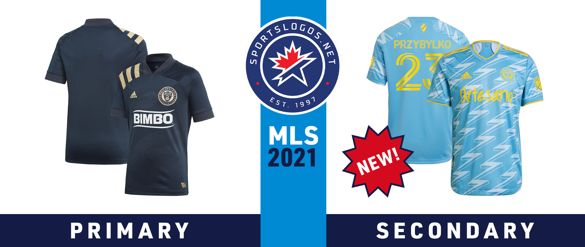
The Philadelphia Union turned to their fans not only for inspiration for their 2021 secondary kit, but also for the actual design. The club engaged a group of fans known as the Union Creators’ Collective to design the jersey from start to finish. This led to the introduction of powder blue and bright yellow – two shades the club had never used before, but are rooted in the flags of Philadelphia, New Jersey and Delaware – and the lightning pattern that covers the front and sleeves. The kit also features two tributes to Benjamin Franklin: a kite-and-key icon on the back collar, and the quote “Energy and persistence conquer all” on the neck tape.
The primary kit from 2020 carries over to 2021. It is navy blue with the snake from the Union crest embossed on the front, and gold adidas stripes wrapping over the right shoulder.
The club continues to sport different sponsors for its different jerseys. Bimbo Bakeries’ logo appears on the primary kit, while Artesano, a subsidiary brand of Bimbo Bakeries, appears on the secondary.
PORTLAND TIMBERS

The Portland Timbers’ new primary kit for 2021 draws inspiration from two past jerseys: their inaugural kit from 2011, which featured two green tones split down the middle and chevrons along the split; and their hooped primary kit from 2019, which introduced a darker shade of green into the club’s colour scheme. The 2021 kit features a green henley collar and gold accents on the cuffs and shoulders. The jock tag reads “Soccer City USA,” while “King of Clubs” is printed inside the collar – a nod to a tifo created and displayed by supporters in 2011.
The secondary kit from 2020 remains in use in 2021. It’s predominantly white, with green collars and cuffs, thin green hoops across the front, and gold adidas stripes wrapping over the right shoulder.
The Timbers have also added social media app TikTok as a sleeve sponsor this year. Alaska Airlines remains the main jersey sponsor.
REAL SALT LAKE
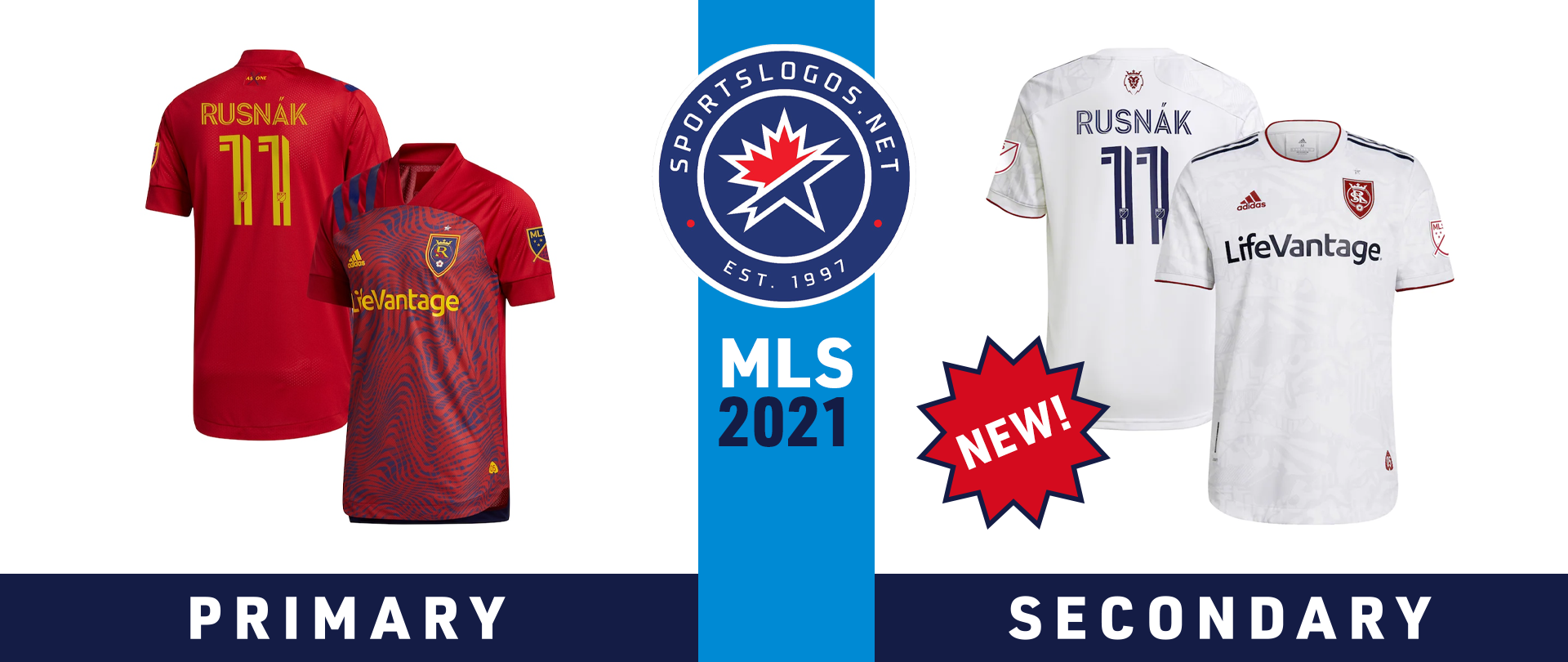
Supporters are the inspiration behind another secondary kit for 2021, this time for Real Salt Lake. The new kit is predominantly white, but includes a tonal pattern that “features graphic elements of Utah’s natural surroundings, iconic club imagery and the punk attitude of Real Salt Lake’s most avid supporters,” according to MLSsoccer.com. There is red trim around the collar and cuffs, blue adidas stripes on the shoulders, and a lion icon on the back collar. The jersey also features a monochromatic red crest and an “05” jock tag, commemorating RSL’s first season in MLS.
The primary kit from 2020 carries over to 2021. It is predominantly red, with blue wave pattern inspired by Utah’s topography. Blue adidas stripes wrap over the right shoulder.
SAN JOSE EARTHQUAKES

The San Jose Earthquakes are turning back the clock for their 2021 primary kit, which pays homage to the Quakes team that won the franchise’s first MLS Cup championship in 2001. The jersey is mainly blue – ending a streak of black primary kits dating back to 2016 – with white bars outlined in black running down the sides, and black and white accents on the collar and cuffs. The neck tape reads “2001 MLS CUP CHAMPIONS” while the jock tag displays the date of that championship victory: Oct. 21, 2001.
The club’s secondary kit was actually their primary kit last year, predominantly black with a blue block and stripe on the chest. The 2020 secondary kit, which was mostly white, with yellow and blue stripes, has been retired is now their third jersey. (Corrected April 16 – Quakes are wearing these kits vs Houston Dynamo)
SEATTLE SOUNDERS

The Seattle Sounders turned to one of the city’s most beloved musical icons for inspiration for their 2021 secondary kit: legendary guitarist Jimi Hendrix. The jersey features a purple wave pattern evocative of many of Hendrix’s album covers, as well as his song “Purple Haze.” The Sounders crest, adidas logo, MLS logo and sleeve sponsor logo are all rendered in yellow, while the adidas shoulder stripes and cuff trim are orange. The jock tag features Hendrix’s autograph, while the neck tape contains a lyric from his song “Straight Ahead”: “We got to stand, side by side.”
The primary kit remains mostly unchanged from 2020, with tonal stripes across the Sounders’ familiar shade of “rave green,” along with blue collars and cuffs, and white adidas stripes wrapping over the right shoulder.
The Sounders have added the Puyallup Tribe as sleeve sponsors starting this season. The logo of the tribe appears on the secondary kit, while the logo of the Emerald Queen Casino, owned by the Puyallup Tribe, appears on the primary kit.
SPORTING KANSAS CITY

After experimenting with a few different motifs over the years, Sporting Kansas City has returned to hoops for its 2021 primary kit. The jersey is predominantly light blue, with dark blue hoops across the front and dark blue adidas shoulder stripes. An argyle pattern with the initials “SKC” appears on the back collar, while the inside collar reads: “Two States, One City, One Club.”
The secondary kit from 2020 remains largely untouched for 2021. It is dark blue with light blue dots on the front, a silver version of the SKC crest, and silver adidas stripes on the right shoulder.
Sporting KC’s jerseys feature a new main sponsor this season. The Victory Project is a charity founded by the club in 2013 that helps enhance and enrich the lives of kids battling cancer, as well as helping to make soccer more accessible to kids with limited financial resources. The logo of Children’s Mercy hospital in Kansas City appears on one sleeve, while Compass Minerals is the other sleeve sponsor.
TORONTO FC

“All For One” is the club motto for Toronto FC, and also the inspiration behind its new 2021 primary kit. The front of the jersey is red, with grey stripes of varying widths that roughly divide the shirt into quarters. These quarters represent the four “pillars” of TFC: Club, city, house, and supporter. Those words are printed inside the collar, and a jock tag contains icons representing each of those pillars, along with the motto. The cuffs, collar and adidas shoulder stripes are all in dark grey.
TFC’s secondary kit from 2020 remains in use for 2021. It’s mainly white, with a grey tonal pattern representing communities in the Greater Toronto Area. The cuffs and adidas stripes on the shoulder are red, as is the monochromatic TFC crest. Toronto’s city flag appears on the back collar.
VANCOUVER WHITECAPS FC

The Whitecaps have brought back the hoop from their previous primary kit, although this time it doesn’t carry over to the back. A badge reading “The Village of Vancouver” appears on the back near the collar. The blue names and red numbers are inspired by how names and numbers appeared on Whitecaps kits in the early 1980s.
The secondary kit from 2020 carries over to 2021, a navy blue shirt with a tonal wave pattern and light blue accents.
All photos courtesy MLSstore.com
Related stories:
 MLS Renews Calls to End Plastic Waste With Return of Parley Kits
  2023 Football Kit Preview: Major League Soccer
  Adidas, Major League Soccer Extend Contract Until 2030
  Busy Wednesday Sees 13 MLS Clubs Launch New Jerseys for 2023 Season
  2022 Football Kit Preview: Major League Soccer
  Friday Flurry of Activity Across MLS Sees 11 Teams Unveil Kits Ahead of 2022 Season
  As 2022 Season Kickoff Approaches, 7 MLS Teams Unveil New Kits on Tuesday