Careful. There’s s-s-s-s-s-s-something extra picante emerging from the desert today.
That hissing sound you hear comes from the Arizona Diamondbacks, who just unveiled their new Nike MLB City Connect uniform, the fifth of seven big league clubs to do so during this inaugural campaign of Nike’s new uniform program. The Diamondbacks will wear the new uniform at least seven times in 2021 with its début coming this Friday against the Los Angeles Dodgers.
“When we heard that we’d be one of the first teams to have a City Connect uniform, we were thrilled,” Arizona Diamondbacks President and CEO Derrick Hall told SportsLogos.Net. “We had sessions up at Nike, they also came down here a few times, and they were really good listeners. They wanted to hear what was important, what is unique and special about our landscape and about our market. Nike was extremely cooperative and collaborative. I could not be happier with the process and with the interaction and creativity set forth by Nike.”

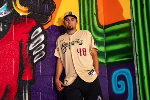
The main feature of the new Sonoran Sand-coloured uniform is the magnificant scripted “Serpientes” (Spanish for “Snakes”) wordmark in black, winding itself across the chest of the jersey. The same snake which has long been used by the Diamondbacks on various caps over the years has now been re-coiled into the shape of an “S”. The back half of the snake’s body has been stretched out long, acting as a flourish to underscore its own name, with a trio of diamond-shaped rattles at its tail.
SHOP: Arizona Diamondbacks “Serpientes” Jerseys, Caps, and more
“In the past, we’ve had too many jerseys at one time, so we’ve tried to simplify things. This uniform is taking the place of the ‘Los D-backs’ jersey that we’ve worn forever, so we wanted to have a Hispanic twist, a nod to our Hispanic culture and population here,” Hall continued. “I was on a plane to Portland when I was testing different names in Spanish, and for ‘snakes’ the word ‘serpientes’ came up. I liked it, so I asked Nike and they thought to make it look like scripting in a snake-type script and they did it! That’s just how good they are, they’ll blow you away with their creativity.”
Beneath this wordmark is the player’s number in Sedona Red in the D-backs standard font. On the right sleeve is a re-coloured black, red, and sand Arizona state flag, on the left is the Diamondbacks’ primary “A” logo in black and sand.

One Diamondbacks player, catcher Carson Kelly, has a unique perspective amongst players when it comes to uniform design. Carson’s father worked with Nike as a Global Brand Marketing Director and the family would relocate back and forth between Oregon and Toronto as his father was transferred between Nike offices.
“I really enjoy the process [of designing the uniform] and seeing the final product because I know there’s a lot that went into it, the design work, what font do we use?” Kelly told SportsLogos.Net. “The amount of time and effort that are put into these uniforms, I think, sometimes is taken for granted.”
“[As a player], it’s really cool when you come into a locker room and see something different, something new, and you’re feeling the material, and learning what’s the purpose behind every single logo, every single stitch, things like that makes it truly special to put it on it, and go out onto the diamond wearing it. The jerseys turned out phenomenal.”

While the team eventually decided against making this a “Valley of the Sun” themed uniform, they did work in a reference to it courtesy of a new logo which has been added to the bottom of the jersey near the “jock tag”. This logo shows a snake, with the Diamondbacks’ old alternate ‘db’ logo for a head, shaped into the letter “V” surrounding a red sun – a nod to the common nickname used for the City of Phoenix.
“We looked at ‘Valley’, we looked at Del Sol, there were so many different treatments that we looked at, but we really wanted to have a Spanish word and for us to be able to keep that snake reference was important,” said Hall. “It’s important for us to recognize the Latino community, they’ve been very supportive of us. They’re so enthusiastic about baseball, for us to give them a nod and let them know just how special they are to us, that’s an added reward. We really lucked out and picked the ideal name, I think the fans are going to have such a positive reaction to it like our players did and I think they’re even going to have fun shortening ‘Serpientes’ to ‘Serps’.”

“We get to play a game at the highest level and having a community like this behind you, that backs you like that, it’s extremely special,” Kelly added, in regards to the team’s large Latino fanbase. “Just getting to wear this jersey is actually really, really special.”
Though this is the first time the Diamondbacks have worn Sonoran Sand as a primary jersey colour, this new uniform doesn’t stray away whatsoever from the team’s existing colour scheme and makes sure to utilize elements already present in their usual uniform set. It’s very easy to imagine this as a uniform that could slide right in alongside their other options as a regular alternate option.
SHOP: Arizona Diamondbacks “Serpientes” Jerseys, Caps, and more
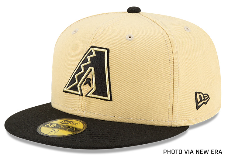
The new caps carry over the same colour scheme as the jersey, the crown is sand with the team’s primary logo re-coloured black and sand on the front. There are no side patches (aside from the usual New Era logo), the visor is black, and the MLB silhouette on the back is coloured black/white/sand.

“We were trying to come down to an agreement on the colour and how we could tie that in with the Arizona desert,” said Hall. “Nike had suggested oranges and yellows and we had to be really cognizant of the fact that the Giants own orange and with yellow we knew that the Red Sox were going to have a strong yellow presence with their City Connect uniform. So we wanted to stay away from that and go with one of our existing colours – Sonoran Sand. It matches perfectly with the desert.”
Unlike the other teams to unveil their City Connect uniform thus far, the Diamondbacks are immediately committing to wearing the new look beyond its initial series. In addition to the June 18th début, the D-backs will wear the new uniforms on July 16th against the Cubs, July 30th against the Dodgers, August 13th vs San Diego, and across an entire three-game series vs. the Dodgers from September 24th through 26th, during which time the D-backs will be celebrating both Hispanic Heritage Weekend and Roberto Clemente Day.
Based on my conversation with Hall it seemed very likely that the team will wear this uniform even beyond the above seven-game schedule and that it’ll be brought along on road trips in case the players choose to wear it away from home. Pants will be either white or grey depending on if the game is at home or on the road, this is not a head-to-toe Sonoran Sand uniform.

“If there’s strong support and enthusiasm from the fans or players, we will encourage our guys to rotate them in more,” Hall said. “Hopefully we turn this poor season around and start playing better and I hope it’s somewhat associated with these jerseys to where they want to wear them more. If we can attach winning to this jersey, even better.”
The Nike MLB City Connect uniform series was first announced back in early April as an opportunity to “celebrate the bond between each club and its city” while also “pushing the boundaries of baseball uniform design to create new traditions and grow the game of baseball.”

Things were kicked off with the unveiling of an all-yellow Boston Marathon themed Boston Red Sox uniform, this was followed up with a red Miami Marlins tribute to the Cuban Sugar Kings, the Chicago White Sox love letter to the Southside of Chicago, and the Chicago Cubs navy blue Wrigleyville set which they just wore last night against the Cardinals.
The San Francisco Giants (July) and Los Angeles Dodgers (August) are the last two teams who are set to release theirs in 2021. The City Connect program will eventually expand across the rest of the league with some joining during the 2022 season and the rest in 2023.
SHOP: Arizona Diamondbacks “Serpientes” Jerseys, Caps, and more


