
After six months of public consultations — including 500 hours of fan roundtables, 10,000 social media responses and more than 225,000 words worth of website submissions — Chicago Fire FC officials have heard fans loud and clear.
On Friday, June 18, the Major League Soccer club unveiled a new crest for the 2022 season, marking a return to the firefighting iconography they had used up until November 2019.
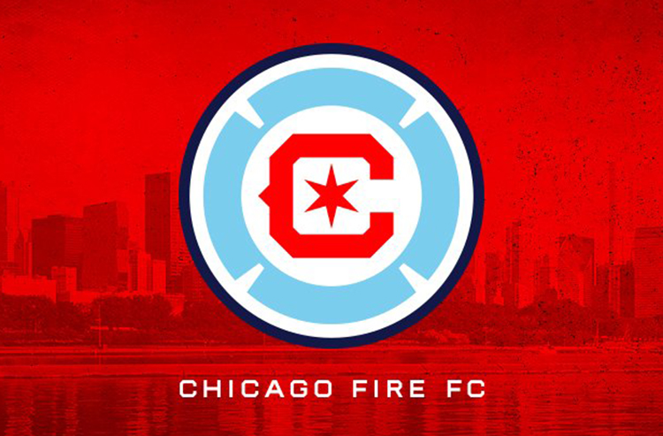
The new crest features a light blue Florian cross — a symbol of firefighters since 250 A.D. — inside a navy blue circle. Inside the Florian cross are a red block C and a six-pointed star from the Chicago city flag.

“As much as this project was about the creation of a new crest for the Chicago Fire, it was also about renewing a spirit of cooperation and collaboration with our fans,” said Fire owner and chairman Joe Mansueto on the team’s website. “We made a commitment in January to welcome anyone who wanted to lend their voice to this project and the result is a crest that was fully and completely inspired by what we heard from our fans and supporters. We’re hopeful all will wear the new crest with pride and feel it represents not only this storied Club, but also the great city of Chicago.”

The crest was designed by Matthew Wolff, who also designed crests for Los Angeles Football Club (MLS), New York City Football Club (MLS), and Louisville City (USL Championship).
According to the Fire, the six-pointed star and the Florian cross were the most requested elements among fans. More than 20,000 people provided their thoughts on the new identity, including from all 77 Chicago community areas.
“This was the most unique branding project I’ve ever been a part of,” Wolff said. “Hearing from fans — both new and old — while I was designing was so inspiring. I hope we’ve created something that can represent this historic Club and city for generations to come.”

The current “fire crown” crest was introduced in November 2019 and was immediately and almost universally panned. Mansueto told the Chicago Tribune in January 2020 that he had heard the concerns and “if it’s not working for people, we’ll fix it.” In January 2021, he announced that was exactly what they’d do, and the club embarked on the public engagement process that led to Friday’s announcement.
The “fire crown” will remain in use for the remainder of the 2021 season, but a limited number of items with the new crest will be available for purchase during matchdays at Soldier Field. The 2021 away kits will carry over to the 2022 season and will feature the new crest.
A new navy blue primary kit is currently in development and will be used for the 2022 and 2023 seasons, but the club intends to return to a red home kit in 2024.

The secondary logo is based on the Chicago municipal device, while the wordmark features “FIRE” in red block letters with light blue bars above and below.

The Fire will host a week-long celebration from Oct. 4 to 8, 2021, to mark the 150th anniversary of the Great Chicago Fire and the anniversary of the club’s founding in 1997. The celebration will feature the release of all-new apparel, giveaways, and other special events.
Photos courtesy @ChicagoFire / Twitter and Instagram
Related stories:
 2023 Football Kit Preview: Major League Soccer
  8 More Major League Soccer Kits For 2023 Unveiled on Thursday
  Photos of Leaked New Kits for 4 MLS Clubs Pop Up Online
  2022 Football Kit Preview: Major League Soccer
  Four More MLS Clubs Unveil New Kits for 2022 on Saturday
  Friday Flurry of Activity Across MLS Sees 11 Teams Unveil Kits Ahead of 2022 Season
  MLS Clubs to Recognize Juneteenth with Special Numbers, Jersey Auctions
  MLS 2021: What’s New in Kits and Logos