Break out your toques and get ready for some rogues, the Canadian Football League is back!
After being forced to cancel their entire 2020 season, the CFL returns tonight with the Hamilton Tiger-Cats visiting the Winnipeg Blue Bombers at IG Field. The rest of the Week One schedule will be played on Friday and Saturday.
The biggest news from a branding point-of-view in the CFL heading into this 2021 season is the changeover from the Edmonton Eskimos to the Edmonton Elks. The team finally made the name change official following both public and corporate pressure, first announcing a change in the first half of 2020 (using the temporary name “EE Football Club”) before revealing the Elks name and logos on June 1, 2021.
So join us, as we take a look at those Elks and all the other team logo and uniform changes for the 2021 CFL season, presented, as always, in alphabetical order.
CALGARY STAMPEDERS

Now that they finally get to play their 75th season, Calgary’s Stampeders are marking the occasion with a special throwback jersey.
The team unveiled the jersey on Friday, June 18, it features a red base with red and white stripes on the shoulders, reminiscent of what the team wore from 1948 to 1952 while also included the logo the team wore from 1945 to 1971 on the sleeves.
The front and back numbers, as well as the nameplates on the back, are set in a classic varsity font. The collar and sleeve cuffs are solid red.
According to Stampeders.com, the driving force behind the jersey was veteran equipment manager George Hopkins. He has been employed by the club since 1972.
“As part of the celebrations of our 75th season, it’s fitting that we’re wearing jerseys inspired by the early Stampeders teams including the undefeated 1948 Grey Cup champions,” Hopkins said on the website. “These are the iconic jerseys that made the Stampeders the Red and White and were worn by legendary players including Keith Spaith, Normie Kwong and Sugarfoot Anderson. The unveiling of this jersey has been a long time coming and we have to take a moment to acknowledge the hard work of former Stampeders employee Jessica Littel in the early days of this project to help it come to life.”
More on the Stampeders new throwback alternate uniform here
EDMONTON ELKS

After officially retiring their old nickname and nearly a year of public consultation, the EE Football Team (previously the Eskimos) announced they would be going with “Elks” as the new team nickname. The club made the announcement at Commonwealth Stadium in Edmonton on Tuesday, June 1st as a giant tarp in the middle of the football field was rolled back to reveal the new name and logo.
“This is not the beginning. This is a new chapter in a story that began 72 years ago officially, and over 100 years ago unofficially,” said club president Chris Presson during the announcement live stream on YouTube. “Thousands have carried our torch since then, and we light it again. We build on that legacy — new name, same colours, for Edmontonians.”

In February 2021, the club announced it had narrowed the field down to seven finalists: Elk, Evergreens, Evergolds, Eclipse, Elkhounds, Eagles, and Elements. The stated goal at the time was to find a new name that began with the letter E so the team could continue to use its double-E logo and retain its green-and-gold colour scheme.
According to the club’s press release, “Elk” was the overwhelming favourite among fans, players and coaches. However, they added an S after “lengthy debate [and] consultation with linguistics experts from the Oxford Dictionary and the [University of Alberta]’s linguistics department”.
The new logo shows an elk peering out from a shield, the shield also in the shape of the province of Alberta. A series of alternate logos were also released, one showing two elk antlers in the shape of a football and another using the classic “EE” logo from the Eskimos days.

While we figured retaining the EE initials would allow the team to keep their classic helmets, the Elks went in another direction. Perhaps in an attempt to own the new identity, the new helmets feature two green elk antlers running up the side, similar to the Montreal Alouettes and their bird wings or the NFL’s Los Angeles Rams and their ram horns.
More on the Edmonton Elks new name and logos here
OTTAWA REDBLACKS

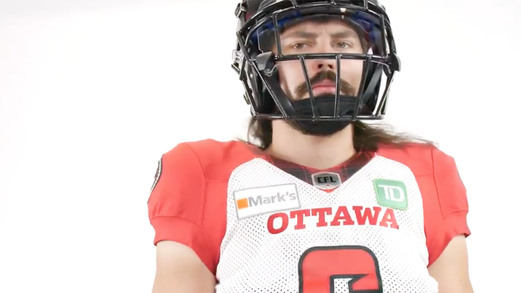
The Ottawa Redblacks unveiled two new uniforms for the 2021 season just this past weekend. The two new looks include a white road set and a red alternate that pays homage to the previous CFL teams that once called their city home.
In a surprising move, Ottawa is retaining its current black home jersey, which features a Redblacks workmark across the chest, custom number font and red side panels down the sides of the jersey and pants that extend to the collar. The previous road set mimicked that design, but that has been replaced with a new look that includes red shoulder yoke and the franchise’s signature plaid pattern on the collar and down the sides. The nameplate on the away jersey has also been changed from black to red.

The red alternate, meanwhile, shares the same design template as the new white road uniform, with black shoulder yoke and side panels and a Redblacks workmark across the chest. The jersey will be paired with Ottawa’s standard black helmet and the black pants from the home set, which includes an “RNation” workmark along the truncated side panel.

All three New Era uniforms feature the Redblacks’ primary logo on the sleeves and hip of the pants, as well as red socks.
More on the new Ottawa Redblacks road and alternate uniforms here
TORONTO ARGONAUTS

The Toronto Argonauts announced they would be returning their classic “Boat” logo as their full-time primary logo. The Argos have used a boat as the main focus of their team’s logos for most of their franchise’s extremely long history — seriously, the 2021 season will be the club’s 139th.
Originally appearing as an actual boat, the logo was updated to depict the boat as a football in the 1950s with a sail above reading the team’s name and a flag that said: “PULL TOGETHER”. In the 1970s this logo was simplified considerably, the team’s name was changed to just an “A” and the words of encouragement were eliminated. The team went in another direction as they moved into SkyDome in 1989, focusing instead on an “A” as the team’s main logo, shown within various different elements in the 30+ years since.

This new boat logo is almost identical to the simplified version that was used up until 1988, it has been updated to be shown in the team’s proper double blue colour scheme of Cambridge Blue and Oxford Blue.
“We are so excited to bring back a logo that is beloved by so many Toronto Argonauts fans,” said Argos General Manager Michael “Pinball” Clemons in the press release. “This contemporary redesign of one of our most iconic emblems reinforces the great tradition of the Argonauts while continuously steering towards the horizon and our future. The boat is back, and our passion lives on!”

Fans of the “A” in the shield don’t need to worry, at least not yet, the now-former primary logo will stick around as an alternate logo for the time being.
More on the new Toronto Argonauts logo for 2021 here
GREY CUP 108

The City of Hamilton will be hosting the 2021 Grey Cup and will do so with the logo shown above.
“We’re very excited to reveal our Grey Cup game and festival brands for the 108th rendition of Canada’s largest sporting event that will take place right here in Hamilton,” Tiger-Cats president and chief operating officer Matt Afinec said in a statement at the time the logo was revealed. “Our goal was to align Grey Cup, CFL and Tiger-Cats traditions with a brand that reflects Hamilton, Hamiltonians and our community’s amazing energy, growth, ongoing renaissance and unity through the CFL and Ticats football.”
The 108th Grey Cup logo follows the standardized template introduced in 2016, with the Grey Cup in the center and the bilingual name of the game in block lettering. It replaces the logo that would have been used by Saskatchewan in 2020 had it not been cancelled amid the coronavirus pandemic, marking the first time since 1919 that the Grey Cup was not awarded. Saskatchewan will instead host the 109th Grey Cup in 2022.

This new 108th Grey Cup logo includes a few local touches to note the game’s location, with a maple leaf in Tiger-Cats gold and a Tim Hortons Field silhouette at the base of the Grey Cup, which is a little more pronounced than it was previously.
That’s all I noticed for newness in the CFL in 2021, if I missed anything please let me know in the comments.
The above article was compiled by Chris Creamer using several previous articles written by Glenn Cook, Chris Creamer, and Andrew Lind


