Interlocked logos are a popular design trend throughout the history of baseball teams at all levels of play, especially when worn on the front of the team’s cap.
But what if Major League Baseball teams unlocked and separated their interlocked logos? It’s the question we didn’t know we needed to ask until Twitter artist @renzonesanchez went ahead and answered it completely unprompted.
The result left us, well, mostly uncomfortable:

It’s amazing what happens when you take a logo that’s so recognizable in its original form and simply shift the characters slightly to the left and right. Look at that New York Yankees logo, did you really have any idea how small and wide the “N” looked compared to the “Y”? I sure didn’t, not until it was presented like this. Meanwhile that Chicago White Sox logo? I might prefer it to their actual diagonally interlocked design.
CHICAGO WHITE SOX

I mean, would you just look at that.
After falling in love with that White Sox logo idea, I had to quickly mock up the rest of renzonesanchez’s creations across all nine of the teams featured just to see if there were any more surprise gems.
Let’s take a look together, presented in glorious alphabetical order.
COLORADO ROCKIES

LOS ANGELES DODGERS

MINNESOTA TWINS

NEW YORK METS

NEW YORK YANKEES

SAN DIEGO PADRES

SAN FRANCISCO GIANTS

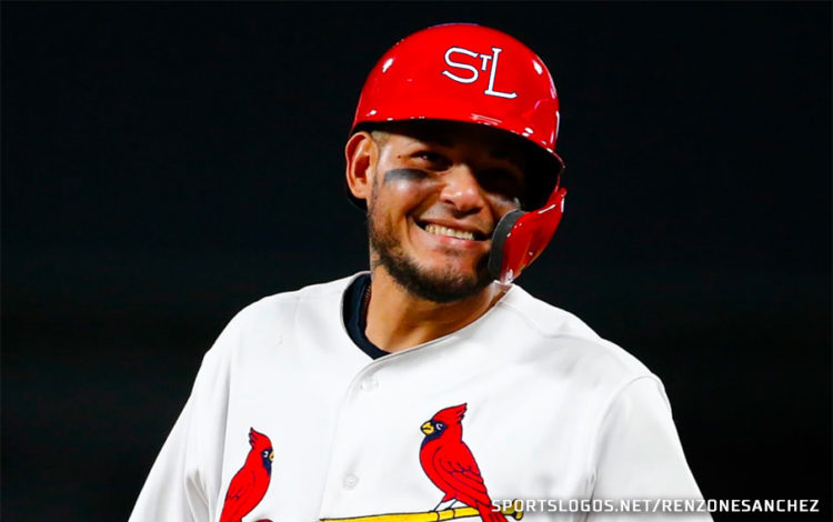
ST. LOUIS CARDINALS

So, mostly these logos give the impression that these teams they belong to a video game that wasn’t able to secure the rights to use the actual logos, but yeah there are some surprises in there.
The New York Mets? Dare I say I wouldn’t mind watching them wear that for a game? Maybe even the Padres? But I don’t think either top what they currently use. As for the Yankees and Twins? No. Just no.
Some of you may be wondering, what about the Kansas City Royals and the Tampa Bay Rays? Well, the Royals isn’t really an interlocked logo, it’s just one letter that flows into the other, and the Rays “TB” logo doesn’t even touch one another, so that’s certainly not an interlocked logo.
What do you think? That White Sox logo, right? Am I wrong? Share your thoughts in the comments.


