
The Indios de Mayagüez (Mayagüez Indians) debuted in 1938 as one of the founding members of the Liga de Béisbol Profesional de Puerto Rico, more commonly called the Puerto Rican Winter League. The team, which plays on Puerto Rico’s west coast, announced a noteworthy rebrand created by Brandiose today.
The Indios de Mayagüez are the first Puerto Rican League team to work with Brandiose on a rebrand, though the prolific San Diego-based firm did recently create the logo for the league itself, which incorporates the silhouette of Roberto Clemente into the Puerto Rican flag.

Brandiose has had a heavy influence on minor league baseball in the continental United States, and while working with a team in Puerto Rico was a new experience, the process was familiar.
“We’re trying to uncover the exact same facts,” said Brandiose partner Jason Klein. “What are the things that are sacred, what are the things that are stories that have not been celebrated? How do we make the sacred things more sacred, more iconic? How do we take the stories that have not been celebrated and celebrate them?”
The team kept its name, Indios, but retired previous branding that focused on Native American imagery (above). Instead, the story that the new brand focuses on Mayagüez’s sweet agricultural heritage.

“Mayagüez is the city of mangoes,” Klein said, “so we created our own character called Manguito—little mango. We designed it to look like it was cut from the same cloth as Mr. Red Legs or Mr. Met or the Swinging Friar. It is a mango head character that looks like it’s been around since the beginning of the franchise, so it’s got like a retro vibe to it.”
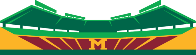
While the character has a fun feeling to it, the team wanted to maintain some classic-feeling aspects of their brand, like traditional typography and a logo that features the well-known aesthetic of their stadium.
“It’s definitely rooted in the history of the franchise,” Klein said. “They are interested in bringing the minor league fun and combining it with a major league approach.”
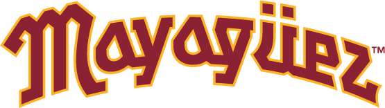
Included in the new brand is a proprietary font set in burgundy and gold, colors that are meant to evoke the 1970s, which Klein describes as the heyday of the franchise.

The team has won 18 championships since its founding in 1938, and has two Caribbean Series titles to its name, in 1978 and 1992. (“They and the Cangrejeros de Santurce are like the Red Sox and Yankees of the Puerto Rican League,” Klein said.)
The Liga de Béisbol Profesional de Puerto Rico’s 2021-22 season begins November 6, with the new-look Indios taking on the Criollos de Caguas.


