
It’s been something of an emotional roller coaster for baseball fans in Beloit, Wisconsin. The Beloit Snappers went from being a decades-long minor league baseball stalwart to being a likely candidate for de-affiliation to—as of moments ago—being the proud owners of a brand-new identity to go with their new ballpark and new Major League parent club. The Beloit Sky Carp unveiled their new nickname and logos today after a lengthy rebranding process that was made public more than a year and a half ago—before Major League Baseball seized control of affiliated Minor League Baseball.
“It was the last identity that was developed under the minor league baseball protocol timeline,” said Jason Klein of Brandiose, the firm that created the suite of logos. “It’s the last before the Major League Baseball era.”

The fact that Beloit has an affiliated Minor League Baseball team at all is something of a surprise. In 2020, the Snappers were on a leaked list of roughly 40 teams slated for demolition by Major League Baseball’s Vogon Destructor Fleet. The fact that new owners were building a state-of-the-art ballpark along the Rock River in Beloit didn’t guarantee the team a spot in the revamped minors, though it certainly helped their cause.
“It’s been a long journey,” said team owner Quint Studer of Studer Entertainment & Retail. “Two and a half years ago, if anyone said Beloit was going to be one of the 120 teams, we could have made a lot of money in Vegas.”

The new nickname Sky Carp is a slang term for a Canada goose, which are plentiful throughout the area. But it’s not just any Canada goose, it’s a goose that has decided it’s through with the hassle of migration and is going to settle down in one place—a metaphor for the loyalty that residents of small-town Beloit feel for their hometown.
“Sky Carp is a term for a goose that loves a spot and decides it’s not going to leave,” Klein said. “All the cool stuff that’s happening in Beloit, people are like, I want to stay in Beloit.”

The metaphor was important to the team in conversations about building the brand. According to Studer, who has written books and speaks on the topic of small and mid-market cities losing talent to bigger markets, the challenge for a place like Beloit is creating opportunities and an environment where young people in particular will want to be.
“That’s what attracted me to the name,” Studer said. “It’s all about keeping talent home.”
The goose itself is kind of perfect for a minor league baseball team mascot. It has sort of goofy, round features—Klein used the word “huggable” a couple times in describing it—but it’s no pushover.
“In terms of underestimating a northern creature that you do not want to screw with, they can be nasty,” Klein said. “It’s a great hood ornament for a team.”

As a person who runs recreationally in Fort Collins, Colorado, I can attest that geese are not to be trifled with. I have been hissed at by more than a few geese who disagree with me about who has the right of way on Fort Collins’ running trails. But they have their good qualities, too!
“When I speak on leadership, I use geese as an example,” Studer said. “Geese can fly without exerting themselves. They honk in order to encourage other geese to stay in formation. And when one goose goes down, two geese go down to stay with that goose until it recovers or passes. So I’ve always thought that geese were a cooler-than-heck animal.”
The suite of logos is filled with details that speak to elements of the local community that make residents proud. First, the goose is wearing a reddish-orange scarf, an indication that he’s going to stick it out in the cold Wisconsin winter. The scarf attracted enough attention during the development of the logo that the team plans to sell them in their store.

The next detail most viewers will notice is that the goose is carrying a wrench. In specific, the wrench is meant to represent one created by longtime Beloit-based manufacturing company Fairbanks Morse, which was founded in the late 1800s and has since evolved and diversified, and is now known as Fairbanks Morse Defense.
“If you look at Beloit, they have a history of iron,” Studer said. “You look at Fairbanks Morse, you look at Beloit Corp, you look at probably the flagship hotel downtown, it’s called Ironworks. It’s really to symbolize what helped build Beloit, the iron industry.”
In a more general way, the wrench speaks to the hyperlocal importance of industry in Beloit, which was on display when the team opened its new stadium this year.
“At opening day, I got on the field and spoke,” Studer said. “I said, 99 percent of the labor that built this stadium lives within 30 minutes of Beloit, and everybody just started applauding. So it’s also a tribute to the labor force in the Beloit area.”

Another small but important detail in the brand has only appeared in one alternate logo so far, but it warrants noting: In a logo where it has its head under water, the goose is wearing goggles—they’re not swimming goggles, though, but rather aviator goggles like those worn by Beloit’s own Bessica Raiche, who in 1910 became the second woman to pilot an aircraft solo.
“One of the things about the Beloit community, if you look at it, particularly from World War II, women went into the workforce too,” Studer said. “If you look at Beloit, it wasn’t just guys. When you think of ironworks, you might think of guys, but it’s really the diversity of the community that makes it so special.”
In an indirect way, Studer explained, highlighting the accomplishments of one of the town’s most famous women is an homage to businesswoman Diane Hendricks, whom Studer says paid for more than 50 percent of the team’s privately funded new stadium, without which the team would likely no longer exist.

According to Klein, the color palette was the last element of the new identity that was developed. Much of the artwork was created before the new affiliation with the Marlins was announced. After initially considering a color palette of sky blue along with rusts and browns associated with industry, Marlins colors opened up new possibilities.
“Color is always the last thing we pick,” Klein said. “With the Miami affiliation, all the rust stuff got shifted over to red and all the sky blue stuff got shifted over to Marlins blue, and we were like, ooh this looks good.”
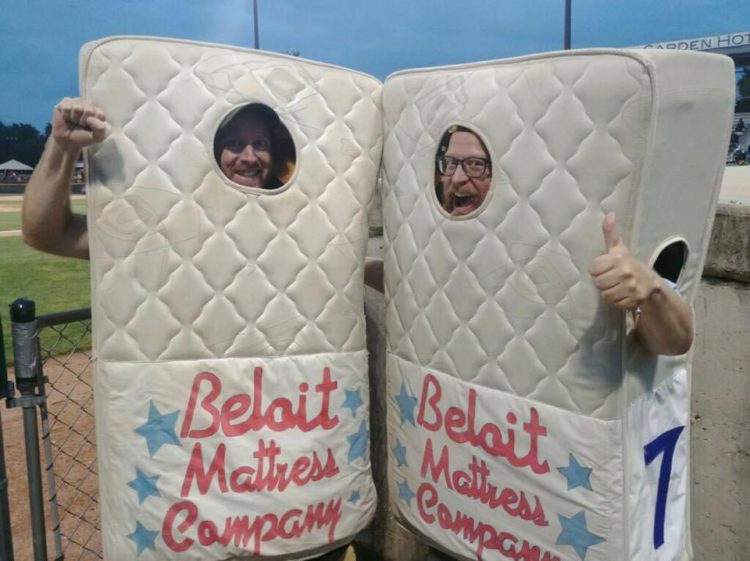
When the list of Beloit’s five potential new team names came out last year, I spoke with my friend Howard Aprill, who is a lifelong Wisconsinite and a longtime park naturalist at Wehr Nature Center in Milwaukee County Parks. Not only is Howard an unrivaled expert on the area’s wildlife, he’s a huge minor league baseball fan who attended opening day at the Snappers’ new stadium this season and who once raced me with both of us dressed as mattresses during an on-field promotion between innings at a game in Beloit’s old stadium. (That’s me on the left, Howard on the right at Pohlman Field in 2018.)
“I really like Canada geese because they’re big and they’re bold and they’re charismatic,” Aprill said. “There’s also a lot that we can learn from Canada geese. They’re very good parents. They take great care of their youngsters. And what a lot of people don’t know is that an orphaned Canada goose gosling will be readily accepted by fellow families of Canada geese.”
And geese as a metaphor for Beloit residents loving their hometown?
“It’s important to remember that there’s a whole suite of hazards that go along with migration,” Aprill said. “Migration can actually be very dangerous for birds and not all birds survive trips south or north. Consequently, if they have all their needs met—their needs being food, water, shelter, and space—if they have all their needs met without picking up stakes and moving, you can’t blame them for taking the easier route.”

For the last year and a half, minor league baseball fans have anticipated the announcement of Beloit’s new name—whether it was going to be Cheese Balls, Polka Pike, Supper Clubbers, Moo, or Sky Carp—against the backdrop of appreciation for the old identity, which was created by designer Chris Kretz.
After pushing back the unveiling of the rebrand, which according to Studer happened largely because MLB didn’t want the first affiliated rebrand under their watch to happen midseason, the team played a “farewell season” as the Snappers, which only heightened the sentimental attachment some felt for the old brand.

Certainly, keeping the Snappers name was on the table when the rebrand process started.
“We seriously considered it. We look at all the data before we get started,” Klein said. “We knew what the power of the Snappers brand was, but we felt like, we’re moving into a new era, it’s a new stadium, we’re moving into a new relationship with the Marlins. Everything was new.”
That said, Studer made a point to emphasize that Snappy will still be a part of the team going forward, and noted that from his perspective sentiment from those who objected to the rebrand focused more on the mascot than the brand.
“The big push was more saving Snappy than it was saving the Snappers name,” he said. “Snappy’s going to play a big part in the future.”
Ultimately, Studer said, Snappy himself may welcome this partial retirement.
“Snappy’s been showing up to work every day for 20 years,” he said. “Doesn’t Snappy deserve some work-life balance? Doesn’t he deserve some flexibility? Now that we’re so close to the Rock River, maybe on a Wednesday Snappy would rather be on the river than hanging out at the stadium.”

With Snappy likely watching from the stands with his feet up and a beverage in his hands, the new-look Beloit Sky Carp will make their home debut April 12, 2022, against in-state rival the Wisconsin Timber Rattlers.


