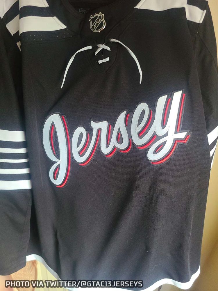
In what could be the 2021 version of that old “Buffalo Buffalo buffalo buffalo…” routine, the possible new “Jersey” New Jersey Devils jersey was leaked earlier today on Twitter by the tandem of @GTAC13JERSEYS and @Scottyk9.
Before we go any further here, please note that I haven’t been able to 100% confirm the authenticity of this leak yet… but I will say this, it’s either legit or a darn good fake.
On to the jersey, which would be the first genuine alternate jersey in the history of the New Jersey Devils (I know, right?!)… so, 25 someodd years in the making, let’s take a look:

Yeah. And please, get in your “Jersey” on a jersey jokes before all the good ones are taken… personally I’m hoping they get a company named “Helmet” to sponsor their lids for this set.
Well, I will say that at first glance, it looks a lot like a 1930s Chicago Black Hawks ripoff. Like that old Black Hawks jersey, it’s entirely black and white, it also has a similar striping style with numerous thin white stripes at the shoulders on either side of the collar and again down on each arm around the elbows.
Considering this is a leak we don’t have any official explanation for the design, but I think it’s safe to say the Devils were not inspired by the Black Hawks for this… instead, let’s take a look at the jersey worn by another hockey team from (almost) the 1930s, the 1928-29 Newark Bulldogs:

As you can see, the Bulldogs wore very Black Hawk-esque jerseys for the era. In fact, during their most recent uniform update, the Devils claimed the bottom stripe on their jersey was a tribute to these same Bulldogs.
Again, we don’t have an official explanation for the design, but this seems like a very realistic inspiration for this design.

It’s a little early to pass judgement on the new look (nor do we even know if it’s legitimate). We haven’t seen the full set, we don’t know what the helmets, pants, socks will look like, or how they incorporate the player name & number and what font they will be.
From what I see so far, however, not a fan of the look. History is always great to turn to for inspiration, but “Jersey” across the front in a scripted font? Eh. Maybe mix in some red in with the white stripes and slap the NJ logo on the front… and why the slang nickname for the state? Sure Vegas did it with their name, but that doesn’t mean it was a good move.
Anyways, I’m going to wait and see what the full set looks like before I come to my final thought on the look, but it’s not looking great early on.


