The US Olympic Hockey team today unveiled the uniforms they’ll be wearing in Beijing this upcoming February.
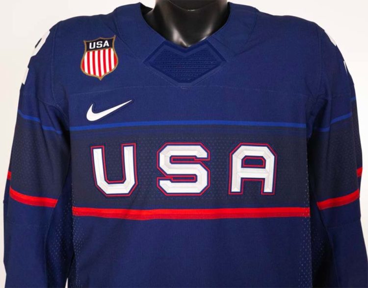
Three uniforms from Nike here — one white, one blue, and then one a slightly more different blue. All three feature a horizontal band with a field of stars around the entirety of the jersey, “USA” written within it in white with red trim.

The style of striping varies slightly between jerseys, the white and navy blue sets go with a royal/white/navy/white/red combo while the royal blue jersey simplifies it a bit with just two navy blue stripes with a thin royal blue line between them.
A closer look:


USA Hockey said the uniform was a tribute to American pride and ingenuity, paying homage to the nation’s industrial past and innovative future. The double stripe feature on the light blue jersey, in particular, was inspired by American “muscle cars”.


Yes, that’s white numbers on a white jersey. I get it, with the blue stripe back there, but when the Montreal Canadiens tried something similar they at least went with blue numbers trimmed in white for greater contrast.
A look back at the USA Olympic Hockey uniforms of the past 20 years, really wish they’d use that crest from 2014 as the main element more often, that 2010 design is also up there.

Unfortunately, national teams are no longer permitted to use their official program logos (as you see on the 2002 and 2006 jerseys above), which is why we have had the more generic looks since 2010.


