
Someone tell Snoop Dogg! The Pittsburgh Penguins this morning officially unveiled their new third jersey which completes the NHL’s list of anticipated new third uniforms set to début this season (note: we should still see a few more new one-off outdoor game uniforms).
It’s a straight-up colour swap of the Penguins white Reverse Retro design from 2020-21, which was a modified version of the club’s road uniforms from the 1990s, which in itself was a re-designed and re-coloured version of the team’s inaugural season road uniforms from 1967. Did you get all that?

Black with white and gold trim, “PITTSBURGH” laid out diagonally in yellow with black and white block shadows. The logo on the shoulders is the Pens’ current primary logo of a hockey-playing penguin but minus its familiar gold triangle – the team used this same emblem without the triangle on the front on their previous alternate uniforms (remember the gold ones?) as well as on the shoulders on their Reverse Retro set last year, and on the front of their Stadium Series uniform from 2017.
LINK: Pittsburgh Penguins complete logo and uniform history
While this idea débuted in double blue back in 1967, it’s the version from the ’90s that’s most remembered in this style. Unveiled along with a major logo redesign immediately following the Penguins second consecutive Stanley Cup in 1992, the Pens wore this style as their primary road option for five seasons until the end of the 1996/97 season. It was replaced with their then-alternate uniform, black with grey shoulders and a gradient stripe around the chest (the ’90s were a trip for uniforms, kids… you kinda missed out).


So what are the similarities and differences between this new 2021-22 set and the original 1992-97 design?
Well the striping is identical, as are the colours (and, for the most part, the typeface) of the numbers. The PITTSBURGH lettering is just about the same, due to the new Adidas jersey style the lettering is a touch more condensed than it was in the ’90s.
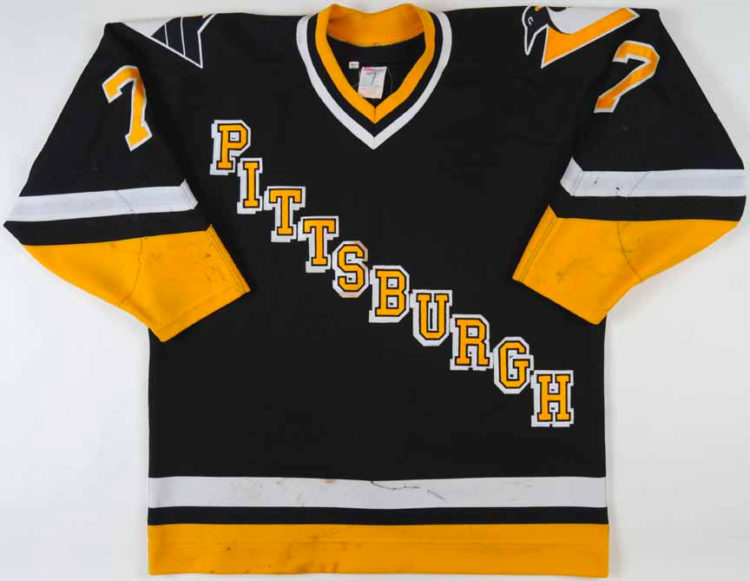
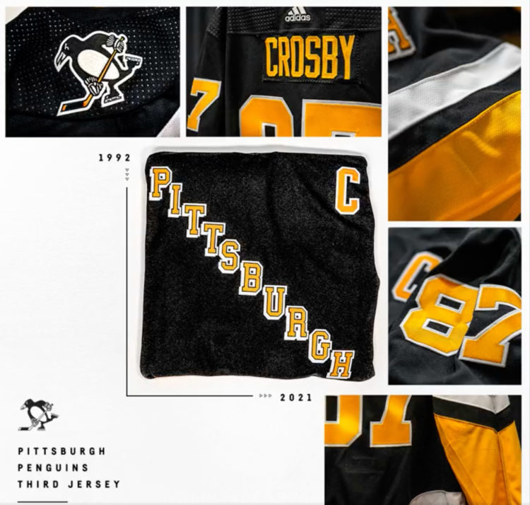
We start see differences in the collar, again due to the new Adidas cut — in 1992 the collar was gold/black/white, in 2021 it’s mostly black with a thin gold line at the top. Player numbers are much wider on the arms now, which has been a fairly consistent feature across the league since Adidas took over in 2017. Player names are now single-colour gold, in the ’90s they were two colour gold with white trim.
The most noticable difference comes via the shoulder patch (we touched on this earlier in the post so forgive the repetition) — originally they wore the old “Robo-Penguin” logo in this spot. Now it’s been updated to work with the new team identity to feature their current logo minus its gold triangle.

Pittsburgh will début the new third uniform on December 11th at home against the Anaheim Ducks. They’ll be worn 12 times in all (in honour of former Penguin Bob Errey, no doubt) and will be worn for at least the next three seasons. Here’s the full schedule:
PITTSBURGH PENGUINS THIRD JERSEY SCHEDULE 2021-22
December 11, 2021 vs. Anaheim Ducks
December 17, 2021 vs. Buffalo Sabres
January 2, 2022 vs. San Jose Sharks
January 23, 2022 vs. Winnipeg Jets
January 28, 2022 vs. Detroit Red Wings
February 26, 2022 vs. New York Rangers
March 11, 2022 vs. Vegas Golden Knights
March 13, 2022 vs. Carolina Hurricanes
March 27, 2022 vs. Detroit Red Wings
April 9, 2022 vs. Washington Capitals
April 12, 2022 vs. Columbus Blue Jackets
April 21, 2022 vs. Boston Bruins


All photos in this post (unless otherwise noted) courtesy screencaps from videos posted by the Pittsburgh Penguins
Related stories:
 2023 Winter Classic Logos, Uniforms and More for Bruins and Penguins
  My Journey to (and at) the 2022 NHL Heritage Classic
  New Jersey Devils Disappoint With Unwhelming New Third Uniform
  All NHL Teams Switch to Primegreen Jerseys, Introduce “Dimensional Embroidery” to Crests

