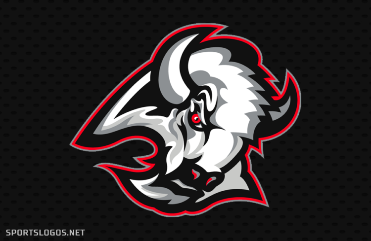
Ladies and gentlemen, the “Goathead” is returning to the National Hockey League.
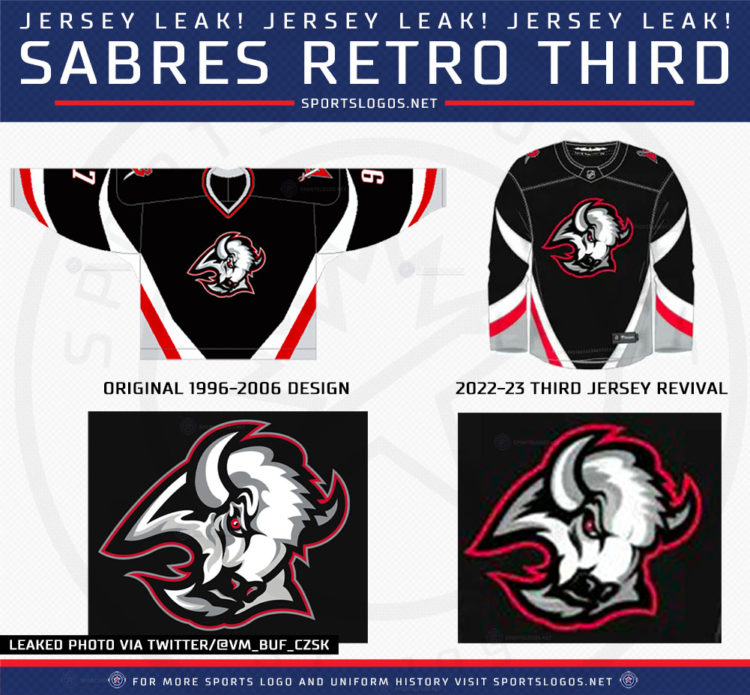
Thanks to a (now deleted) Tweet from @VM_BUF_CzSk, we’ve learned that the Buffalo Sabres will be bringing back an updated version of their much-loved (or much hated, depending on when you were born) black “Goathead” uniforms for the 2022-23 season.
SportsLogos.Net reached out to its good friends “Reliable Q. Sources” and confirmed this leak was legit and that the jersey would be officially classified as their “third jersey” which means it’ll be worn for at least three seasons and between six to fifteen times per year.

The new design (on the right, in the above graphic, which also appears to be missing a red stripe) does differ slightly from the original (on the left). On the jersey, the collar is the most significant difference, going from red/black/silver in the 1990s to just plain black in 2023 – the lightning bolt design from the City of Buffalo flag (and the Sabres regular home and away uniforms) is also a new addition to the 2023 sweater.
We also see some significant modernization and (dare I say it?) upgrades to the “Goathead” logo itself — unnecessarily complex shading and additional trim have been removed and simplified (see the area around the eyes, the shading and details around the back of the head). It’s much like what the Sabres did when they brought back the original royal and gold set. They took the opportunity to correct some mistakes of the past.

The Sabres initially unveiled this logo back on April 11, 1996, at a ceremony held before 16,000 at the old Buffalo Memorial Auditorium. Designed by Vermont’s Jager, Di Paola, Kemp Design (JDK), the Sabres wanted a new look both for their new arena as well as the club’s 25th anniversary season. The design came a little too late for the anniversary, but the club opened the new Marine Midland Arena with the unique and bold design.
“What we’re trying to do is revive interest in Sabres hockey,” team president Doug Moss said after the 1996 release. “To be honest, I think this town could use something to be excited about.”
LINK: Buffalo Sabres complete logo and uniform history
Buffalo ended up wearing this design for a decade, including a run to the Stanley Cup Final in 1999, before making a return to the blue in gold in 2006 (remember Buffaslug? Yeah, the Buffaslug replaced this!)
I’m all for returning any old uniform, but I’m also on board the “A Third Jersey Should Resemble the Rest of the Set In Some Fashion” train. Overall, the modernization we see here is fantastic, but I’d rather this be worn as a “throwback” or “classic” uniform rather than as a far more regular alternate… but that’s just me!


