
Remember when the NFL used to commission unique and colorful Super Bowl logos inspired by the host city for each year’s game?
Well, that all stopped in 2011 with Super Bowl XLV, when the league began using a templated design that prominently featured the Lombardi Trophy. The only thing that changed for the next four years was the Roman numerals and the facade of the host stadium.
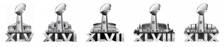
Created by Landor Associates with assistance from the NFL’s in-house design team, the logo was part of a new graphic system that carried across the Wild Card and Divisional rounds of the playoffs, the AFC and NFC championships and the Pro Bowl. It was also the first time the Vince Lombardi trophy had been used in the Super Bowl logo.
“A sports event of this stature needs a consistent, iconic identity – a symbol that fans can immediately recognize, much like the Olympic rings,” the company said at the time. “The Vince Lombardi Trophy, bestowed on league champions each year, was the ideal inspiration for a lasting symbol.”
Former NFL chief marketing officer Mark Waller echoed those sentiments, saying the logo was “trying to reflect the stature and preeminence of the Super Bowl. Given its global size and scale, we really wanted a design that was permanent and that really could emphasize the prestige and stature of the game, so we decided to focus very much on the Lombardi trophy and the structures that host these incredible games.”

Super Bowl 50 followed this template, albeit with gold numbers behind the trophy and stadium. That transitioned to an even more standardized design with Super Bowl LI, as the Roman numerals were standing on the logo’s base alongside the Lombardi Trophy.
The designs for Super Bowl LI through LIII were virtually indistinguishable, with the Roman numerals and color of the base and the shading of the trophy and numerals, as the only differences between the three. The Lombardi Trophy was no longer centered on the design as the Roman numerals changed.

Super Bowl LIV and LV generally continued this pattern, though the Roman numerals changed from a serifed font to a more streamlined design, and a second color was introduced to the shading.
Meanwhile, the logo for Super Bowl LVI brings some much-needed local flavor to the otherwise templated design. It incorporates palm trees and colors that reflect the Southern California sunset – a more colorful design than any since Super Bowl XLIV.

Hopefully, this will lead to a few extra local touches on future logos. Perhaps next year’s game, Super Bowl LVII, could feature a cactus, mountain or even the Arizona state flag within the Roman numerals.
Photos courtesy of the NFL.
Related stories:
 Super Bowl LVI Logo Revealed
  Kansas City Chiefs Add “Run It Back” To Uniform For Super Bowl LV
  Every Super Bowl Uniform Matchup Ever: Cartoon Edition
  Fact Check: Bucs-Chiefs the First Super Bowl Colour Match? A Look At The Kansas City Chiefs’ Logo History A Look At The San Francisco 49ers’ Logo History

