The National Hockey League this morning unveiled a new logo for its crown jewel event, the Stanley Cup Playoffs and Stanley Cup Final.
It’s the first new logo for the annual templated design since 2013.
The new logo, designed by Fanbrandz in coordination with the NHL’s creative services department, is rich with symbolism paying tribute to the well-over one-hundred-year-old origins of both the Stanley Cup as well as the league itself.
Take a look:
The Stanley Cup, presented in stunning detail, complete with etchings, rests within a black and silver shield shaped to resemble the banners raised by defending champions. Below the shield in silver is “STANLEY CUP” in a typeface based on the engravings that adorn the bowl of the trophy, added over 125 years ago. Finally, the bottom text (which will read “PLAYOFFS” or “FINAL” depending on where we are in the tournament) is in a typeface inspired by the signage outside Montreal’s Windsor Hotel; it was in this building in 1917 that the National Hockey League was established.

“All players dream of having their name engraved in immortality, and it is every NHL team’s mission to raise a championship banner,” the NHL’s chief brand officer and senior executive vice president Brian Jennings told ESPN.com. “We wanted to visually capture and evoke the majesty of Lord Stanley in a manner that both respects the history and represents the future of this great game.”
LINK: History of the NHL’s Stanley Cup Playoffs Logos
There are no details on how the patch will work with that level of detail on the Cup itself, but they’re doing incredible things with that new ChromaFlex patch technology. I’d imagine they’ll be able to reproduce it perfectly on jerseys… unless Cup Final patches are going away because of ads? Because, of course, that would happen.
As had been the case with the previous Stanley Cup Playoff logo style, each team will get its version featuring its logo and colours. However, this is the first time the league has gone ahead and publically posted all of those options (as always, the NHL has included the Sabres here just for funs):

Overall this is the seventh significant design change to the NHL’s Stanley Cup Playoffs/Finals logo style since they first began wearing patches in the late 1980s. Let’s take a look back and reminisce, shall we?:
What’s the best Stanley Cup Playoffs logo style? Call it retro bias, but I still love that 1989-94 style, though the 2013-21 design is pretty darned good. What do you think? Share your thoughts in the comments.
Related stories:
 My Journey to (and at) the 2022 NHL Heritage Classic
  Blues Honour Pronger With Retro 90s Threads
  Smashville vs Bolts! 2022 Stadium Series Uniforms Unveiled
  New Jersey Devils Disappoint With Unwhelming New Third Uniform
  All NHL Teams Switch to Primegreen Jerseys, Introduce “Dimensional Embroidery” to Crests
 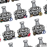 Every Possible 2018 Stanley Cup Final Matchup and Other Musings

