“A life is not important except in the impact it has on other lives.”
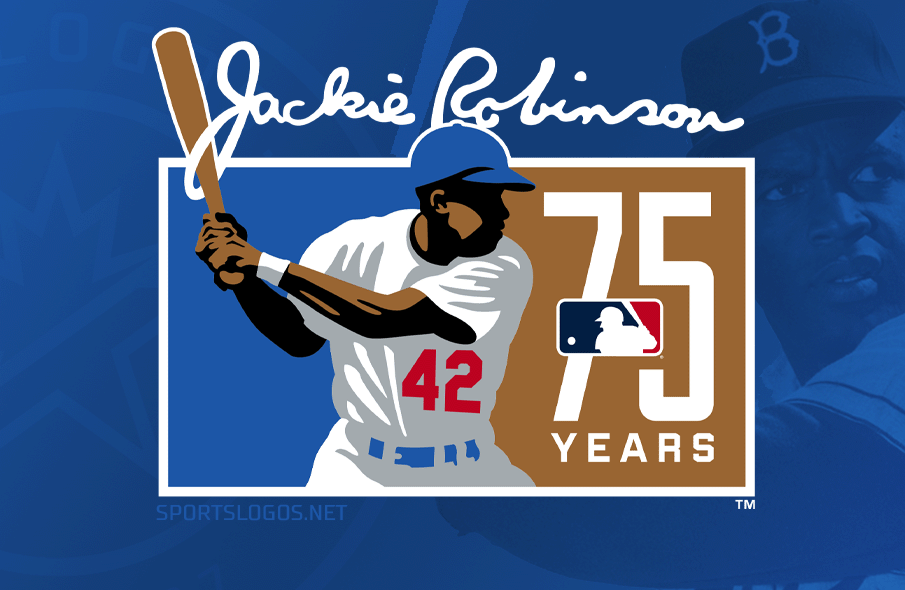
This morning, Major League Baseball unveiled the logo they’ll be using to mark the 75th anniversary of Jackie Robinson breaking the league’s colour barrier on April 15, 1947.
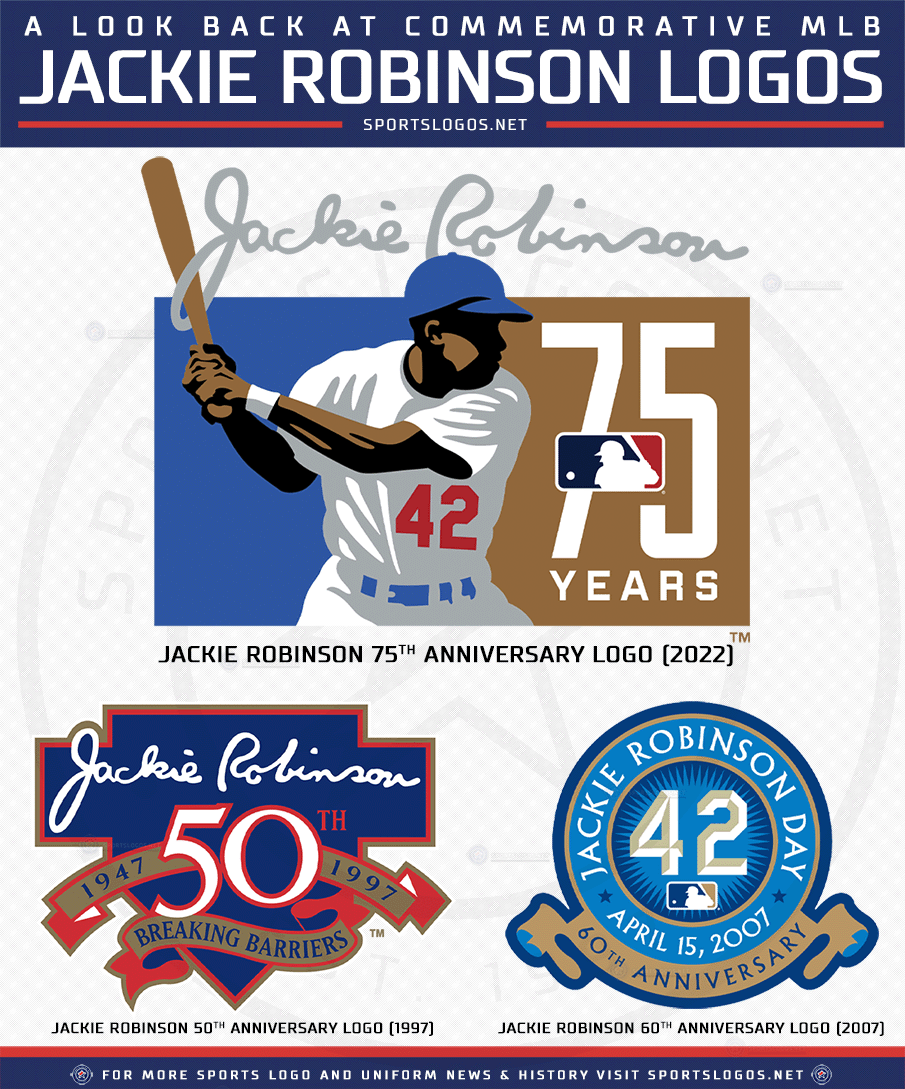
The logo shows Jackie in a batting stance on a blue and bronze rectangle, his retired number 42 in red prominently on the front of his Brooklyn Dodgers home white uniform with a blue cap and belt. To the right is a large 75 in white, the MLB logo centred vertically within it, facing Robinson. In a callback to the 50th anniversary logo from 1997, Jackie’s signature has been added to the top of the logo in gray. My favourite bit of the logo is Jackie’s bat poking through the loop in the “J” of that signature.
SHOP: Jackie Robinson Day 2022 caps and #42 team jerseys available now
“When this first comes across your desk, it’s like, ‘Oh wow, this is going to be a moment in history,'” recalled Jason Yeadon, Major League Baseball’s Creative Director of Brand Design, in a call with SportsLogos.Net. “It’s so important for baseball; you don’t want to go outside the box so much, yet you want it to pay homage to Jackie and the history of this important moment.”

Yeadon teamed up with Todd Radom, designer of the 50th anniversary logo, and Britt Davis, an Atlanta-based sports designer who, as Yeadon noted during our call, did her senior thesis on the Negro Leagues.
“Todd was the history. I focused on what this looks like for the future of the league, and then Britt came in with that diverse perspective for some of the illustrations. It was a pretty good team tandem.”
“I think I would have been happy with any of the logo [concepts] that we did, but this one shined out to me as the best with the history. Looking at what the 50th logo was with Jackie Robinson’s signature at the top, having some tie into where that one was, and then a modern illustration of Jackie, and not having to put in so many bells, whistles, and ribbons with a digital-first approach of how to synthesize this into one succinct mark.”
Of course, another essential collaborator on the design was the Robinson family, with whom the league consults regularly on projects involving the Jackie Robinson name.

“Number one [importance] is speaking to the family, making sure that we’re working with them every step of the way,” Yeadon said. “Sometimes we have one [concept] that we really like, sometimes one that the family likes, and of course, we want to go with the family and make sure they’re proud of it. There’s a little back and forth there, and I think the one that we landed on we both love equally. We gave the family three options of where we thought the mark would go, and we had a call to discuss even the final points of why we thought this one was it. They had a few questions based on the stance and colours, and we worked through those details. They really had a hand in the end product.”
“You take a step back and want to make sure that you include everything you can in this, to make sure that Jackie looks like the hero he is and signify what this day means through this mark.”
With Robinson’s pose placed on a two-colour rectangle, it almost mirrors Major League Baseball’s iconic batter silhouette logo. An element that wasn’t intentional at first but, once discovered, was an idea the designers ran with.
“We had some designs where Jackie’s popping out of this shape, and we thought ‘that looks like the silhouette of the two colours,’ and not to tie into that, but suddenly you get that representation of ‘baseball’, right at the core.”
Back in 1997, when the 50th anniversary logo was worn as a jersey patch by all teams for the entire season (even in place of the World Series patches during that year’s Fall Classic), this logo will not be worn on anything. Instead, we’ll see this mark used for broadcast, on stadium video boards, and across social media — the one on-field use of the logo will be on the base jewels during games played on April 15; those little decorations affixed to the side of first, second, and third base.
While we won’t see this logo on the player jerseys for Jackie Robinson Day, the league is still doing something different this season, uniform-wise, for the games on April 15. As is tradition, players will all wear the number 42 for one day, but what’s new is that the number 42 will now be in Dodgers blue and in the numbering style of the Los Angeles Dodgers to match what Jackie originally wore in 1947 (has anyone asked the San Francisco Giants how they’re holding up with this?).

The #42-diamond-bats jersey sleeve patches are again back this year, like last year the #42 within the patch will be customized to match each team’s jersey number style. New is that the entire patch itself will be recoloured to match the team’s uniform and colour scheme. So, the patch matches the uniform better but now the player numbers do not.
SHOP: Jackie Robinson Day 2022 caps and #42 team jerseys available now
Jackie Robinson broke the AL-NL colour barrier on April 15, 1947, when he took his spot at first base on opening day at Brooklyn’s Ebbets Field. Robinson, batting second, went 0 for 3 with a run scored in a Dodgers 5-3 win over the Boston Braves. Robinson would go on to win the NL Rookie of the Year that season, the NL MVP two years later, and play in 7 All-Star Games before retiring after his tenth season in 1956. Robinson was elected to the National Baseball Hall of Fame in 1962, his first year on the ballot with (only) 77.5% of the vote.
As part of the 50th anniversary celebration of his debut, the league retired Robinson’s number 42 across all of Major League Baseball on April 15, 1997, with only the players who were currently wearing the number permitted to continue doing so. New York Yankees Hall of Fame closer Mariano Rivera was the last player to regularly wear #42, doing so right up until his retirement from baseball in 2013.


