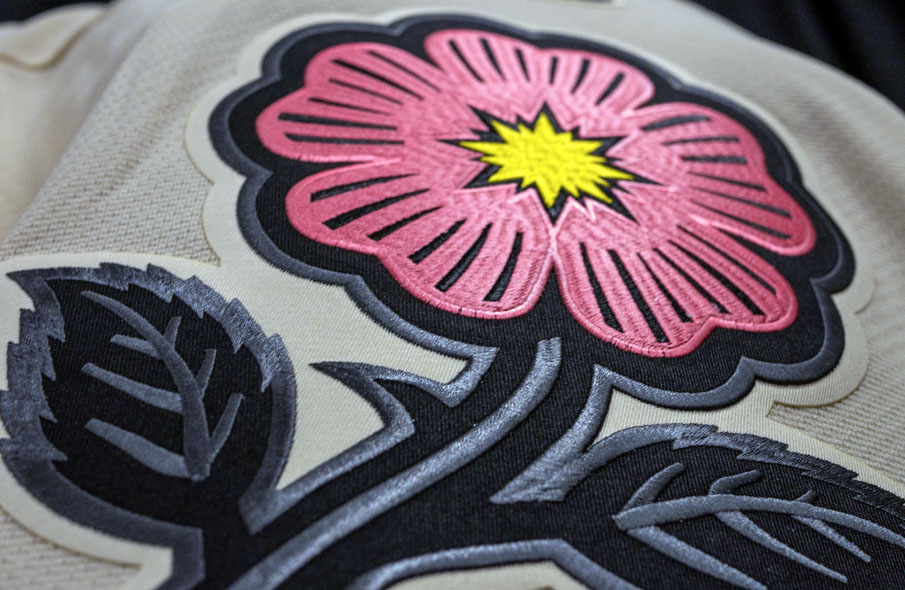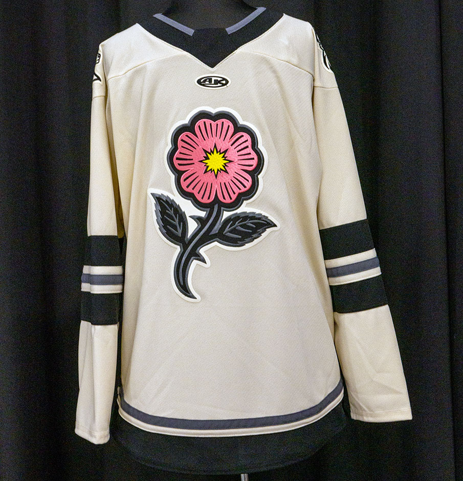
The ECHL’s Iowa Heartlanders (affiliate of the NHL’s Minnesota Wild) unveiled their new third uniform yesterday featuring the club’s alternate wild prairie rose logo as the crest.
With a limestone sand base (like a creamy white), the jersey has two thick black stripes on either sleeve with a single, thin silver stripe in between. Around the waist is a thick black stripe with a thinner silver stripe above. The collar is black with a thin grey at the neck, shoulders feature their primary white-tailed deer head logo.

The limestone sand base was chosen as a tribute to the limestone found along the Iowa River. The wild prairie rose logo is coral coloured in reference to the historic coral reefs found in the area, so much so that the town itself is known as Coralville.
LINK: Iowa Heartlanders logo and uniform history

The Iowa Heartlanders, an expansion team for the current 2021-22 ECHL season chose their unique name following an open call to the hockey fans of Iowa.
“We put out an open submission to fans to share their suggestions with us,” said Cody MacDonald to SportsLogos.Net last May, one of the two creative directors who worked on creating the team’s name and logos. “They leaned into elements of local and regional pride and that ended up being the basis of where the Heartlanders name came from. We really liked that name and then it was a matter of finding the right marks to go with it and to tell the whole story.”

The wild prairie rose logo (as well as the Heartlanders’ primary mark) was created by Brian Gundell, a Florida-based designer who in recent years has developed the new look of the San Diego Padres, the Sun Belt Conference, and even the new secondary mark for the NHL’s expansion Seattle Kraken.
Iowa will begin wearing their new alternate set immediately, taking to the ice with the limestone-coloured uniform for three home games to close out the season on April 6, April 8, and April 9.
You can purchase the new look in-arena or online here.


